The Ask
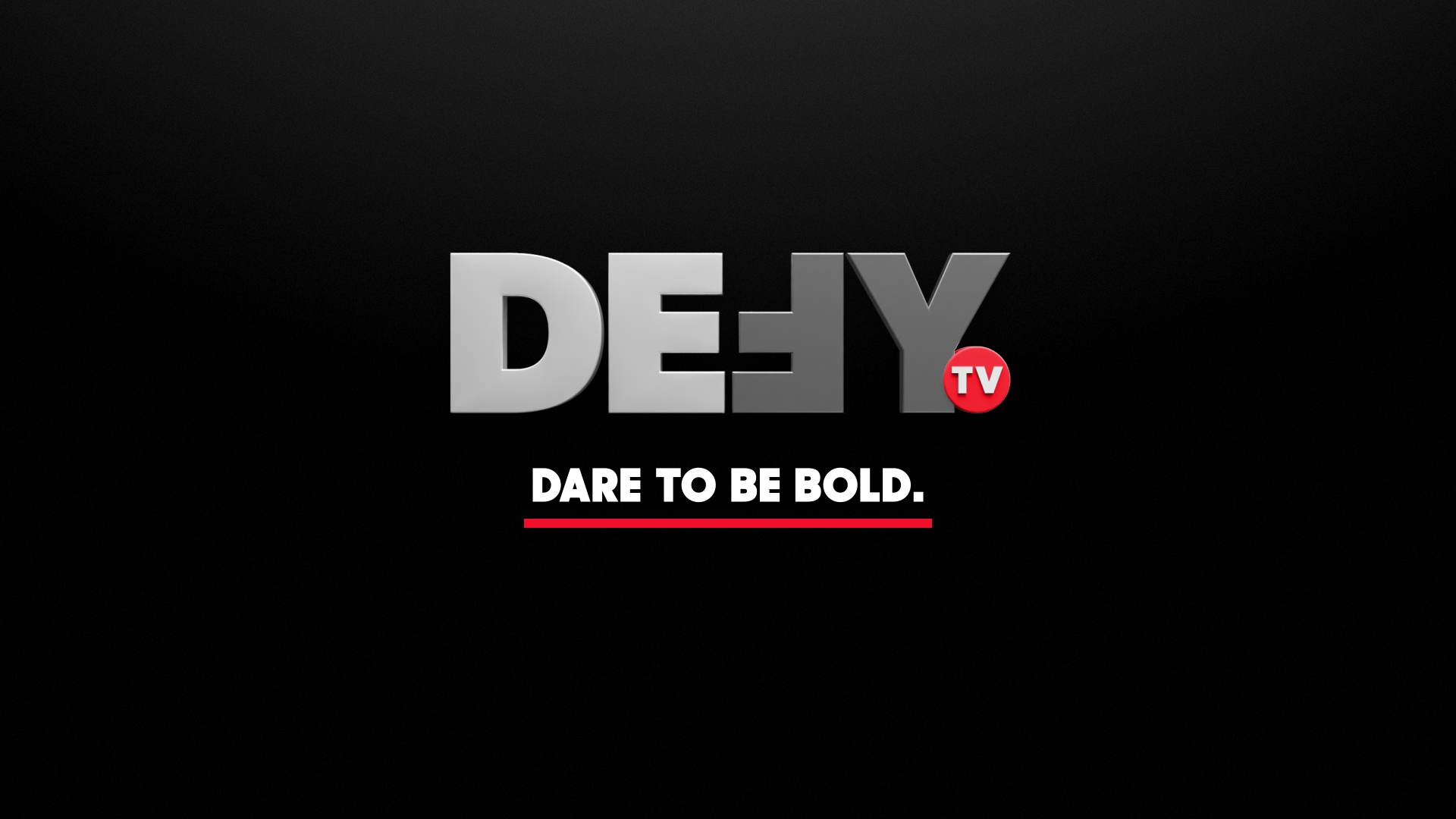
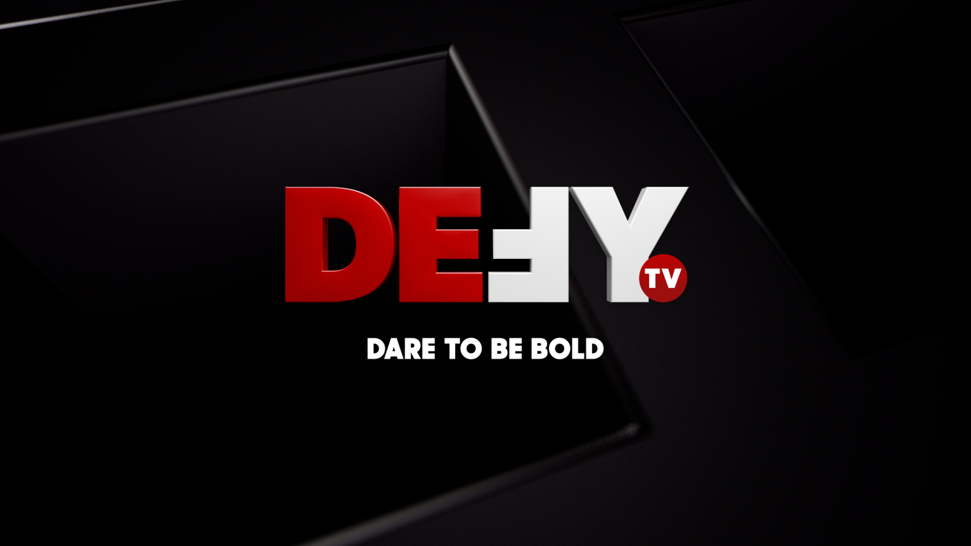
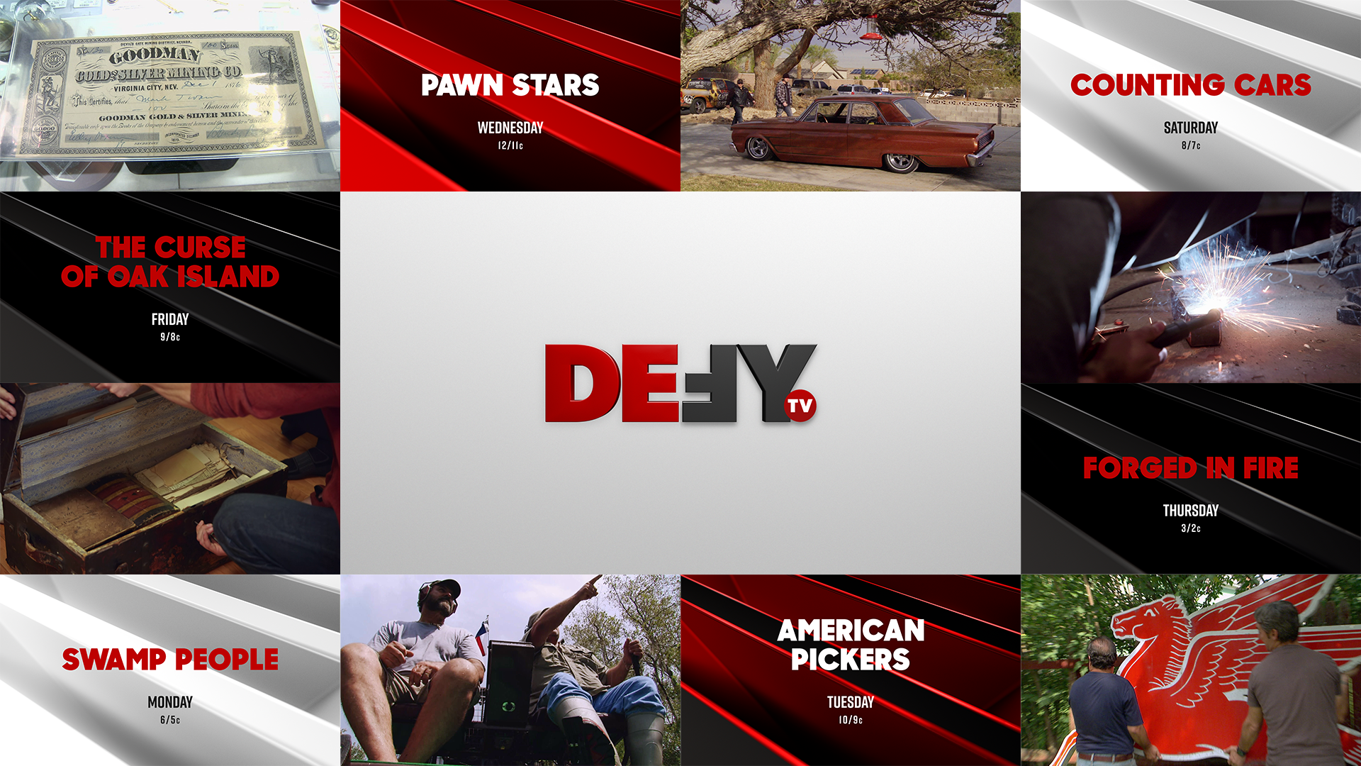
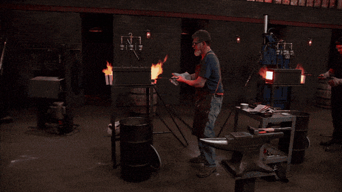
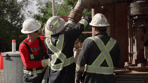
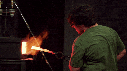
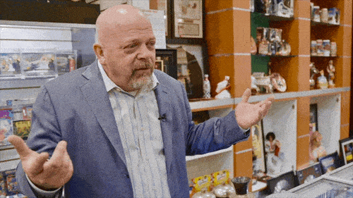
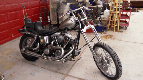
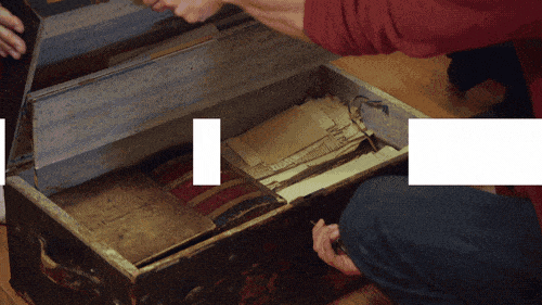
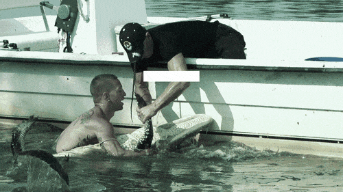
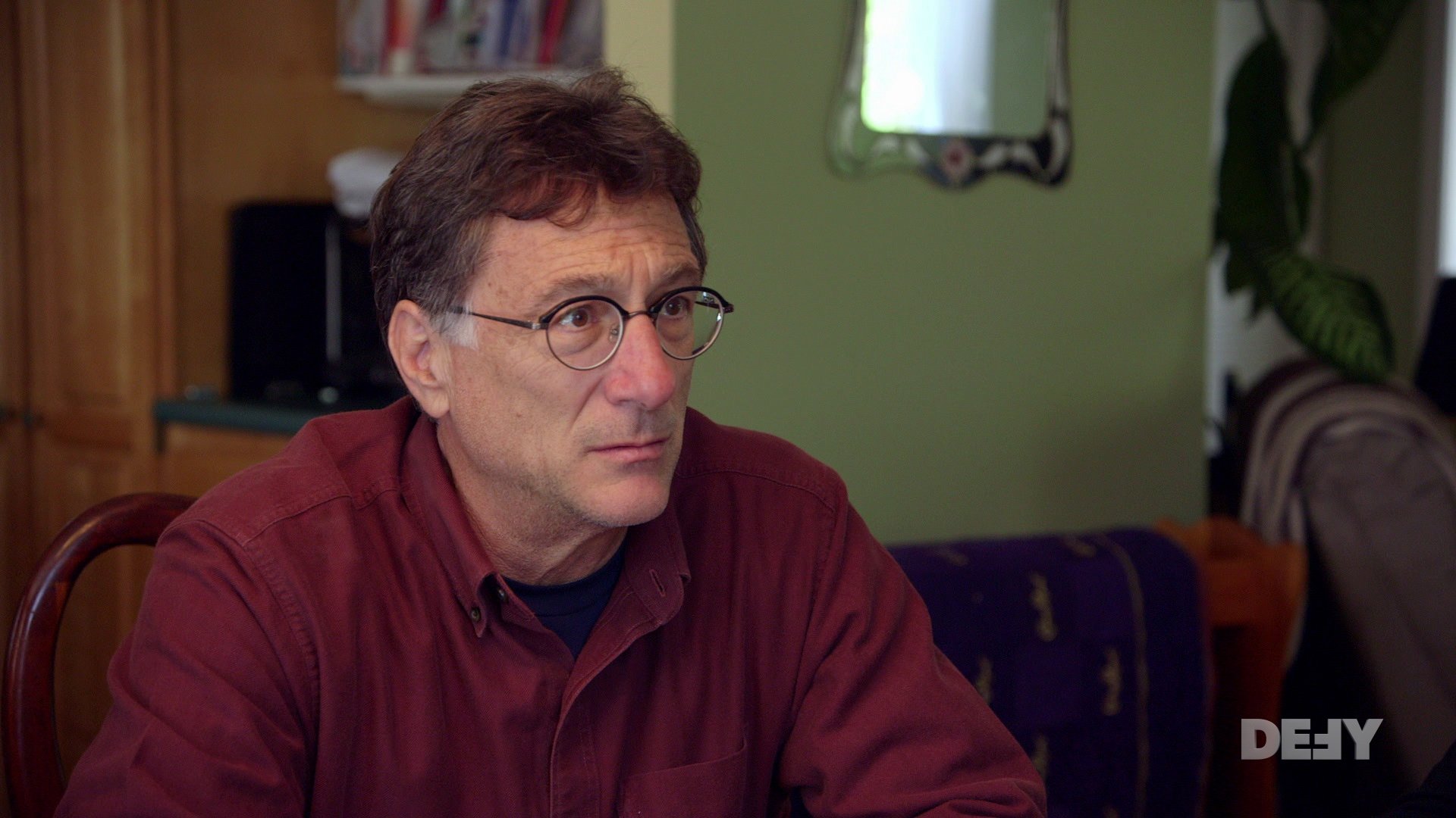
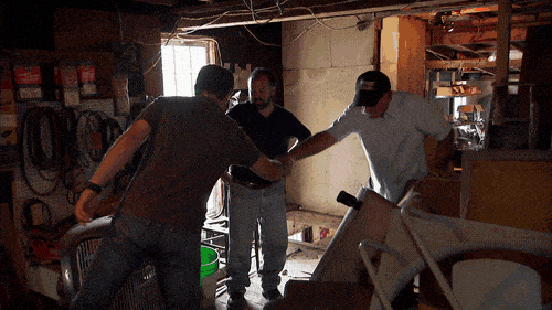
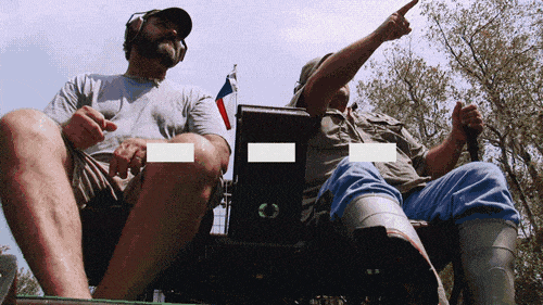
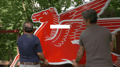
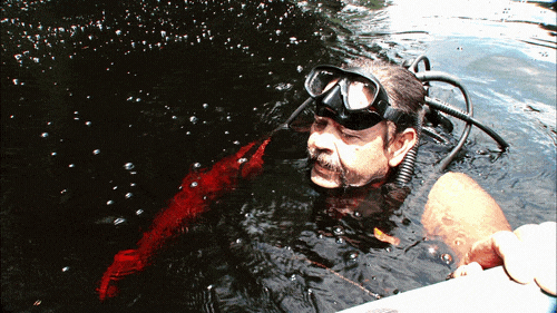
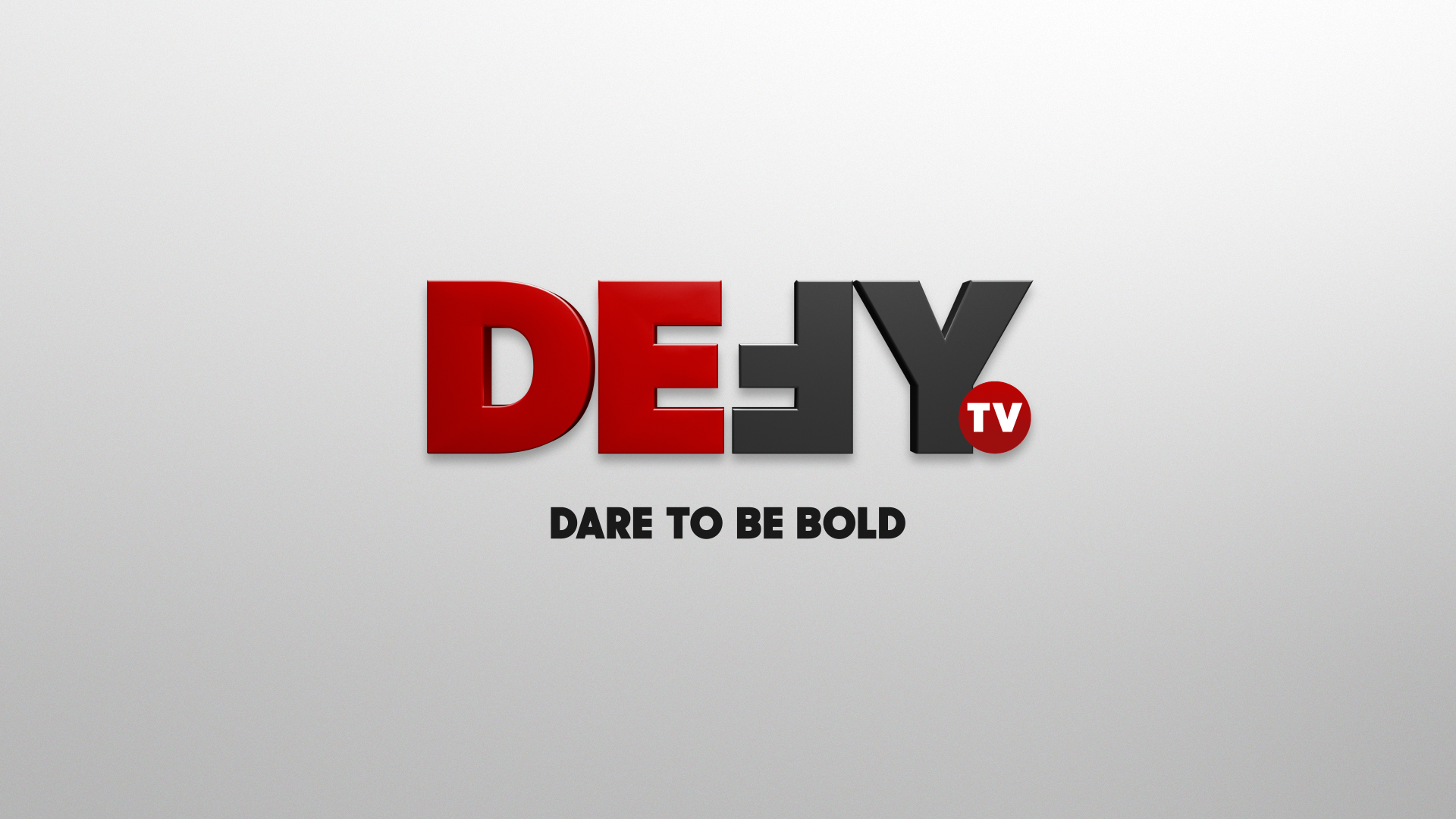
Dare to Be Bold. The E.W. Scripps Co.’s new network, Defy TV, is doing just that and encouraging its viewers to do the same. Defy is a multi-platform network that provides premium, action-packed content that fearlessly confronts the norms of reality television. With over 6,000 hours of content, which is largely made up of A&E original series, Defy has access to all the best of reality TV, with OTA (over-the-air) exclusivity for these shows. Scripps tasked Creative Mammals with elevating the network’s launch campaign by creating a brand identity that brings together thrill, adventure, craftsmanship, education, trade, and real-life people into one ultra-sleek package.
The Challenge
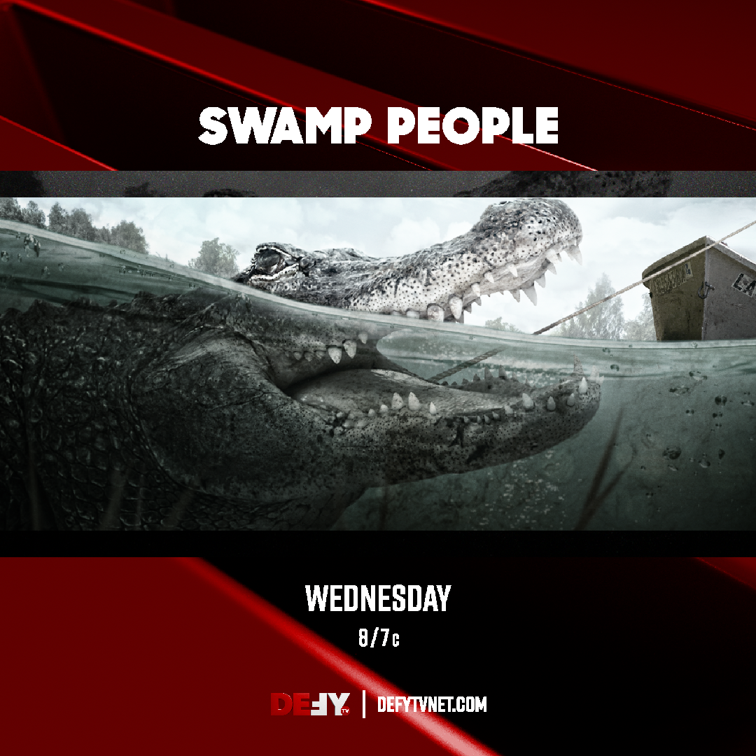
Defy is host to a wide range of diverse programming, so we needed to create a look and feel that was cohesive and complementary to each unique show within this lineup. Although most of these shows are A&E Originals and not a direct product of Defy, we needed to make sure each show fit seamlessly within the graphics system we were creating. As we were establishing this look, which relies heavily on 3D design and animation, it was also important for us to remain grounded, and avoid leaning into a high-tech or futuristic style that would make the brand feel unrelatable.
The target demographic of this network is men, which needed to be reflected in the branding; however, we also wanted to ensure that Defy would appeal to a broader audience. In order to achieve this, we needed to prioritize a strategy early in our creative process. By doing so, we were able to gather more information about how to best serve the future audience of Defy, and use that knowledge to inform key decisions along the way.
The Result
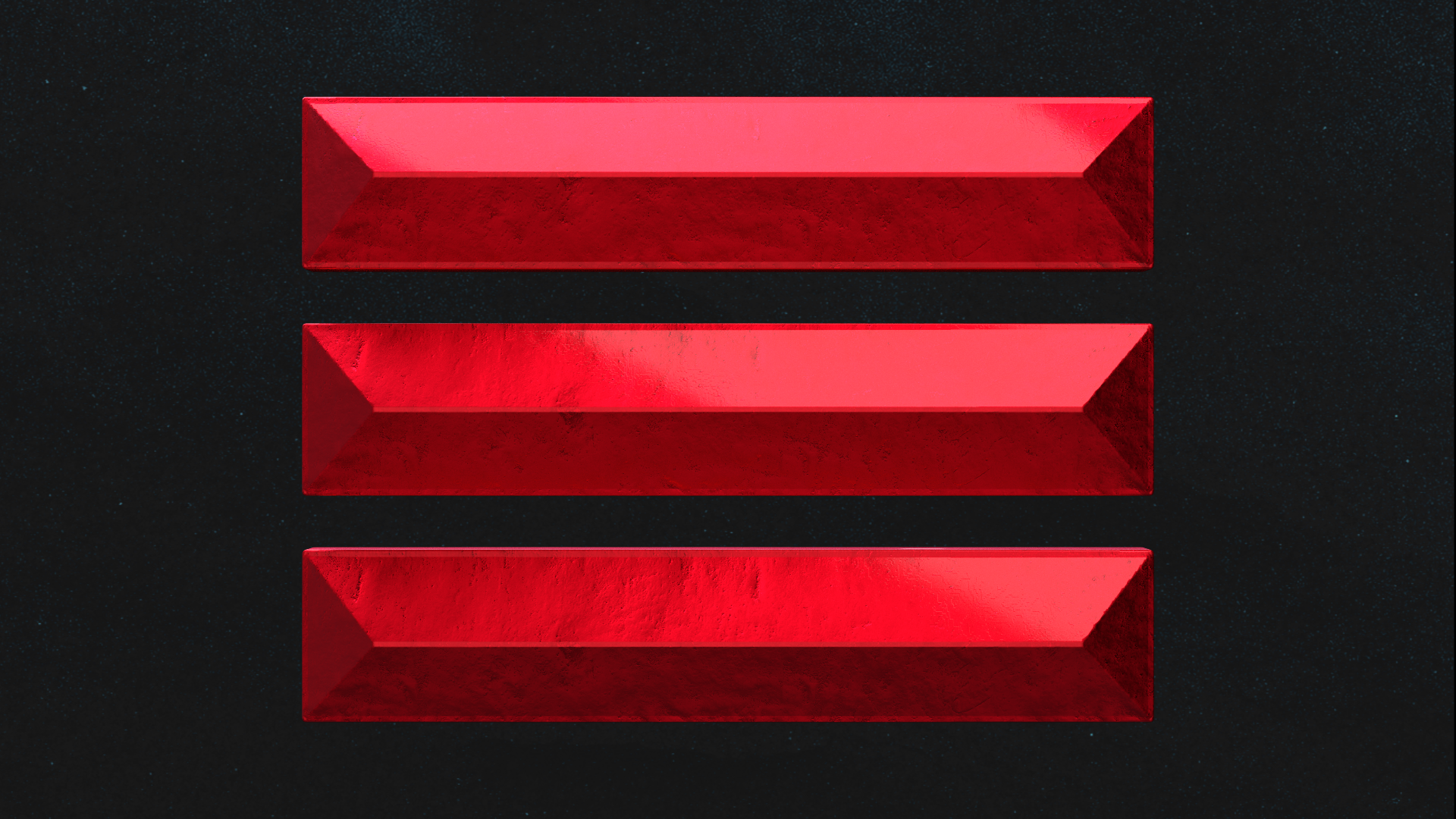
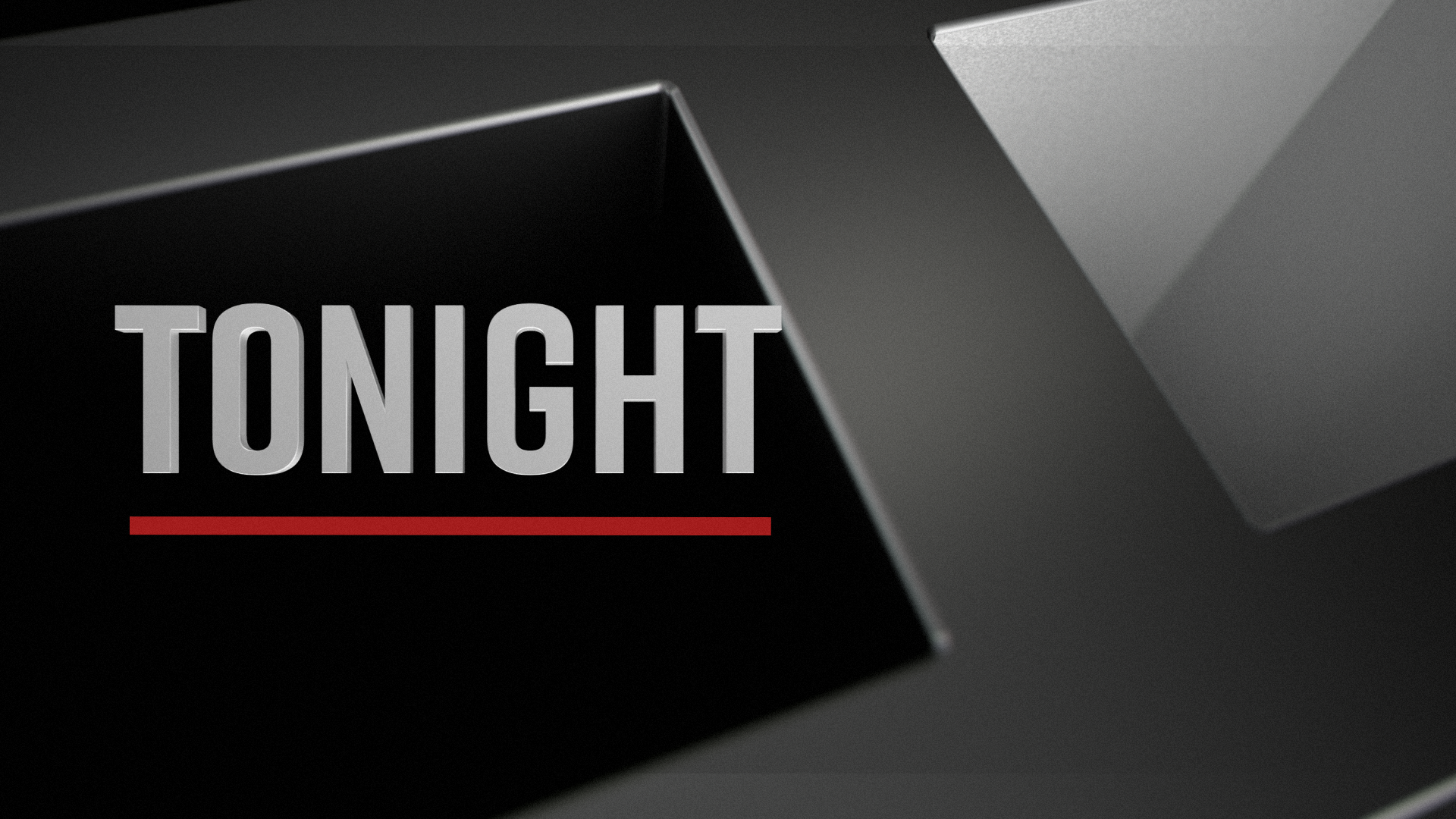
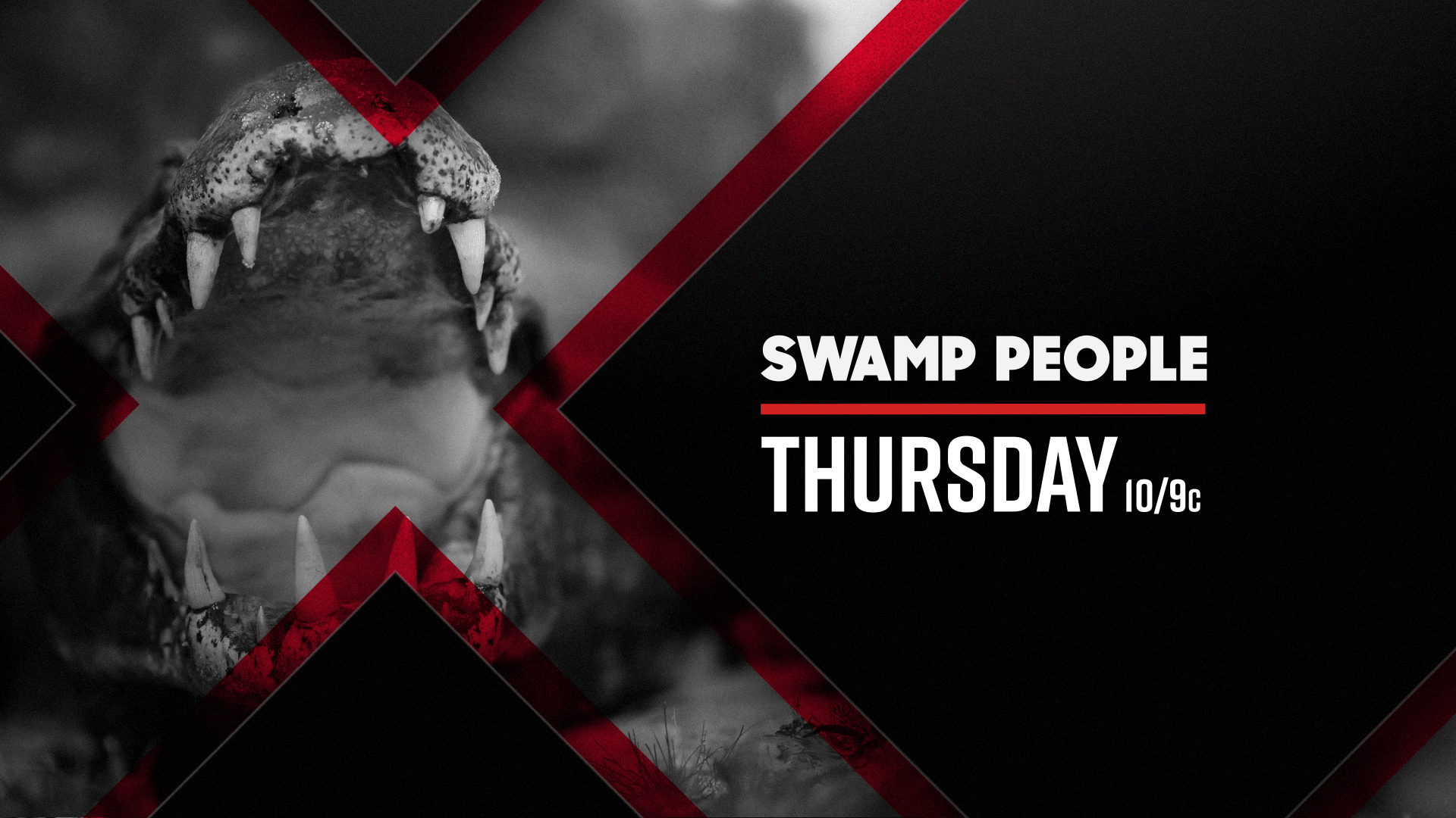
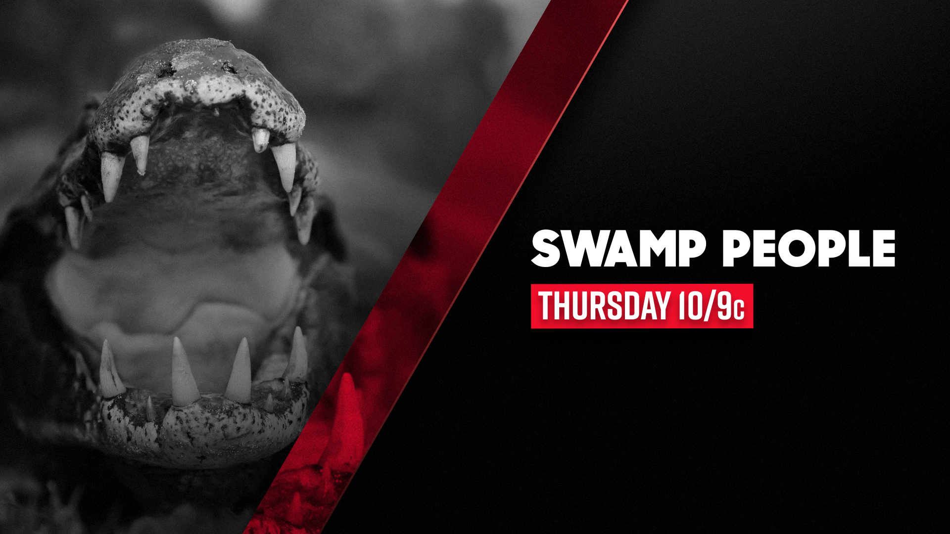
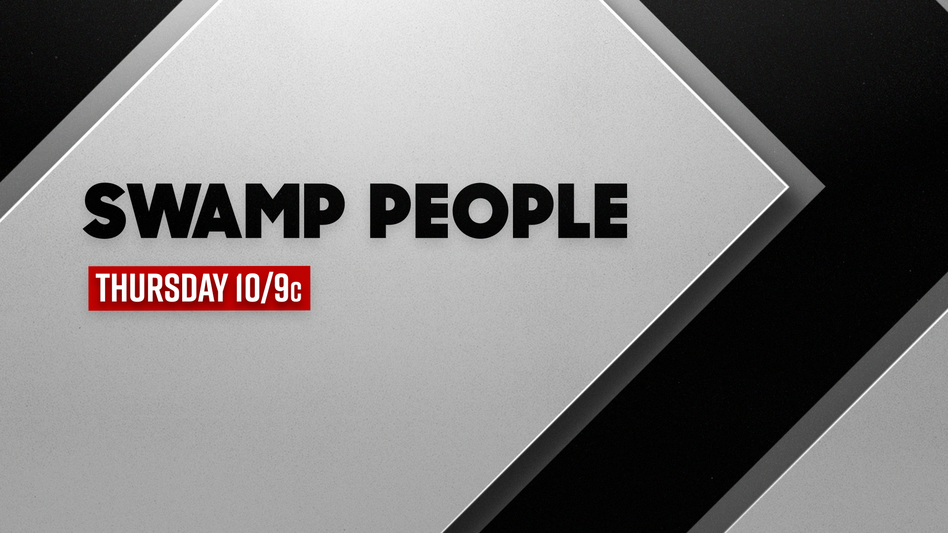
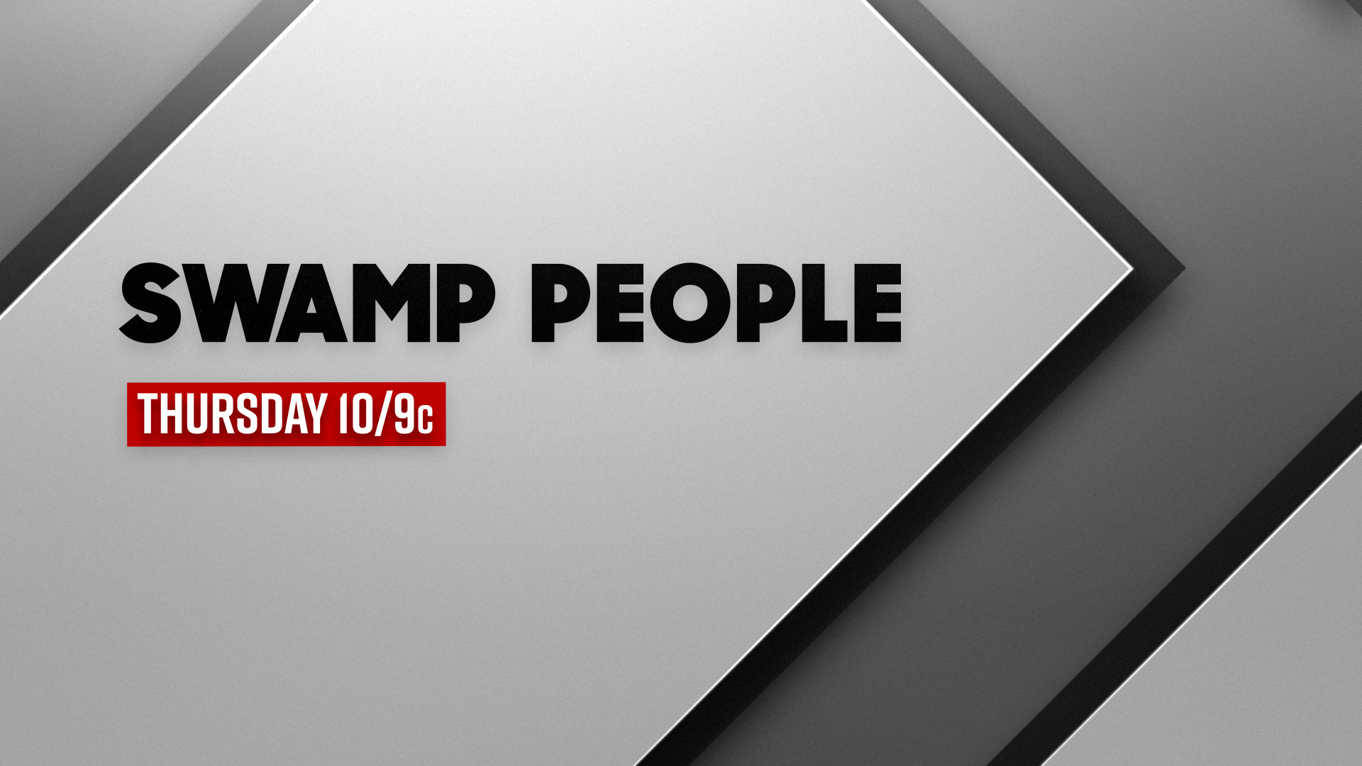
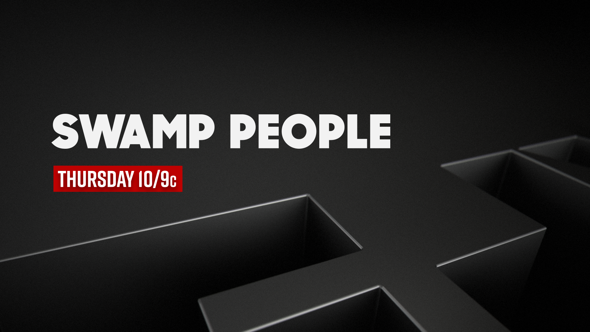
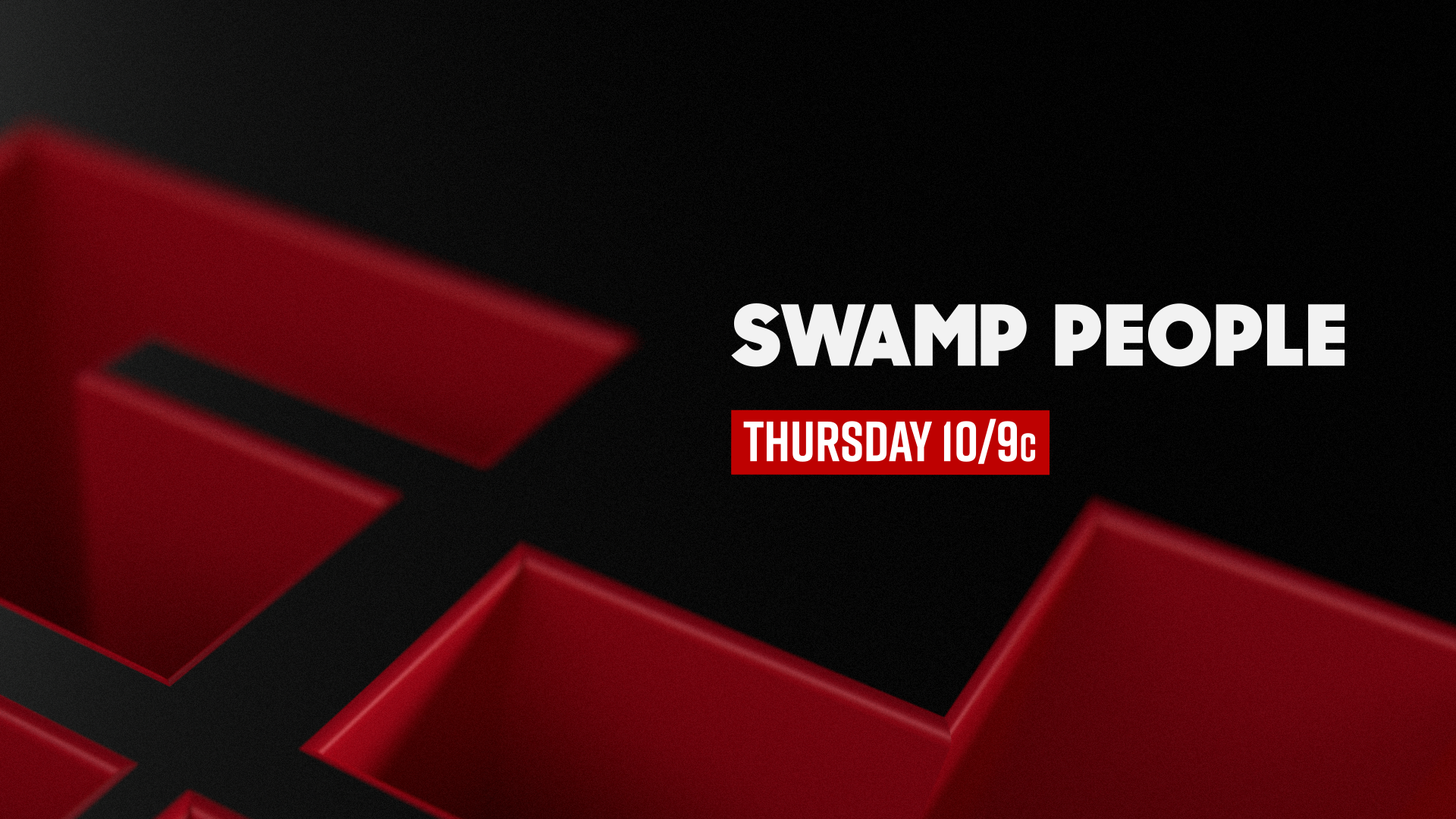
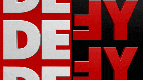
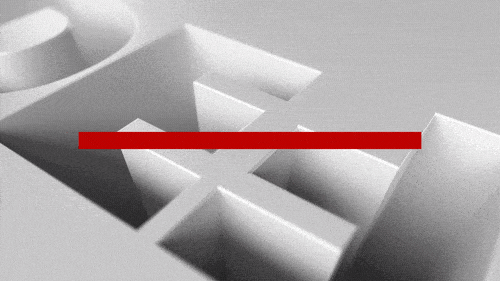
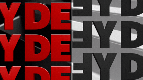
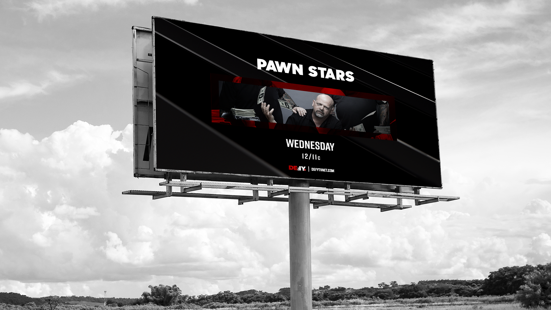
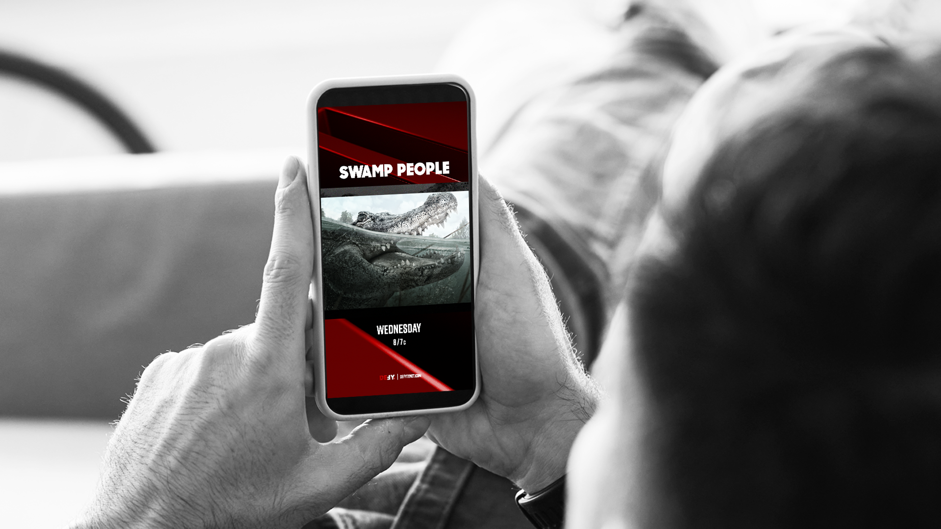
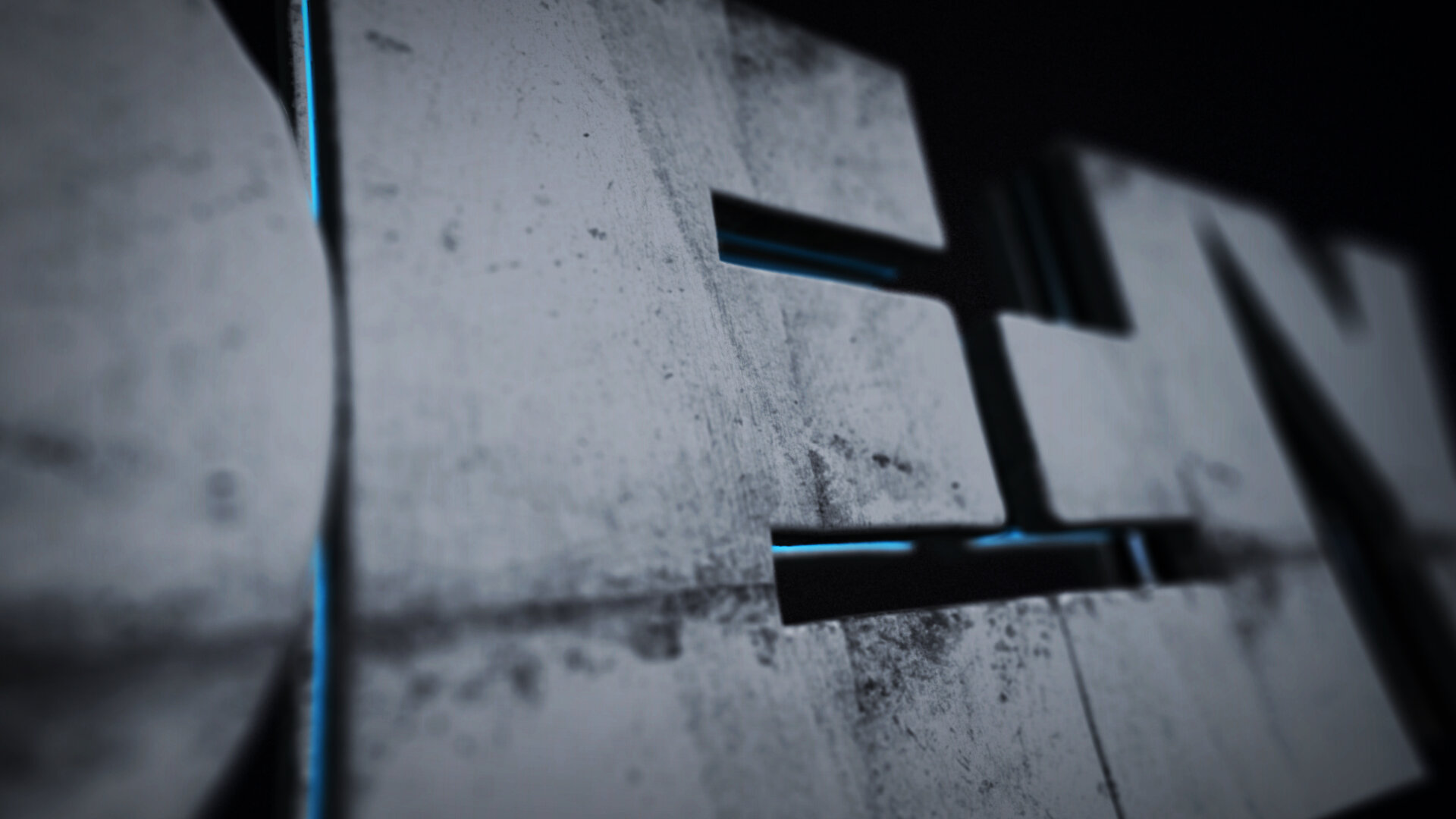
A limited color palette, 2 all-caps typefaces, and abstracted, 3D interpretations of the network logo serve as the cornerstones of Defy’s brand identity. The motion language of the network is snappy and dynamic, but with a subtlety that pulls you in and guides your attention to the shows’ content.
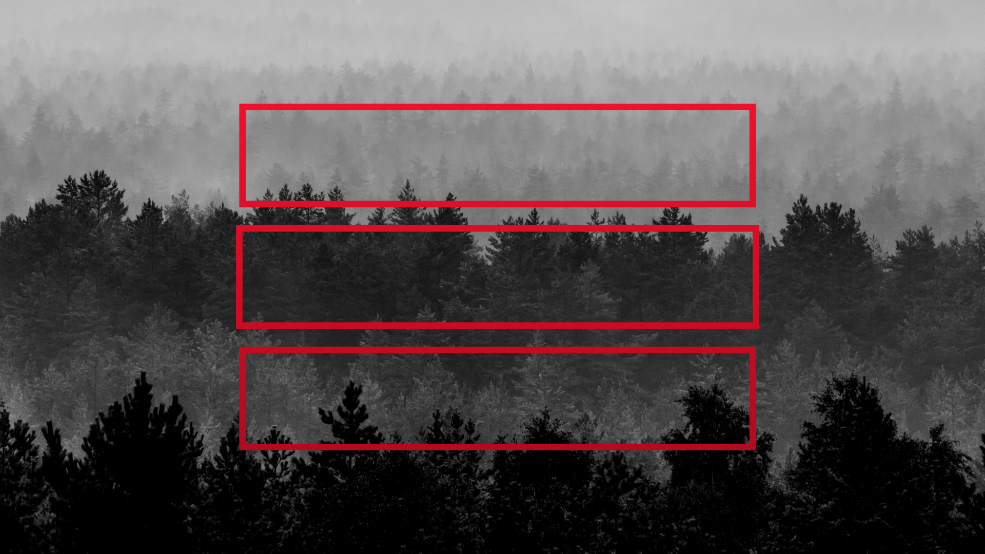
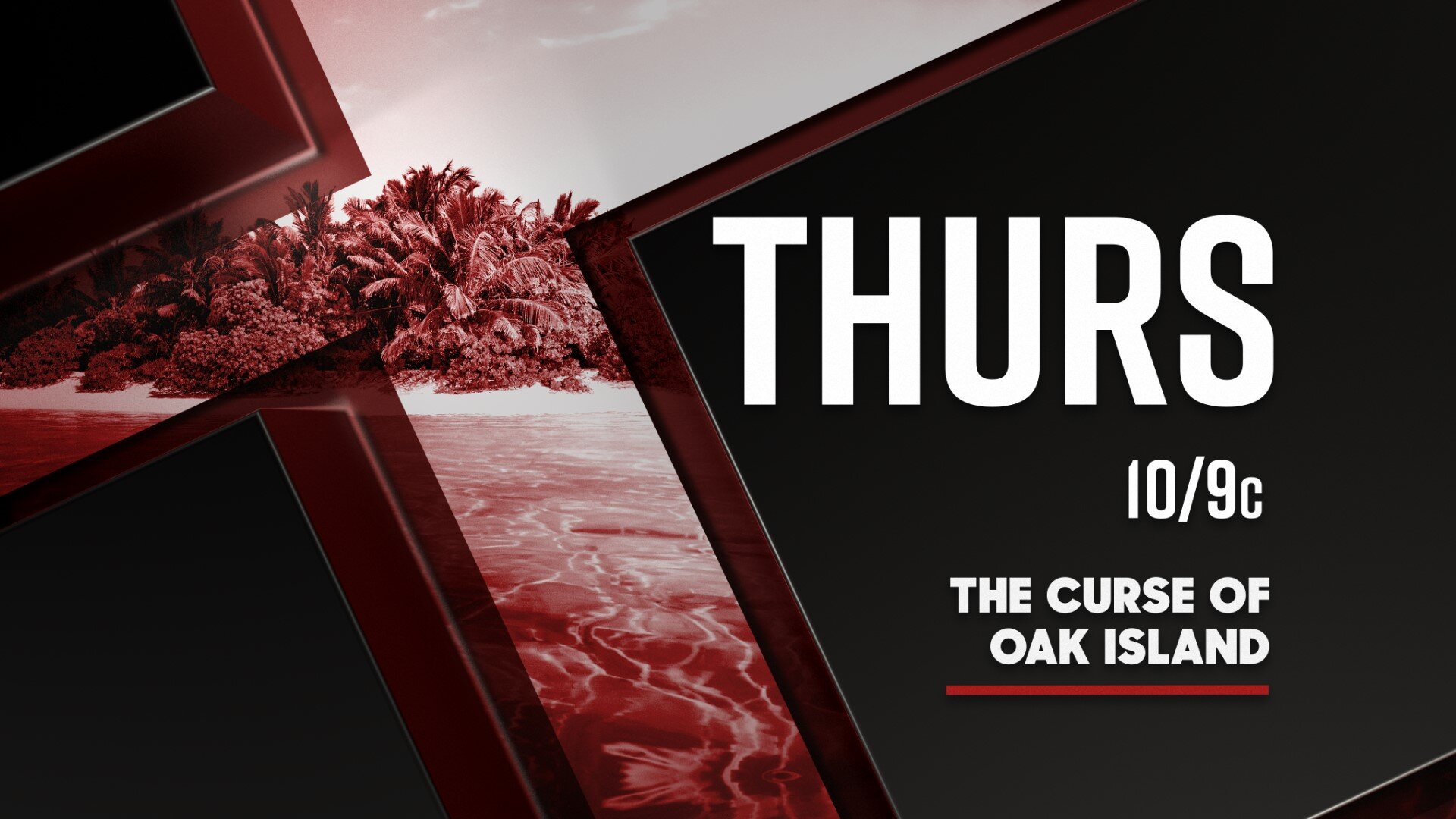
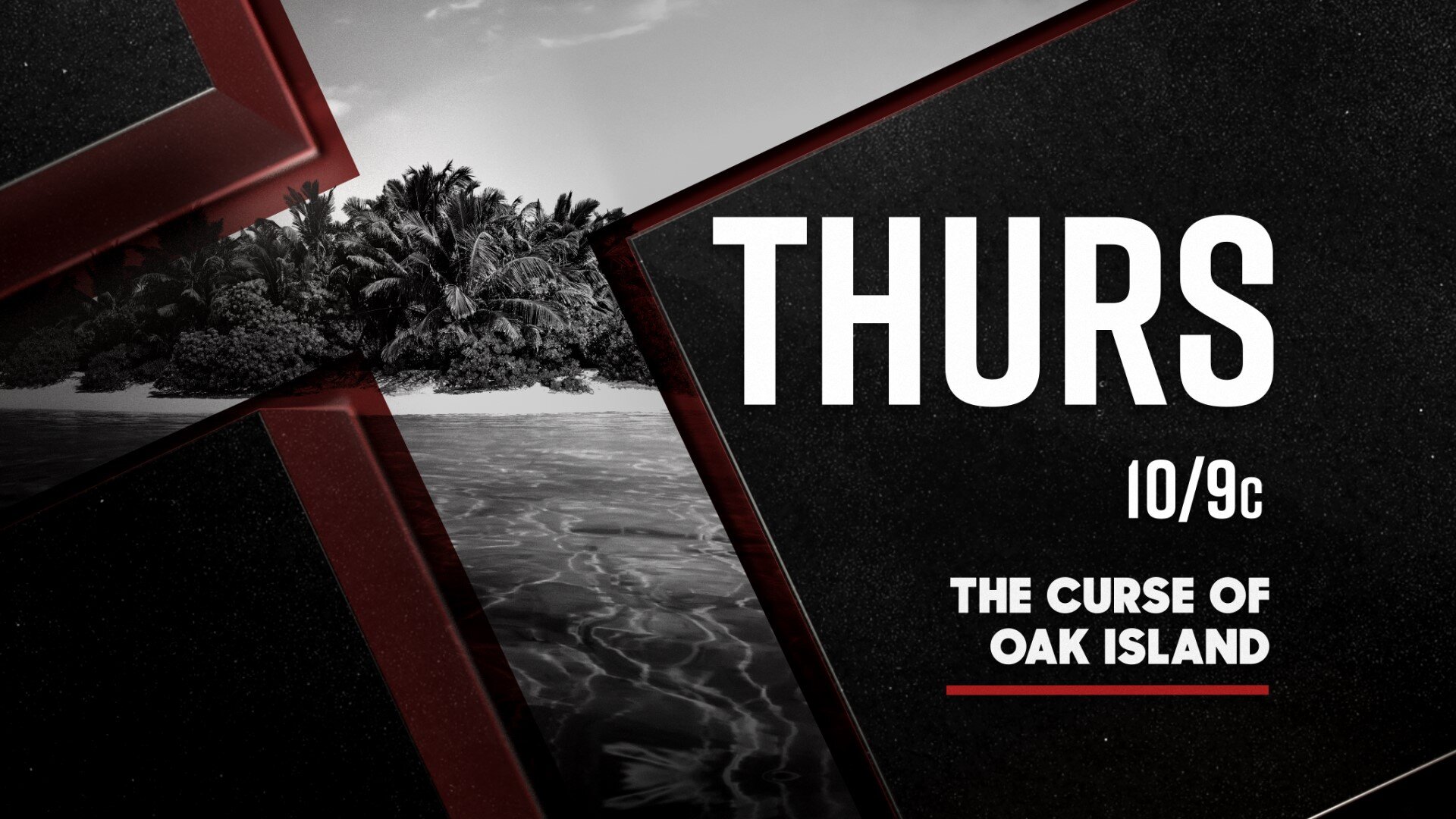
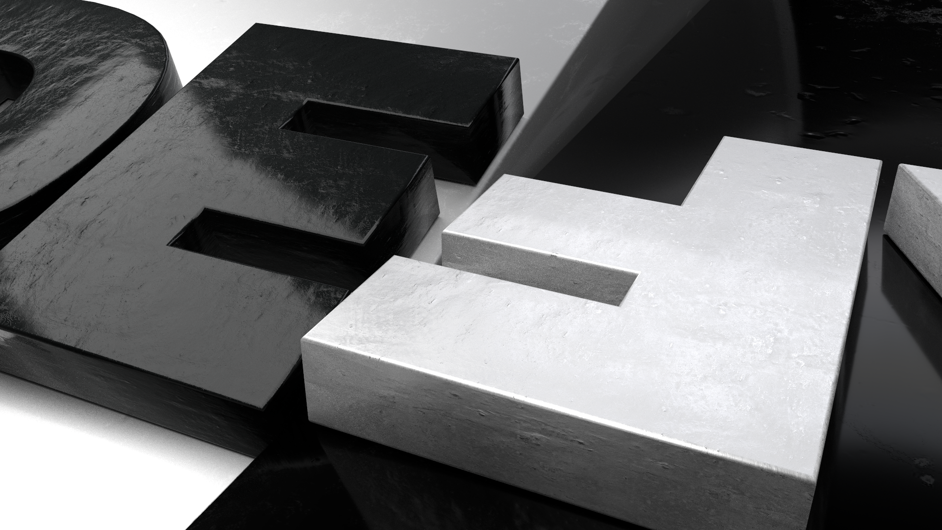
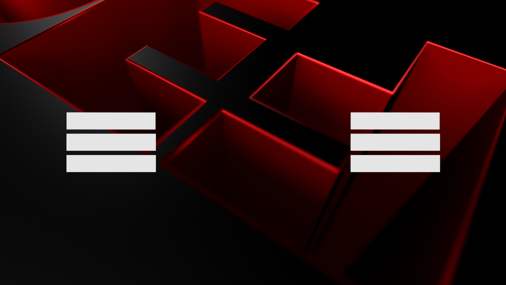
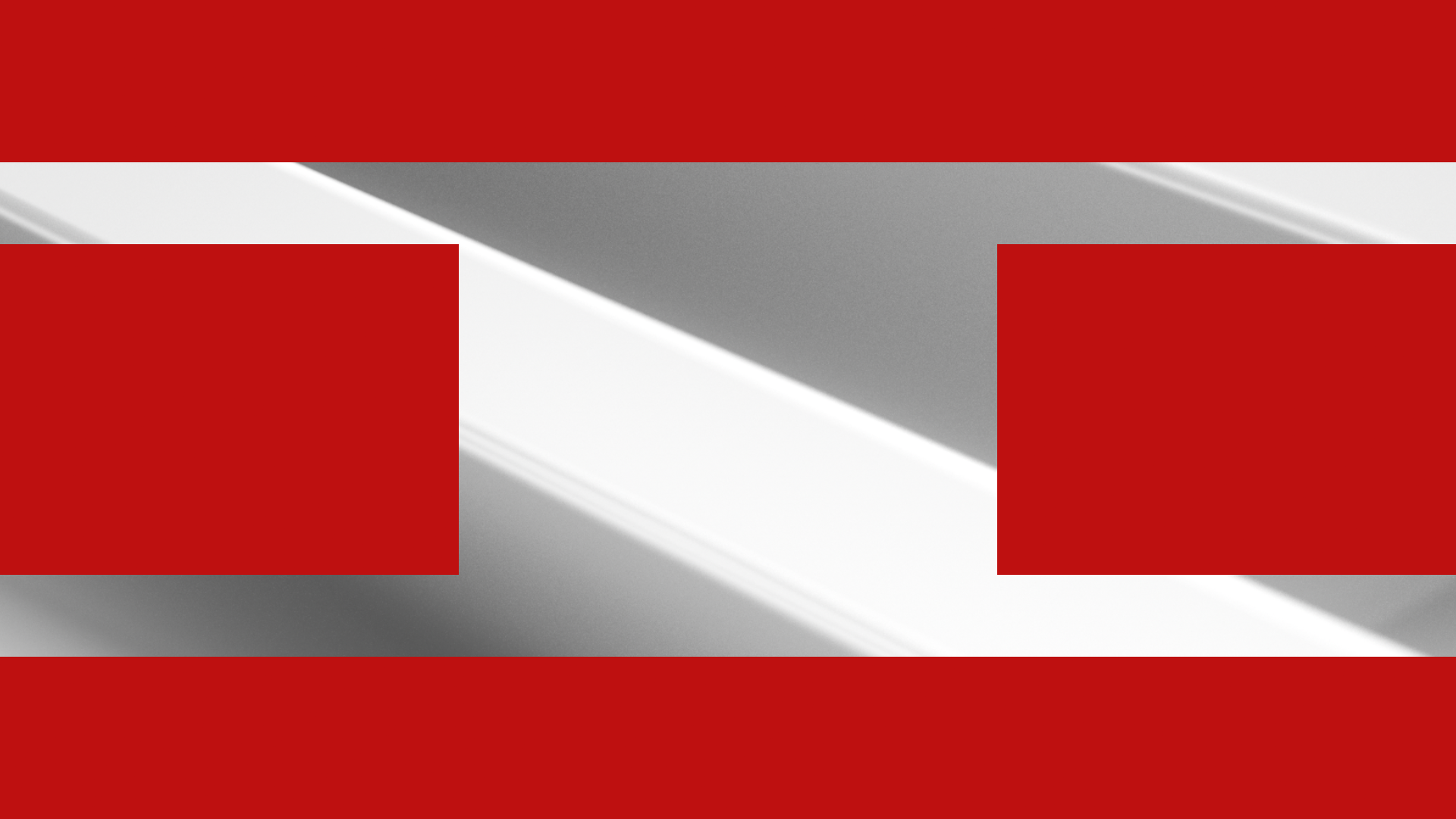
By breaking down and abstracting different aspects of the network’s 3D logo, we were able to create a recognizable graphic system which uses the 3D logo shapes as backgrounds and transitional elements throughout the deliverables. To accompany the gorgeous, ultra-sleek 3D aspects of the design, we used a grid system to create a series of 2D rectangular bar shapes that would be stacked and scaled according to the grid for a variety of use cases.
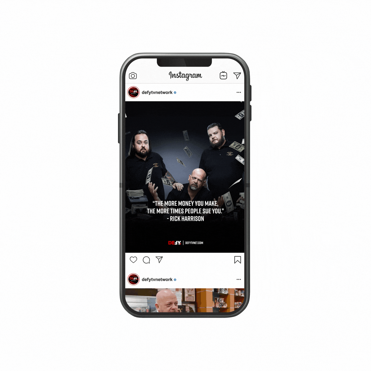
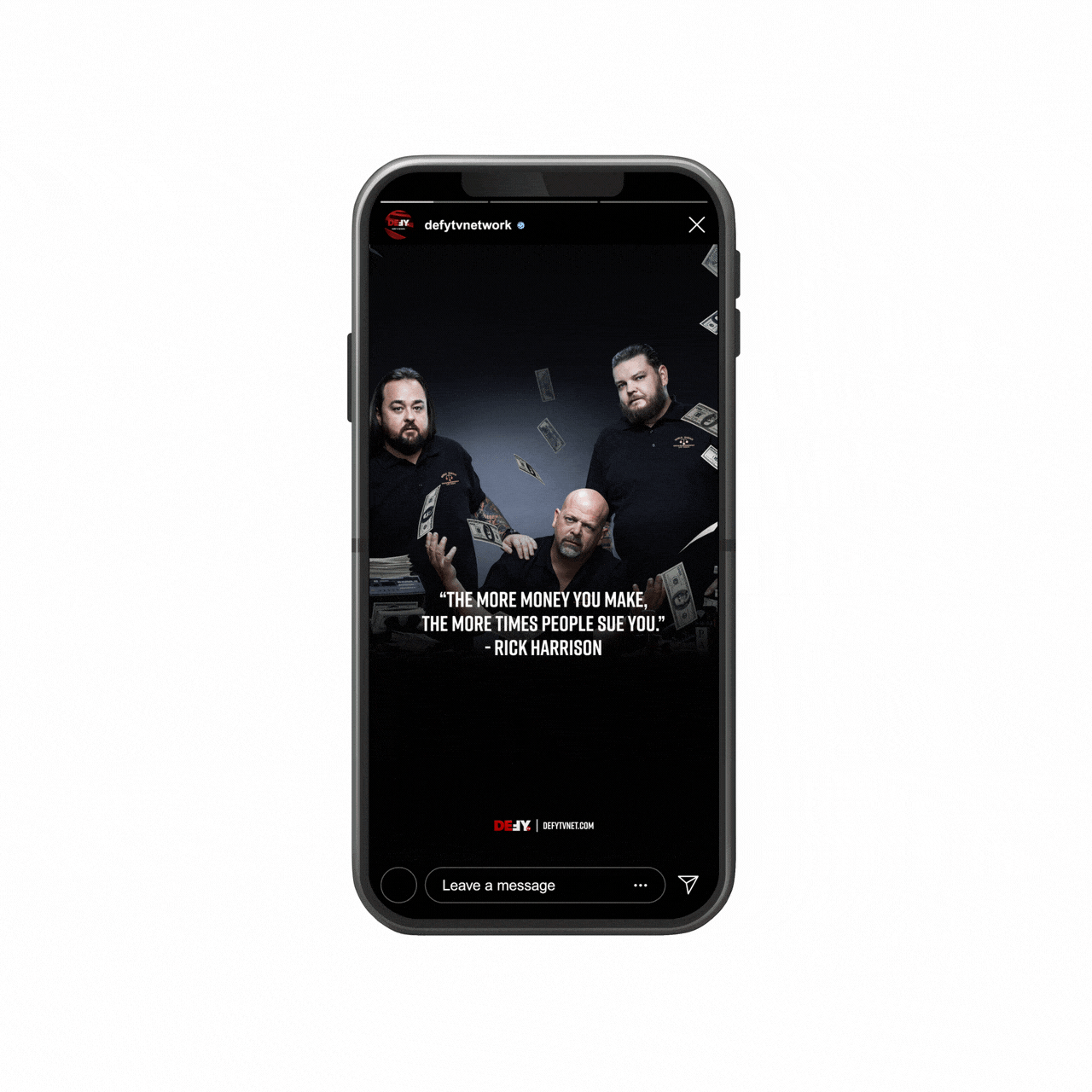
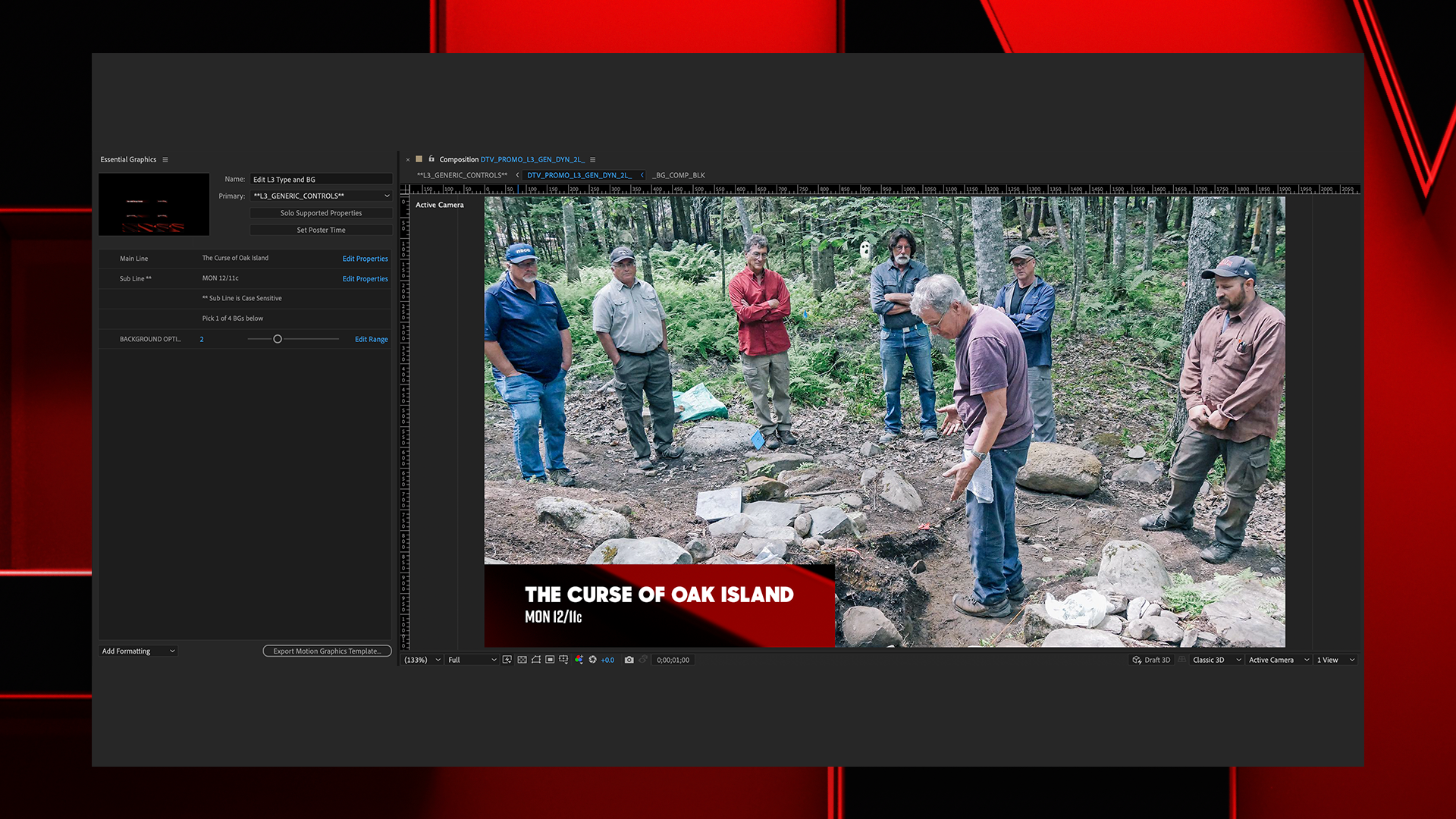
In conjunction with a vast breadth of network, promotional, and social deliverables, we used the Essential Graphics panel within Adobe After Effects to create a fully customizable graphics toolkit, which can be easily adjusted by producers and editors alike, for all of the network’s future needs.

The Solution
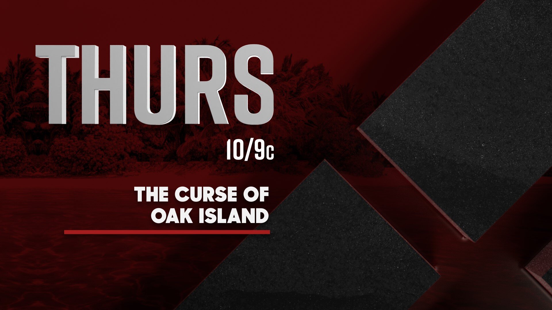
Toolkit elements
LOOKING SHARP
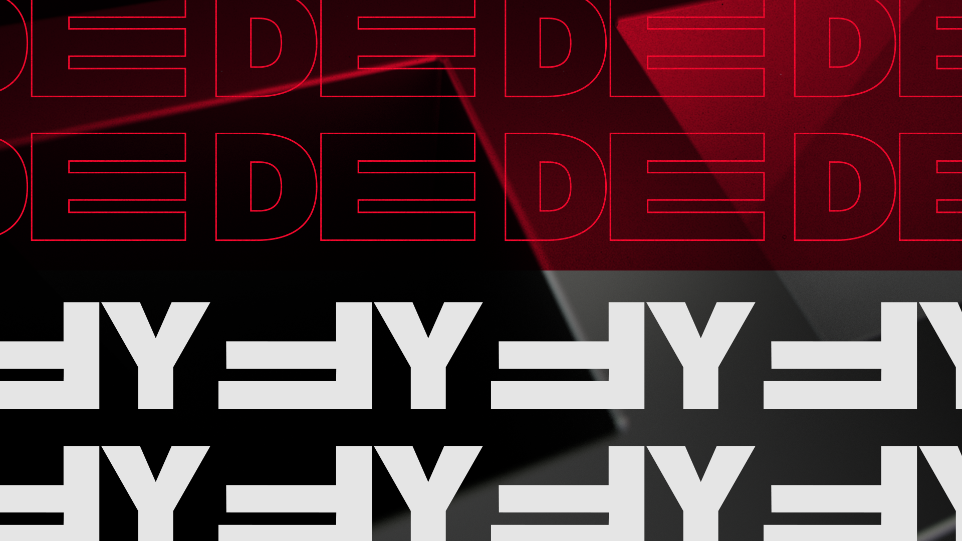
Sharp Sans Display No. 1 is a thick, cutting-edge, geometric typeface that wholly embodies the mantra of the brand in its design: it Dares to Be Bold. Rift is a condensed, all-caps sans serif typeface. Rift is clean, but expressive; adventurous, but grounded; and nostalgic, but modern. Our main goal when selecting typefaces for the brand was to find a balance between rugged and modern, without feeling exclusionary.

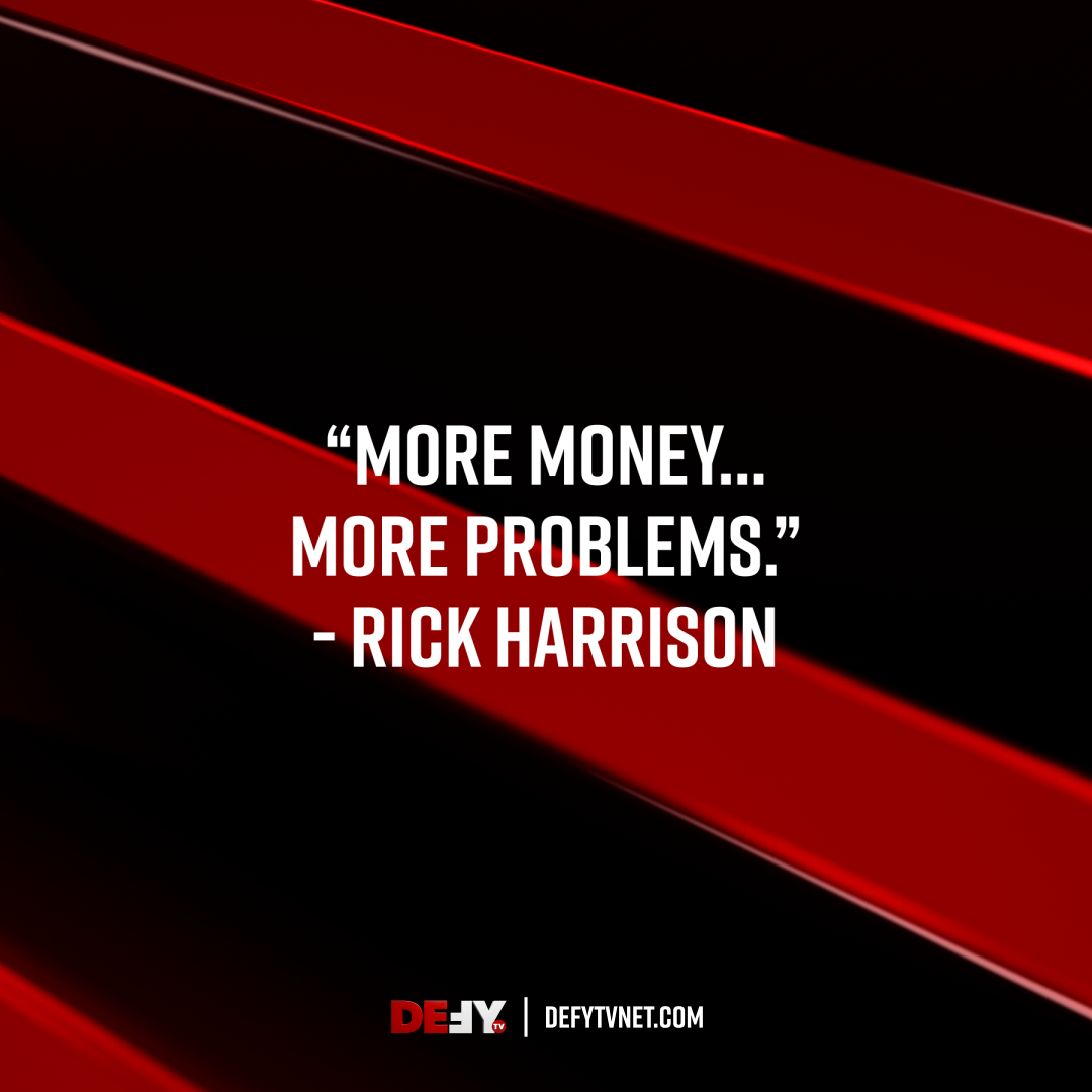

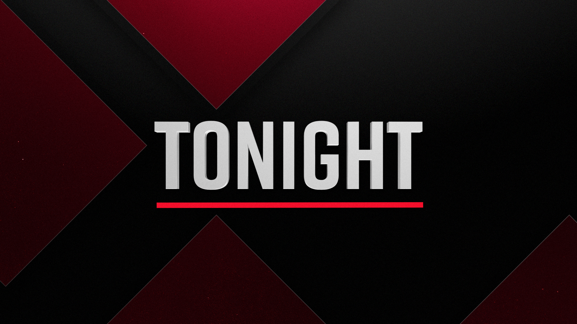
red hot
The color palette we established for Defy consists of black, red, gradient gray, and white. The hero color of this palette is the red, which reinforces the bold and confident look of the brand. Red, a primary color, is typically characterized as assertive, daring, adventurous, energetic, and determined — all qualities which translate seamlessly across the board of Defy’s diverse programming. Variations of red, black, and white are used for all 3D elements, while the gradient gray is reserved for the background on stings only.

on the grid
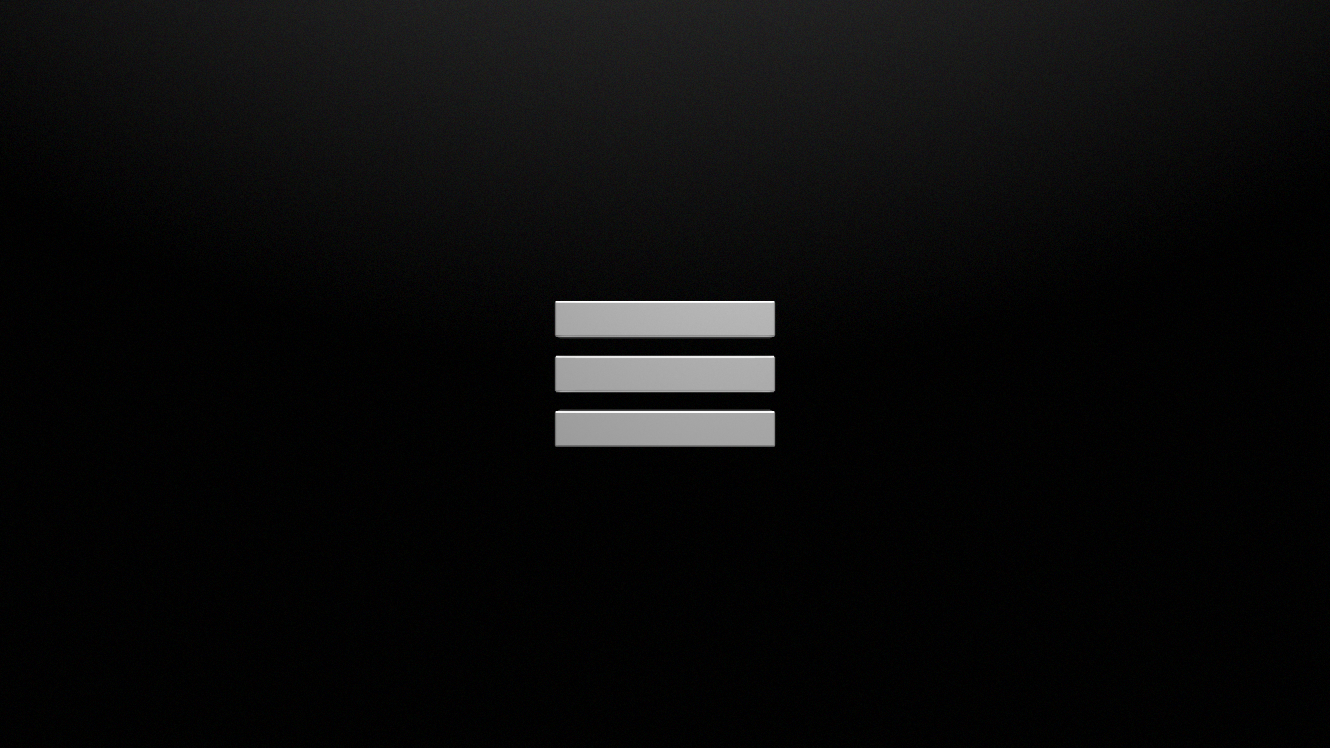
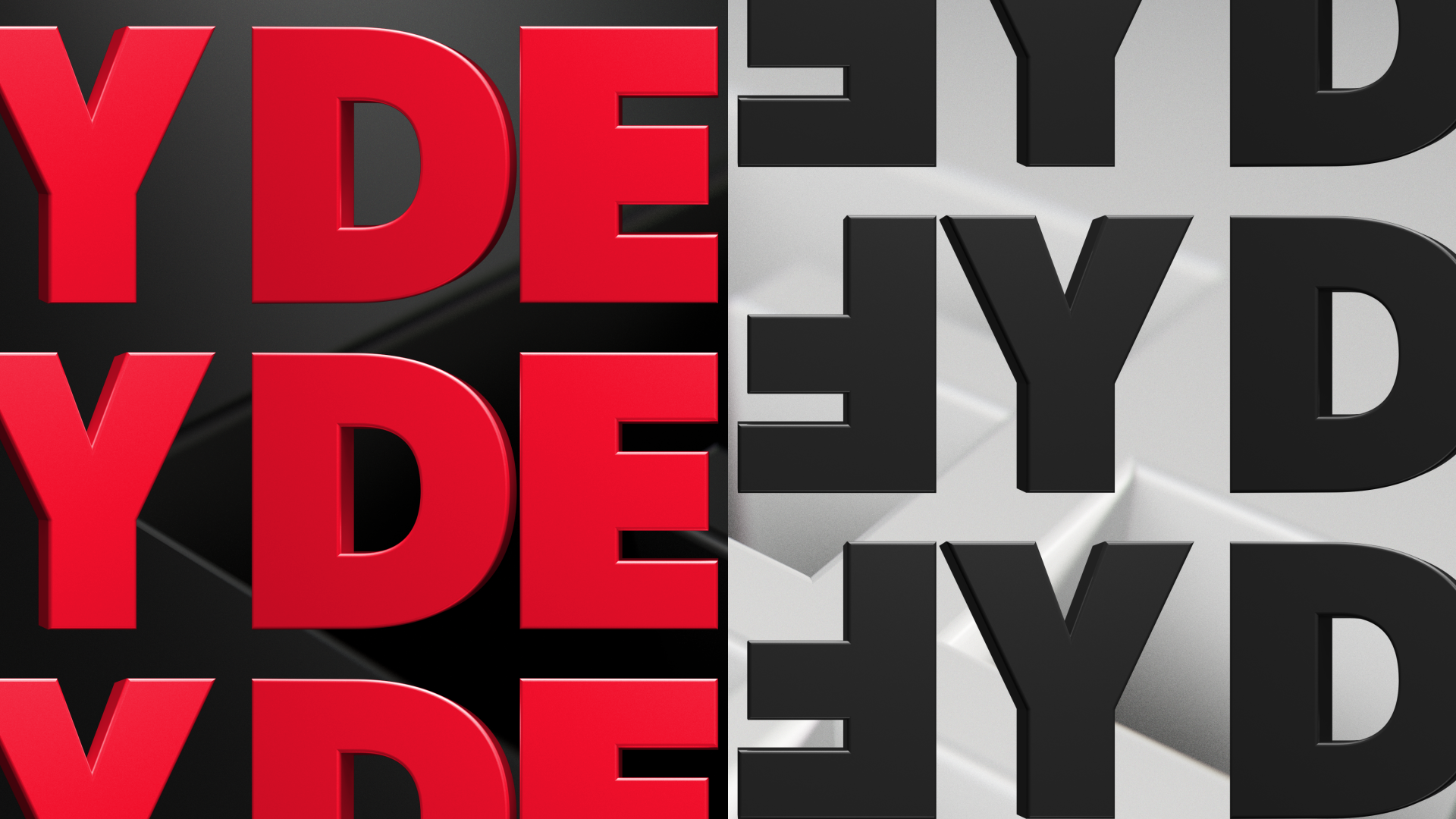
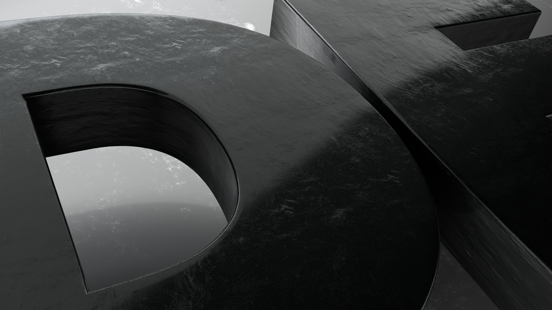
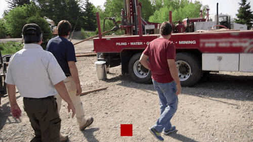
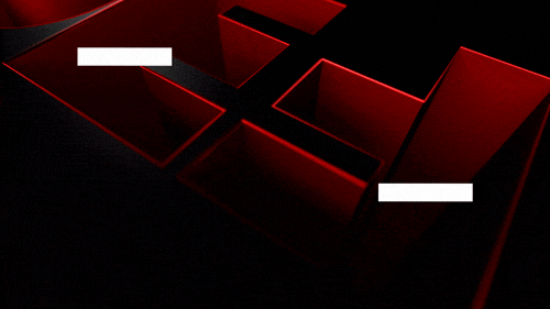
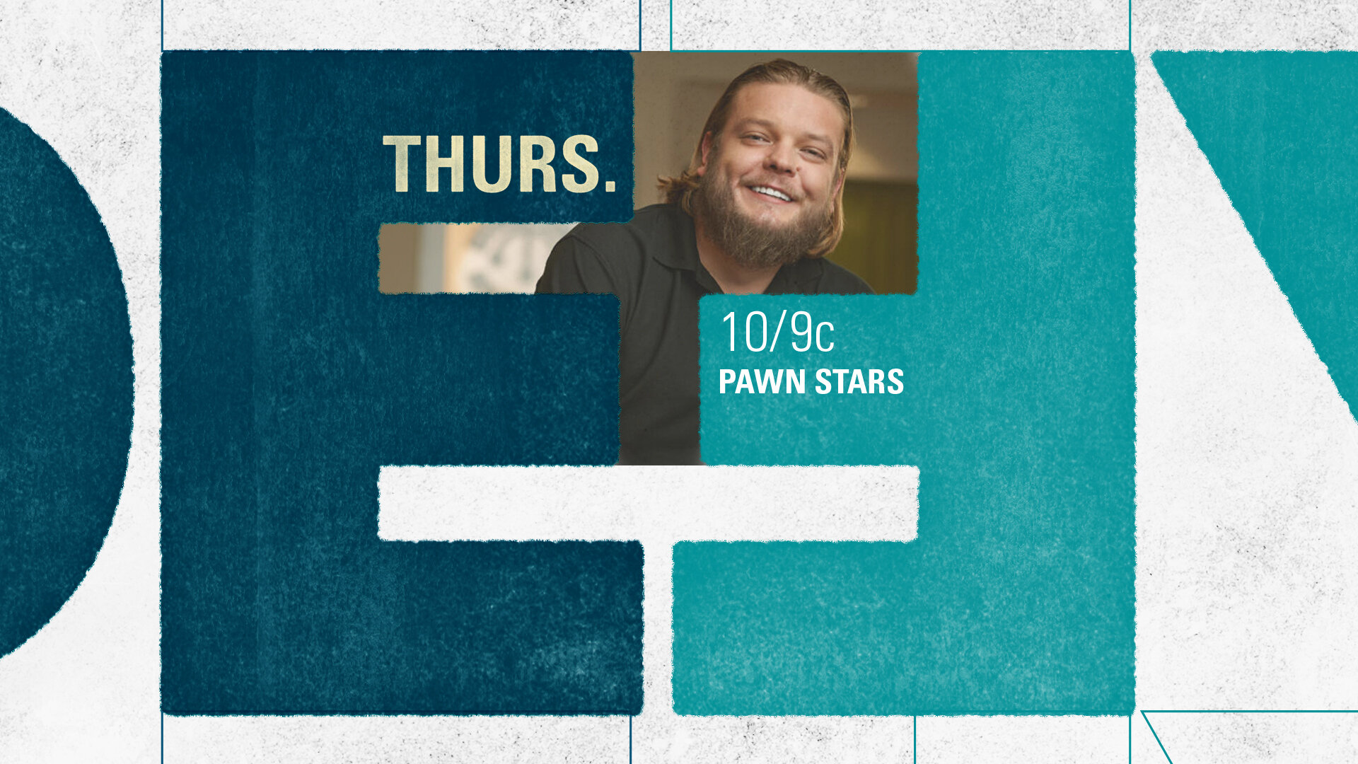
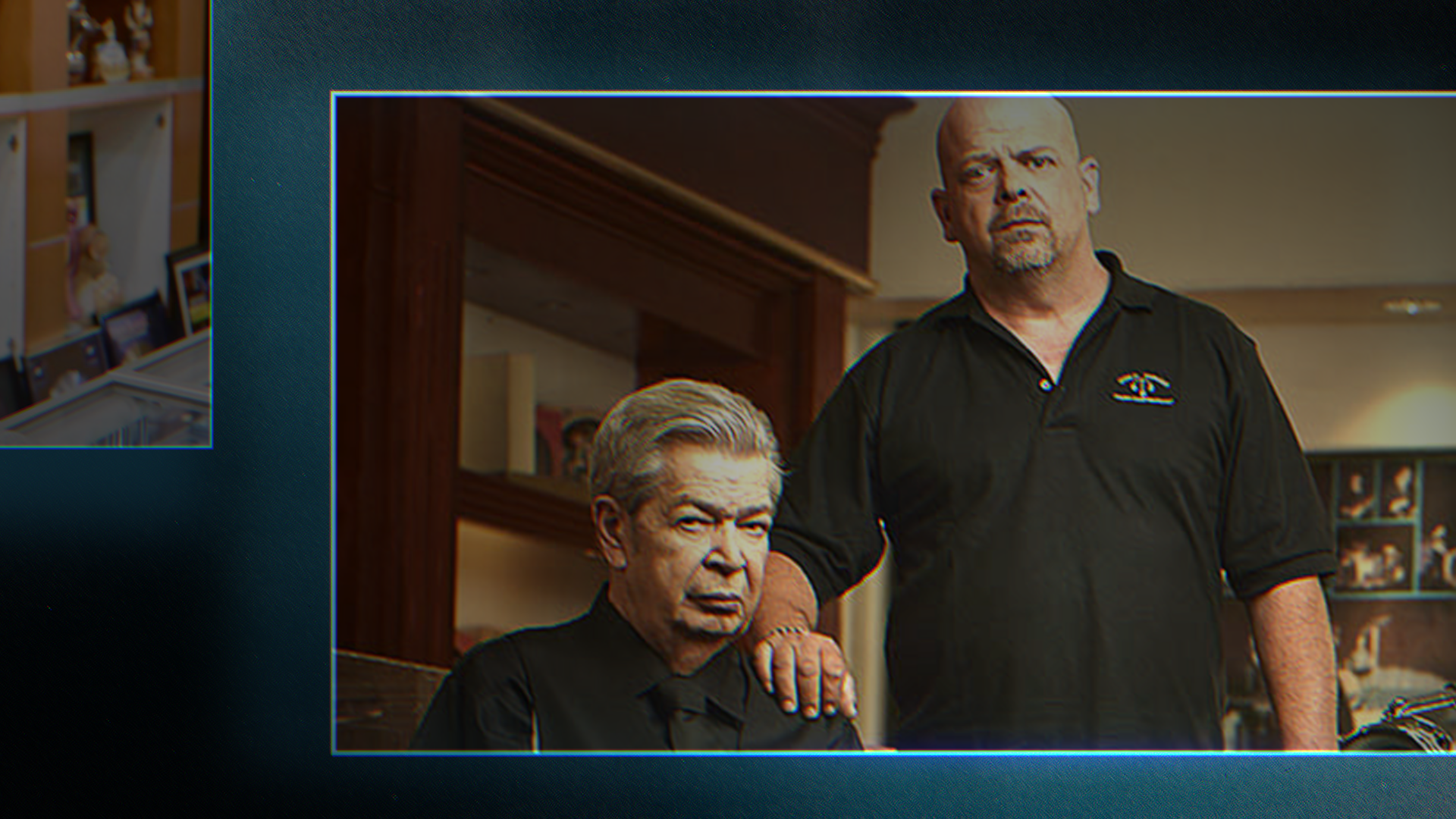
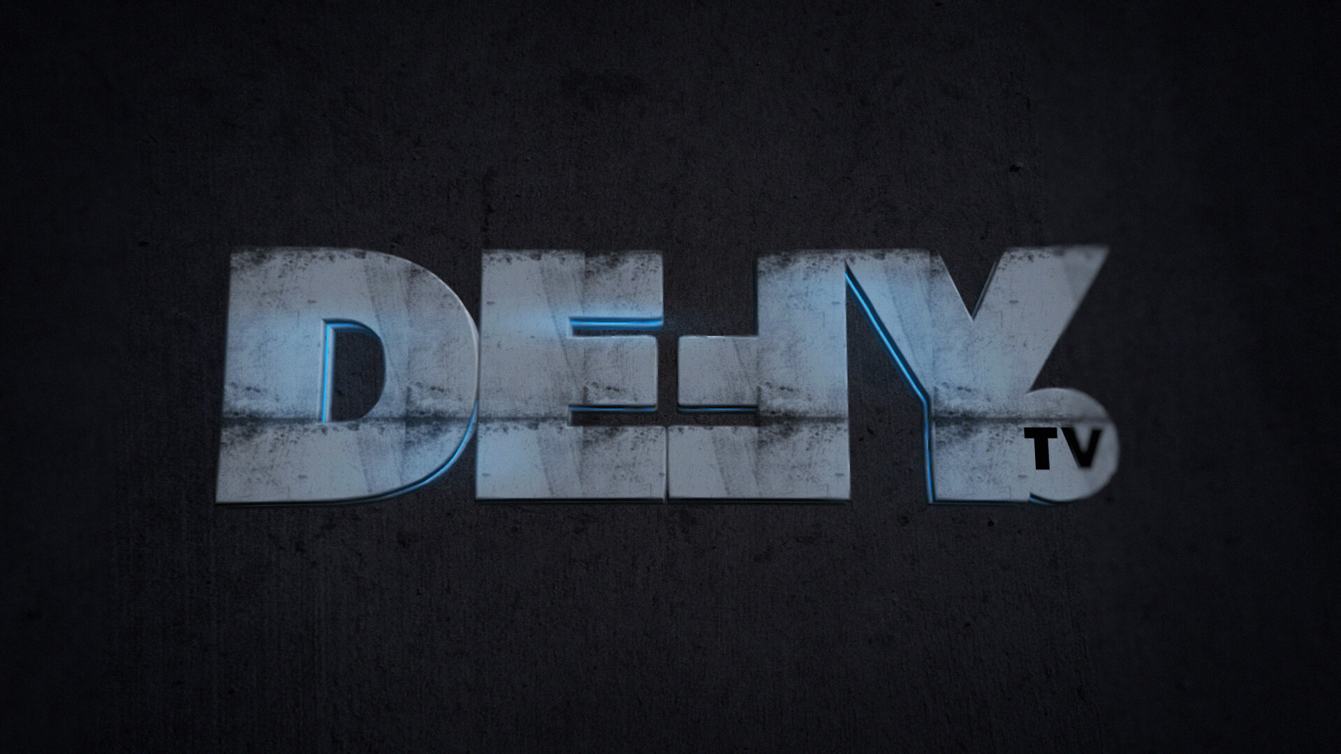
The letter shapes within the Defy logo were modified using a 60px grid in Adobe Illustrator to create an agreed thickness for each of its stems, which ensures that the logo will be pixel perfect for animation. This 60px lockup (2D & 3D letters) is seen in transitional animations only, preserving the integrity, and design of the 3D logo seen in the bug, sting and IDs. From here, we created a system of rectangular bar shapes, inspired by the E and reversed F. The 3 and 5 bar lockups are as a cursor device used to propel, introduce and direct us into various scenes.


dare to be bold
Typography, color, and the use of the 60px grid system all played a key role in molding the modern, ultra-sleek brand identity of Defy. When creating the look for the network, we wanted to envision a brand identity that was forward-thinking and versatile while still feeling grounded and approachable. Not only does Defy’s brand identity work well within network, promotional, and social deliverables, but it functions seamlessly across a diverse range of in and out-of-home marketing solutions. Using Defy’s “Dare to Be Bold” tagline as a sounding board throughout each step in our design process, we were able to create an extensive brand identity that is cohesive, adventurous, and edge-of-your-seat engaging.

toolkit time
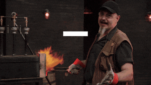
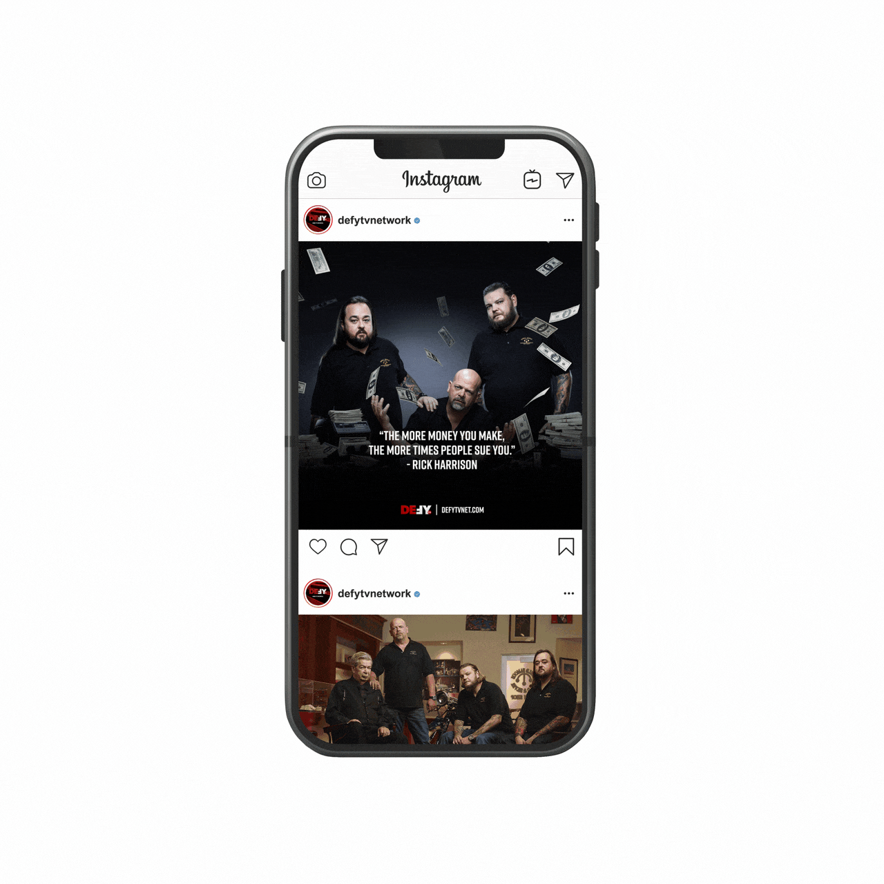
Using the Essential Graphics panel within Adobe After Effects, we created a completely custom graphics toolkit with extensive functionalities. When building out this toolkit, we needed to ensure that the designs we’d established throughout this process could be easily and elegantly translated into a variety of future use cases. We were also mindful of creating a toolkit that would be extremely user friendly, so virtually anyone could find their way around it without issue. Though this is just a snippet of what it looks like inside the toolkit, the possibilities are endless for customization of network, promotional, and social deliverables.
The process
There is a lot that goes into building a new network from the ground up, so we wanted to take you through a little bit of our visual and conceptual process. We like to showcase some of these behind the scenes moments in order to paint a larger picture of the decisions and thought processes that drove us. Below, we will take a look at some of our initial phases of typography, color, and art direction.
art direction
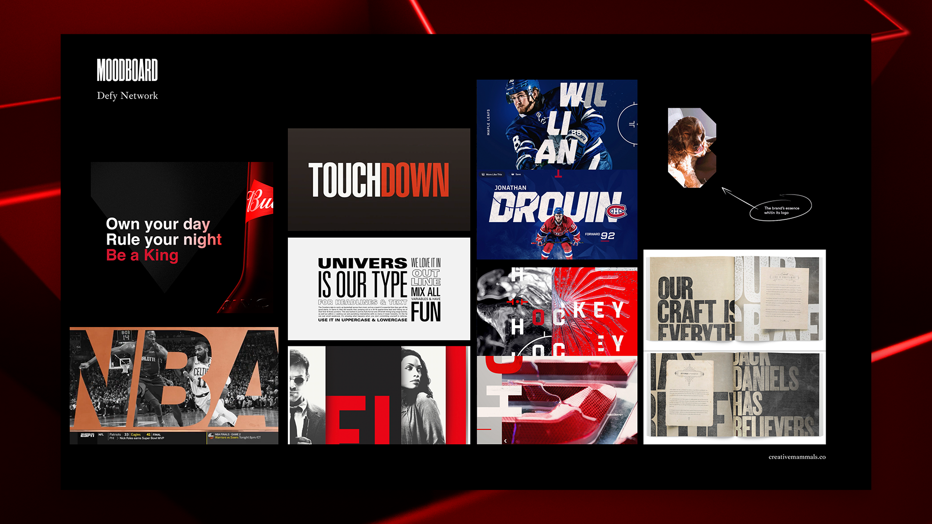
When we began concepting for this look, we wanted to explore how masculinity would play a role in different aspects of the design — from typography, to texture to motion — as shown here by one of our initial moodboards. Although some of our first looks revolved around the initial Defy logo and brand colors, which were blue and teal, we also explored how color could be used to set the mood of the brand. We went through several rounds of concepting, type treatments, and visual exploration before landing on a style that fully embodies Defy’s mantra: Dare to Be Bold.
COLOR
The color palette we established for Defy only has 3 main colors, 1 of which we used as the hero color and a supplementary gradient. Once translated into the 3D designs, however, these colors take on an immense range of variation thanks to the dramatic lighting and shading of each 3D environment. Before we landed on these particular colors and decided how lighting and shading would be used to create more depth, we went through an extensive color exploration phase to determine which colors would adequately express the energy and confidence that we were looking to convey in our designs.


STYLEFRAMES
Once we’d established the typeface choices and colors for the network, we doubled down on defining the visual identity of the brand. During this process, we explored the use of the grid system and the logo’s 3D letterforms to reinforce the content onscreen and direct the viewer’s attention to important information. Both of these ideas were carried through to the final look after some modification, but it was only after going through this styleframe process that we could explore what truly fit into our vision for the network’s brand identity.