The Ask
In Season 3 of Going Through It, Jenny Yang sits down with 15 incredible guests to chat about the lessons they’ve learned from an elder. In advance of this new season’s release, Mailchimp and Hone Production brought on Creative Mammals to refresh and reimagine the podcast’s brand identity. Additionally, we would need to produce all web assets, social content, and copywriting.


The Challenge
Going Through It is a podcast with significant star power, so we needed to highlight these exciting guests as a way to pull listeners. At the same time, the guests’ messaging needed to feel relatable and target the show’s core audience: young women, particularly entrepreneurs and small business owners, who are curious, audacious, and focused.
Since podcasts are an inherently auditory medium, we would have to strategically translate keywords, phrases, and quotes in a visually interesting way. Part of this process would involve pulling out themes from each episode which we would use to create our social concepts.
The Result
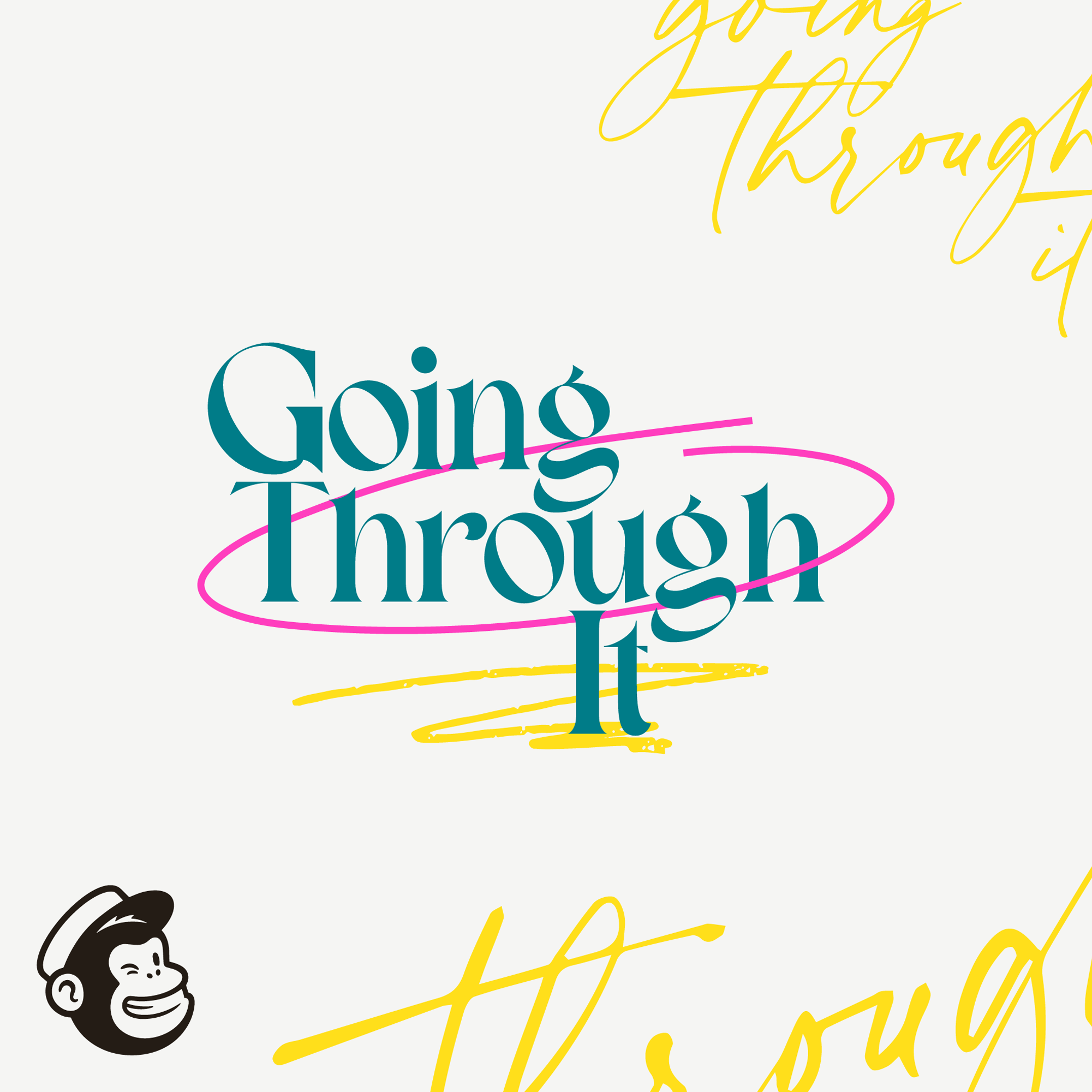
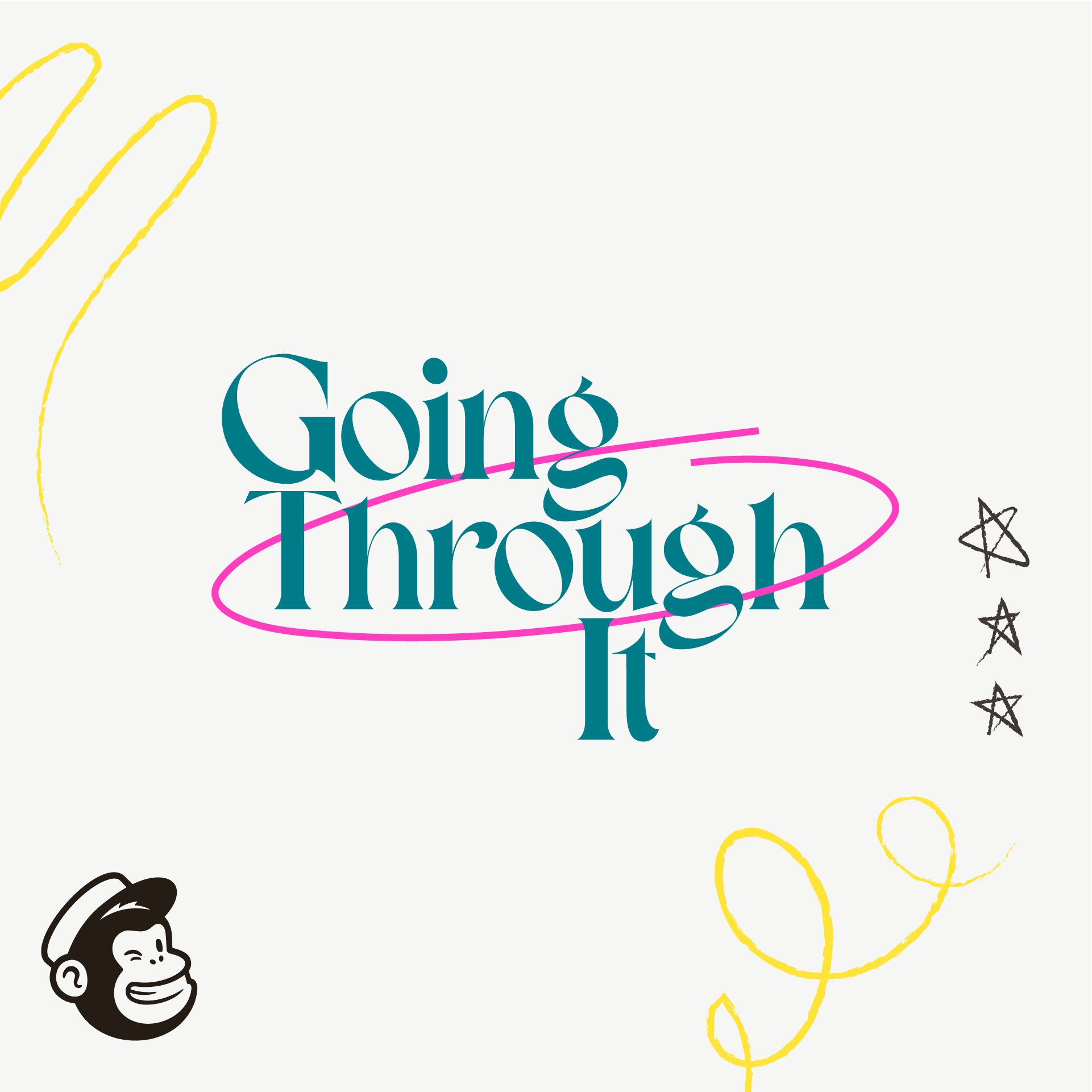
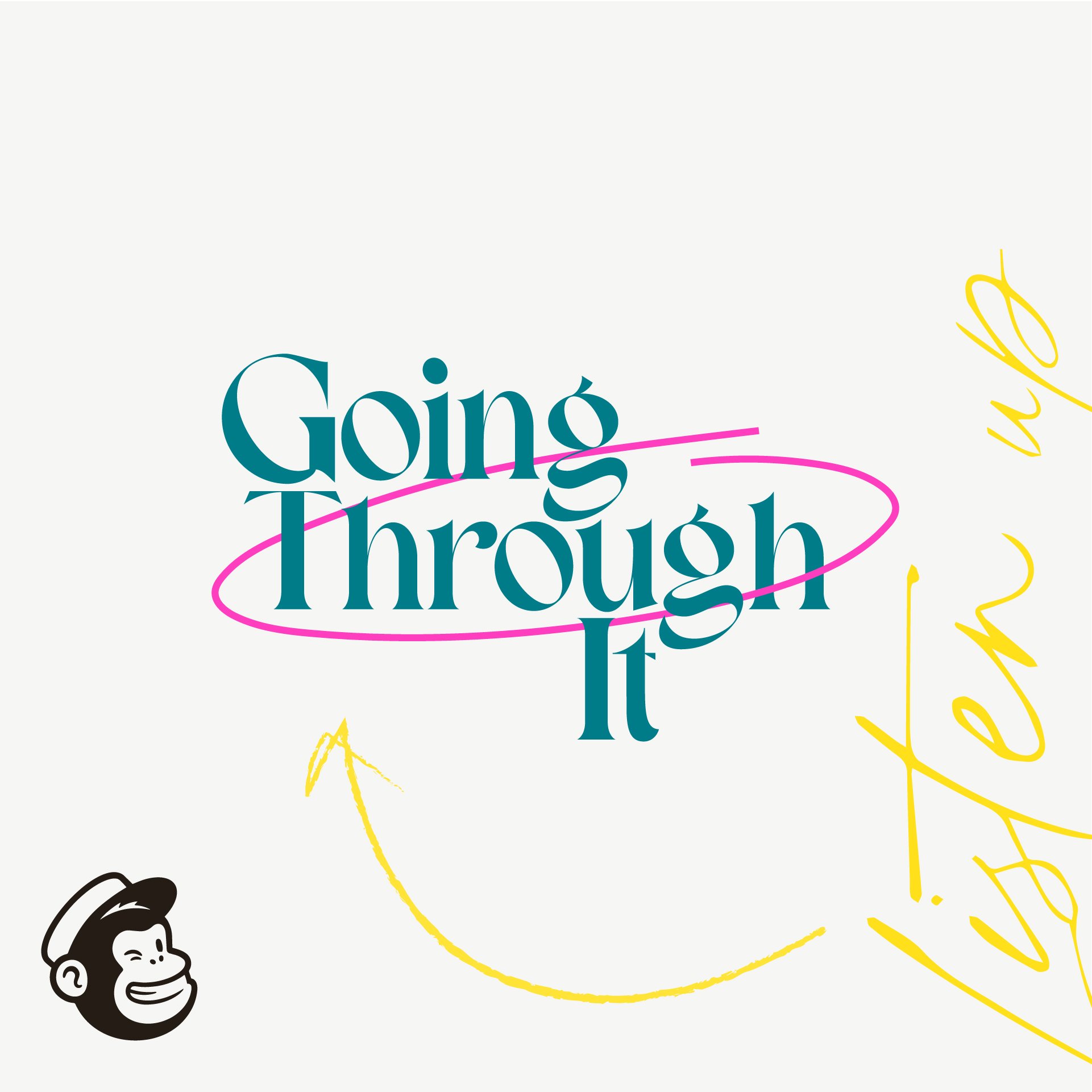
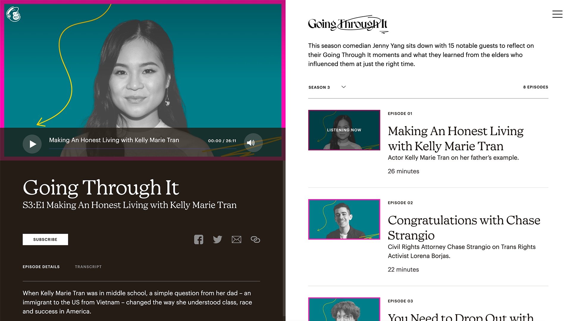
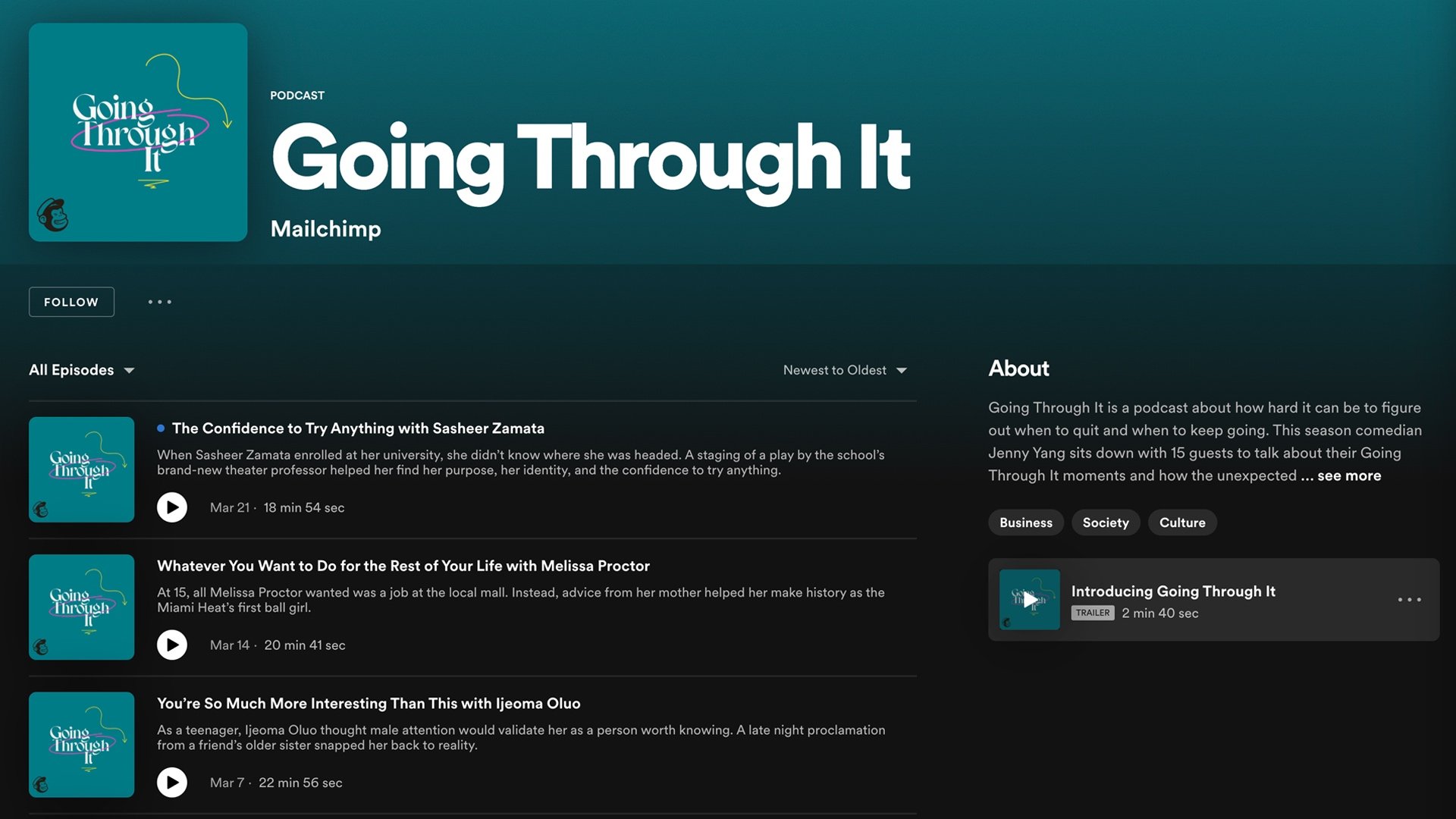
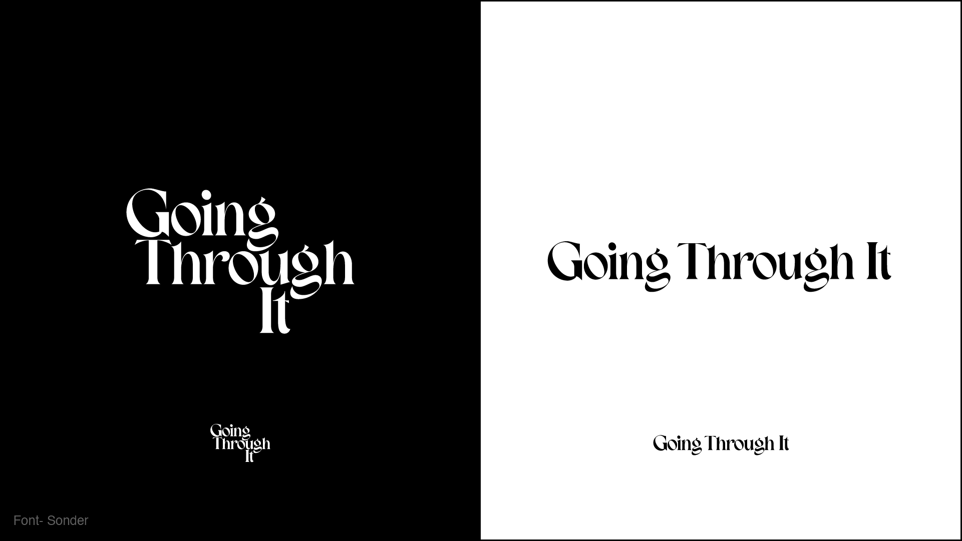
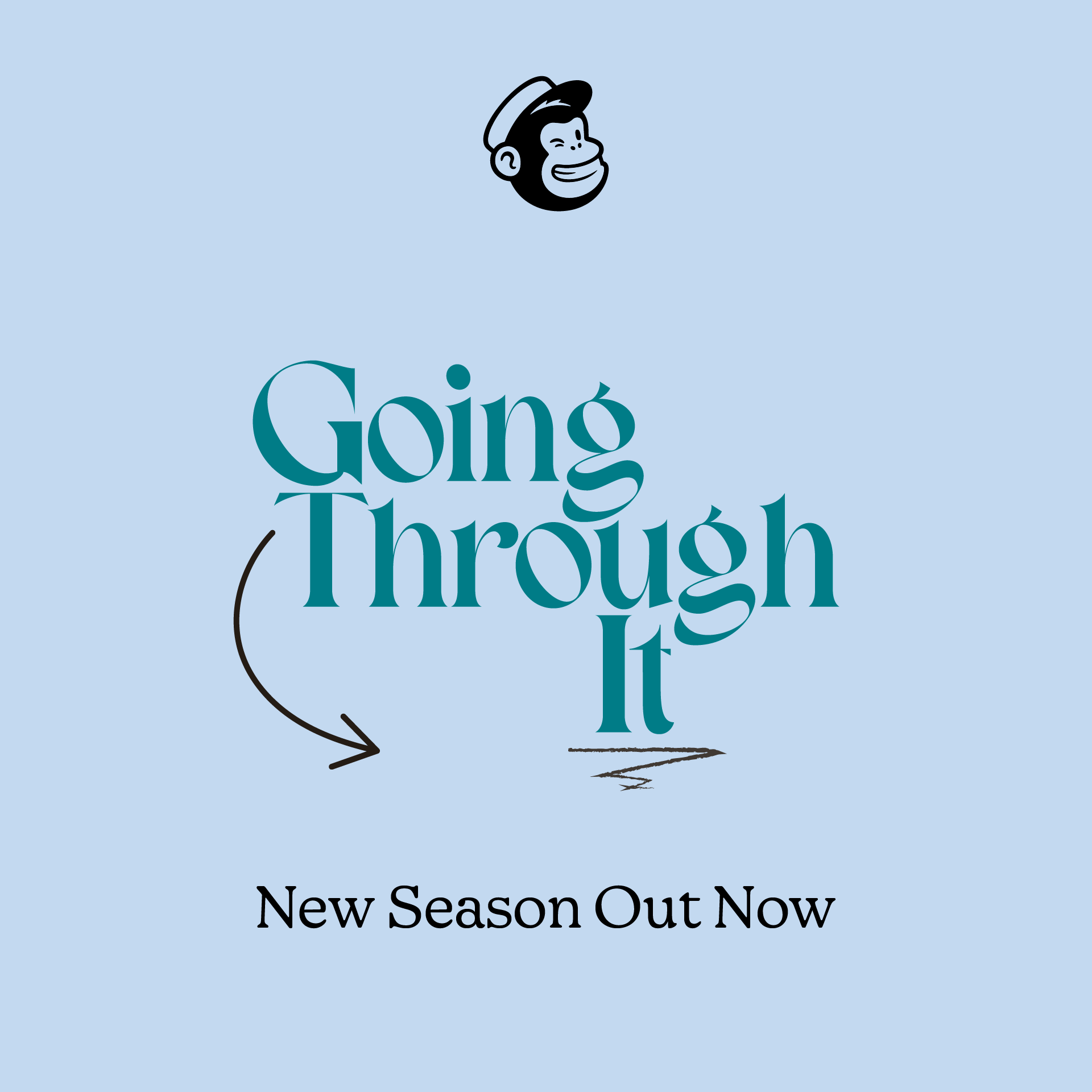
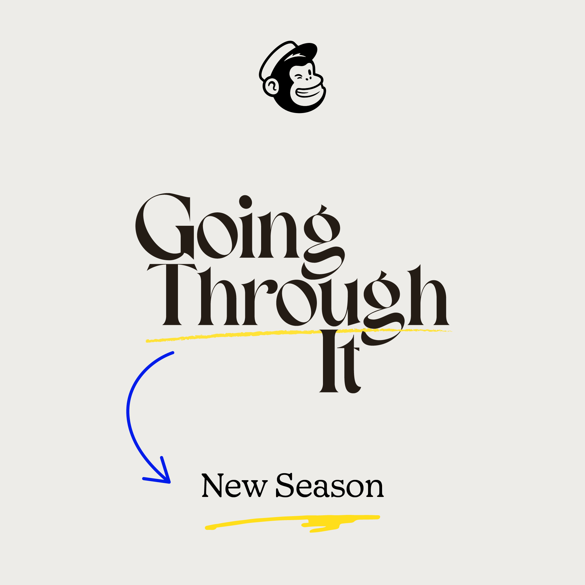
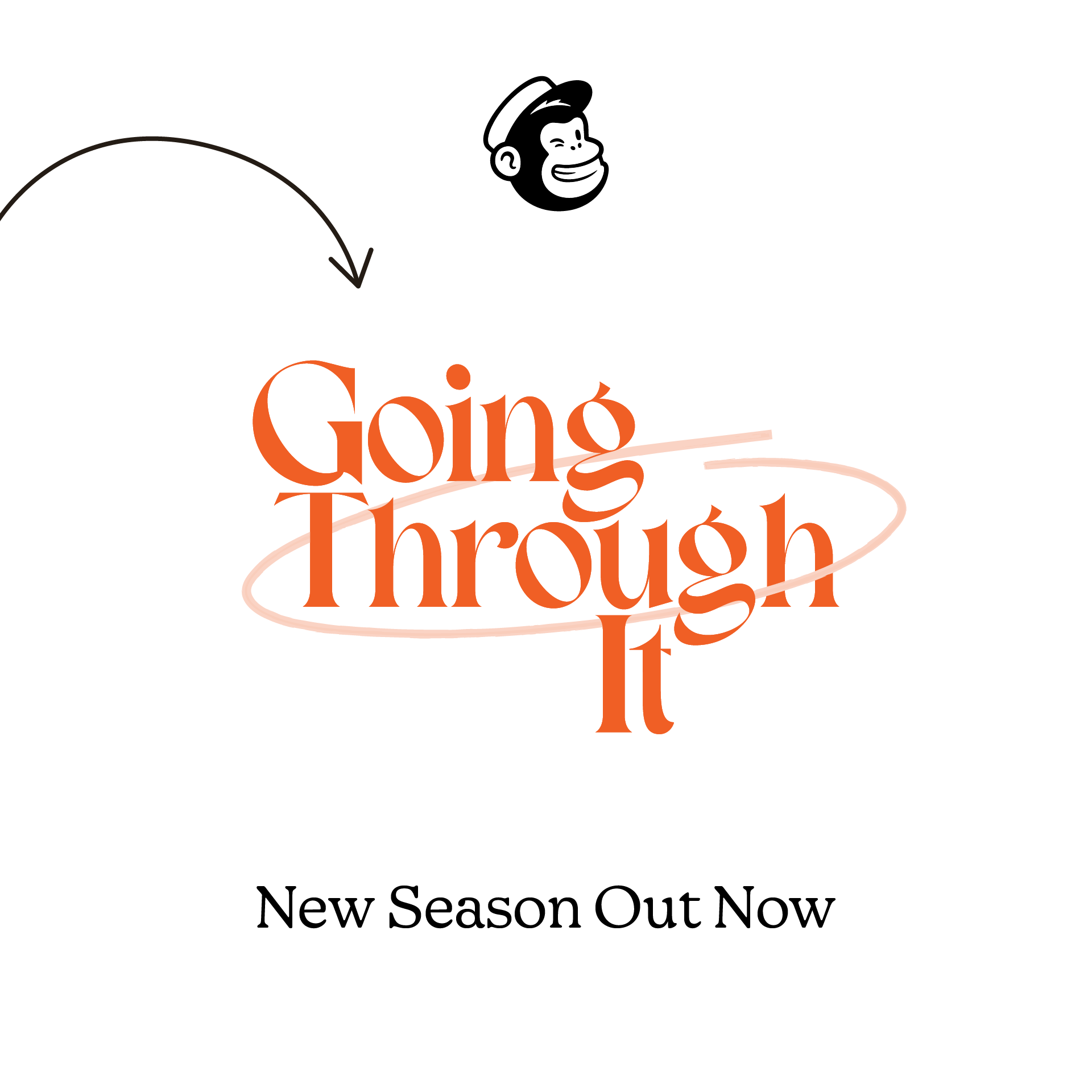
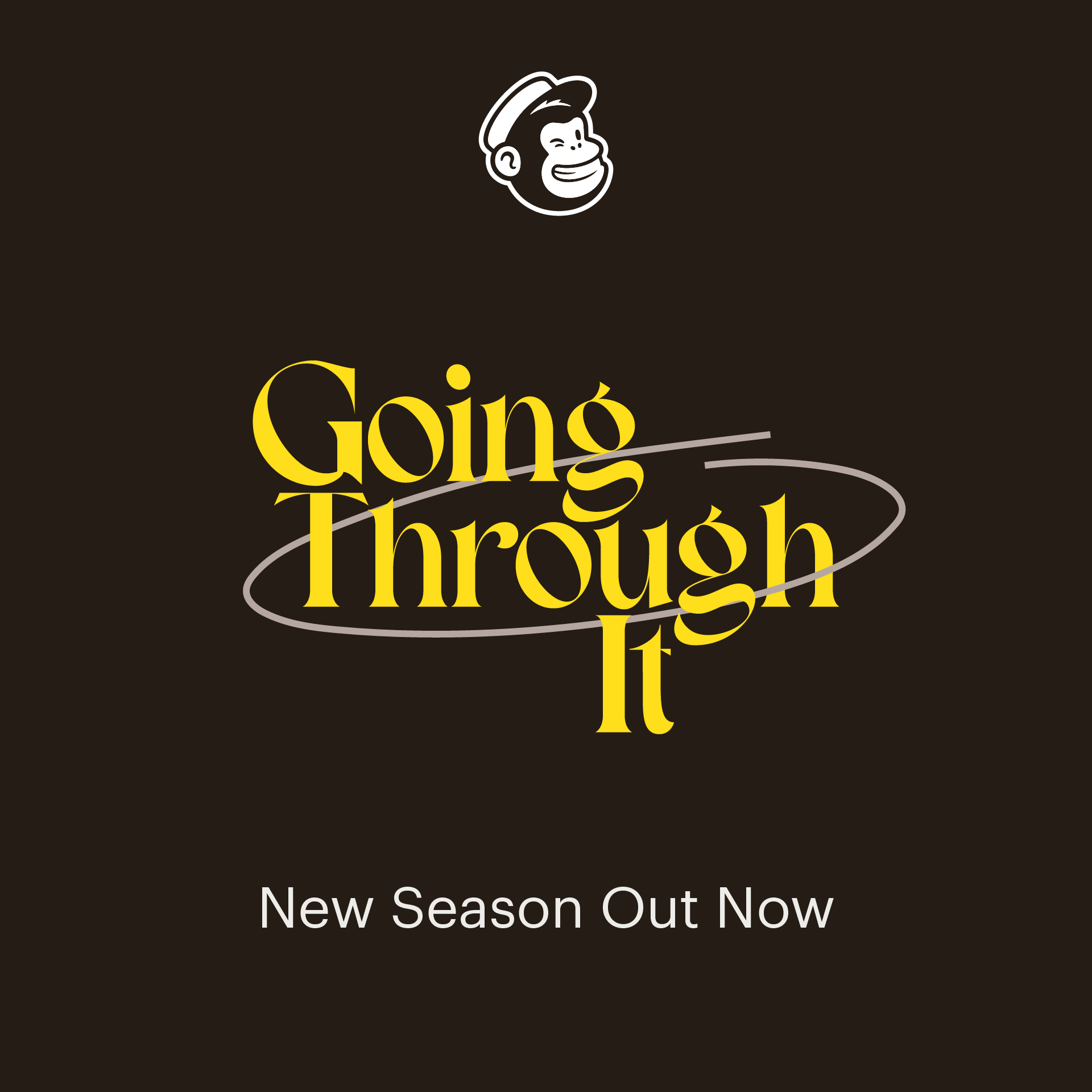
A stylish and trendy logo with hand-drawn accents is the basis for our inviting, empathetic approach to a podcast with heavy thematic material. The various hand-drawn elements we chose to incorporate throughout the branding represent a work-in-progress attitude, constant reimagining, and notes to self, which are core themes throughout the show. By combining a funky serif typeface with these organic shapes to create the show’s key art, we were able to hone in on the guests' imperfections, vulnerability, progress, and personal experiences.
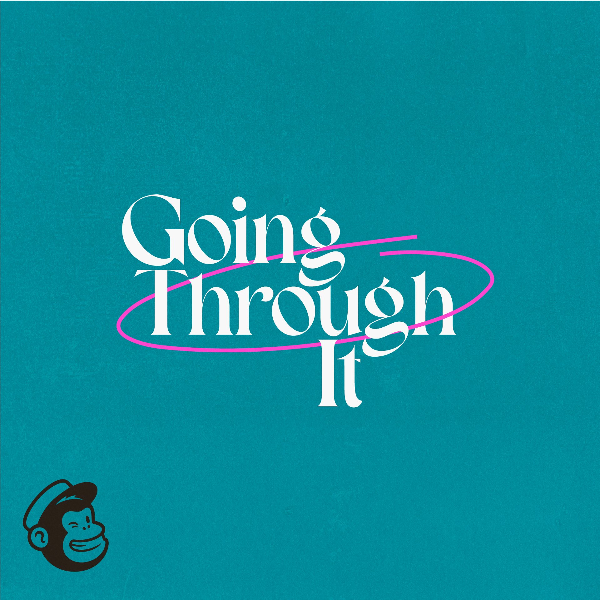
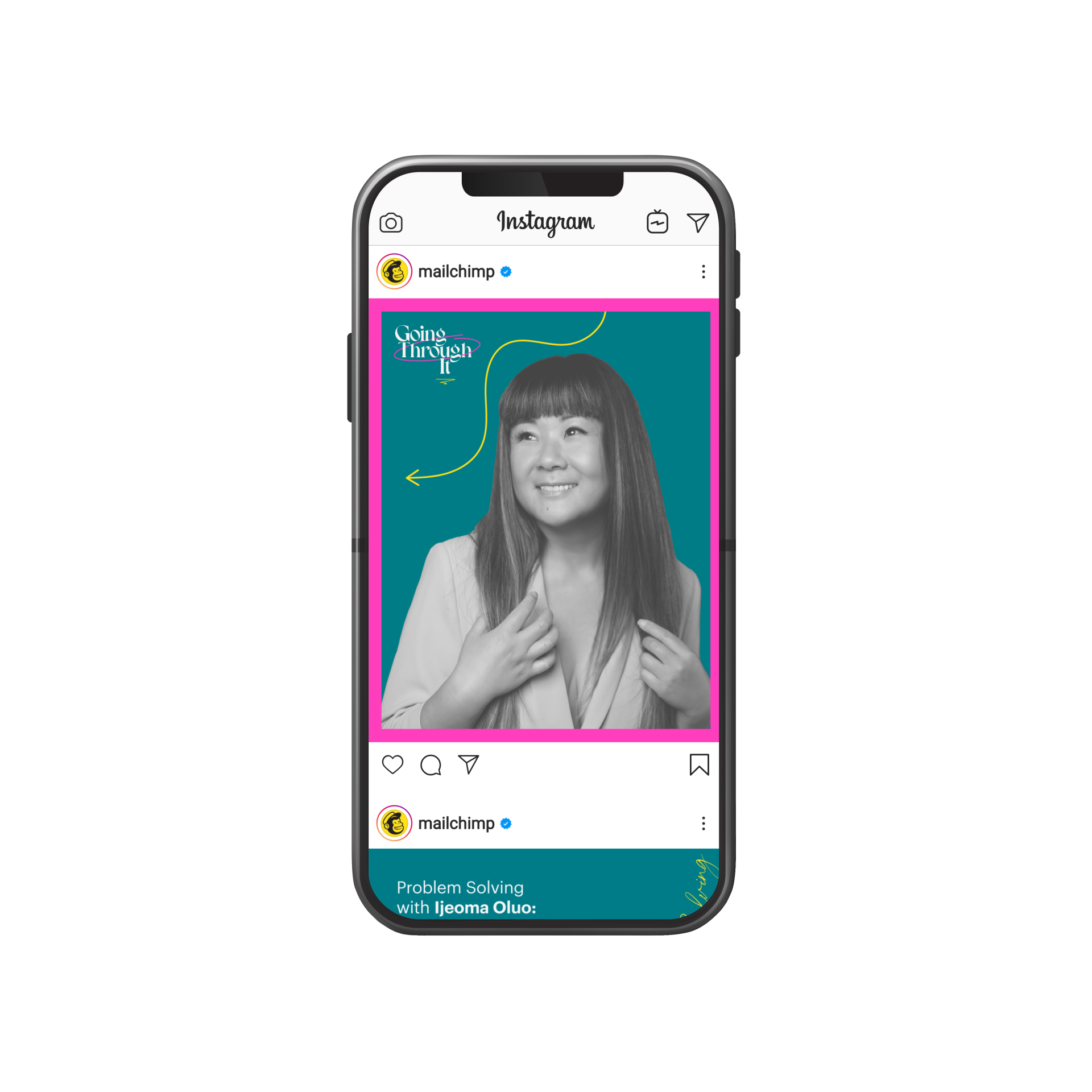
Though the logo uses a new, modern typeface, the remainder of the brand identity creates a fresh take on existing Mailchimp typefaces and colors. As a product of this refreshed brand identity, we also designed several guest-centric and type-friendly animated motion graphics to use as social assets for listeners to share and comment on with each week’s episode.

The Solution

the process
Since Going Through It has already been around for two seasons, we wanted to approach this brand refresh from a place that would feel relatable to existing listeners. In the following sections, we’ll take you through our visual and conceptual processes to paint a larger picture of the creative decisions that drove us to the final product. Here you’ll get a peek into some of our initial phases of art direction, logo exploration, color, key art, and social content.

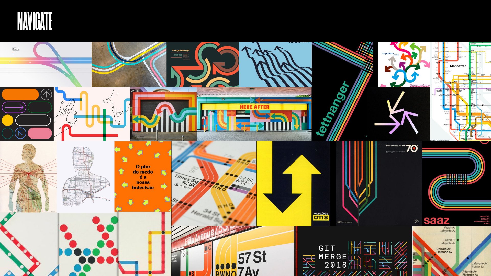
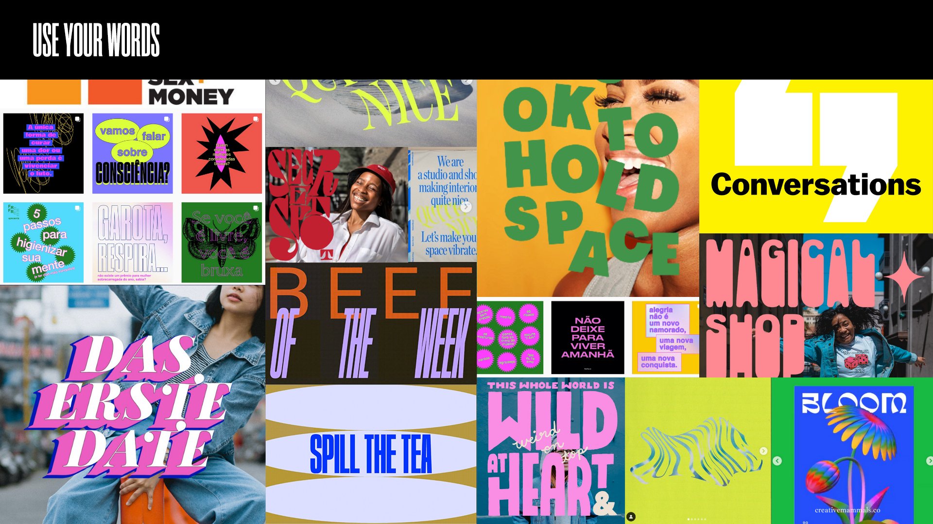
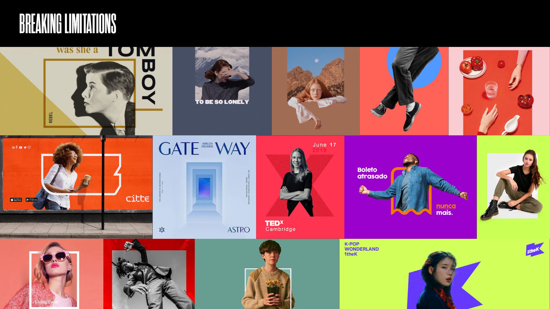
art direction
As we explored different stylistic approaches for the brand, certain looks were starting to develop alongside themes we had picked from the podcast episodes. We paired these ideas down into four directions: Navigate, Use Your Words, Breaking Limitations, and Taking Notes. Our chosen look, seen here on the left, was Taking Notes, which encapsulates the sentiments of learning and growing featured throughout the show.
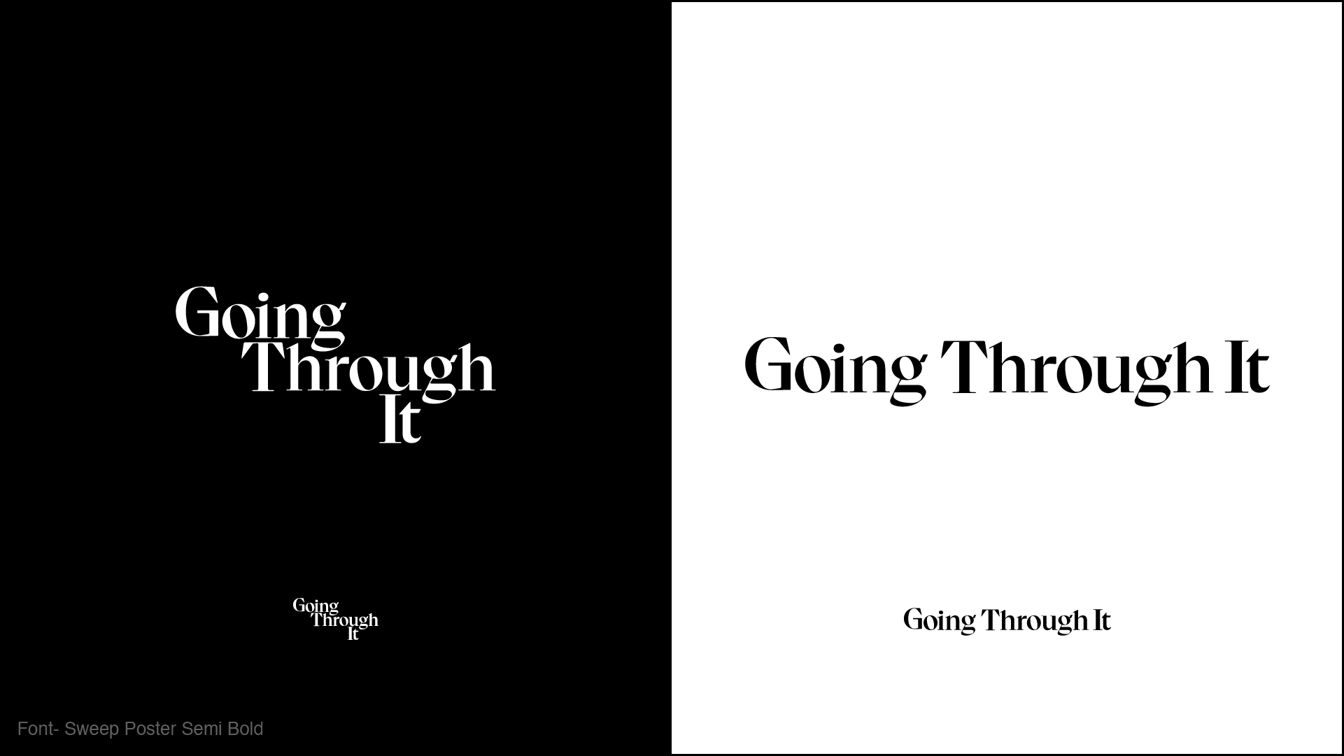
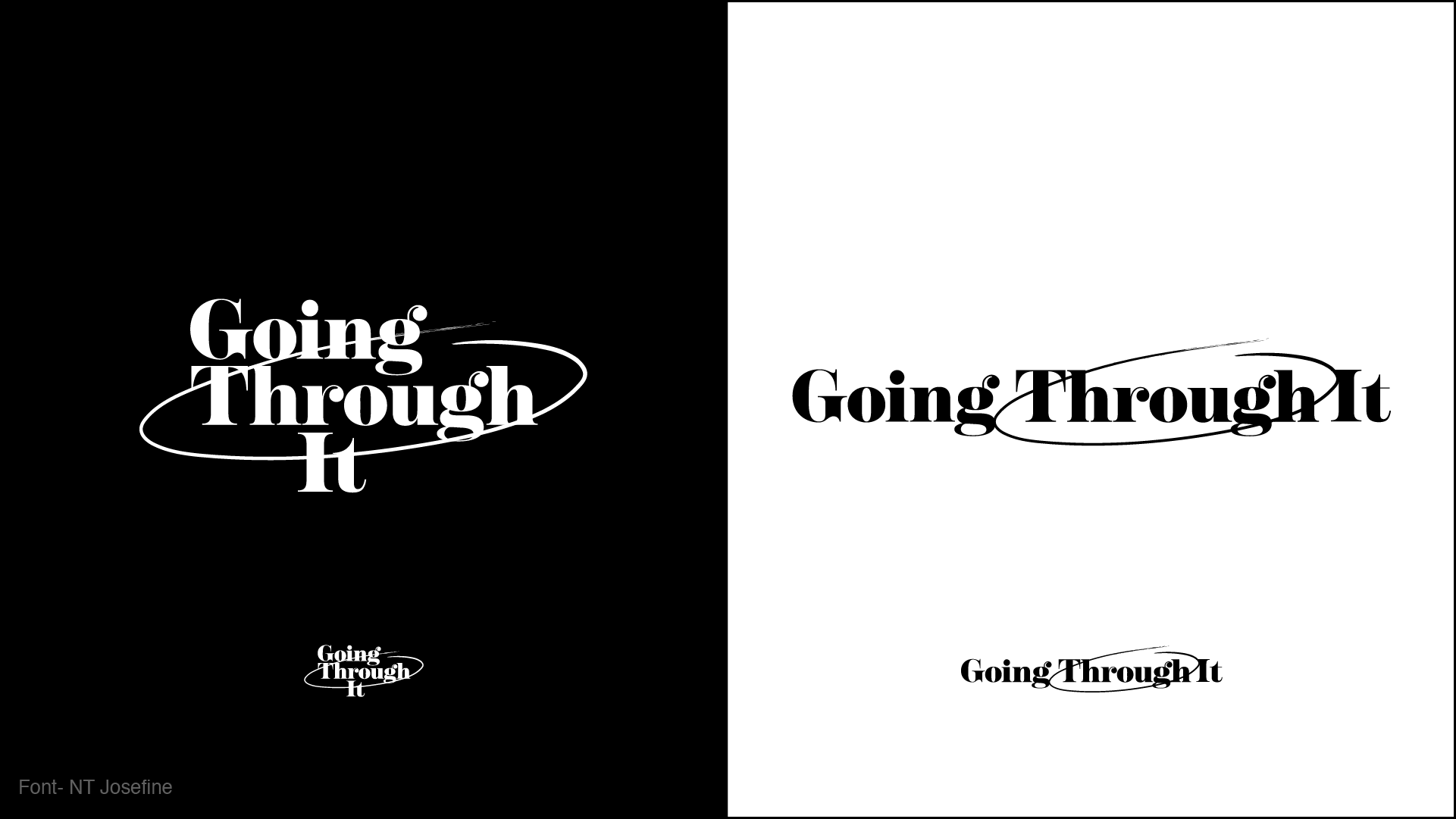
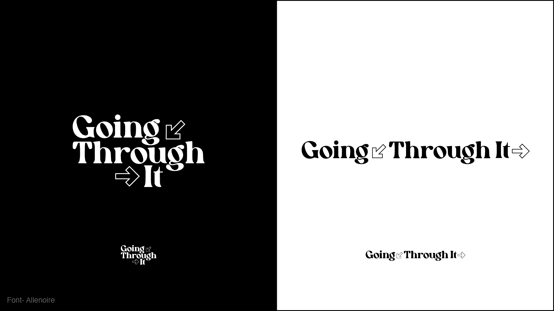
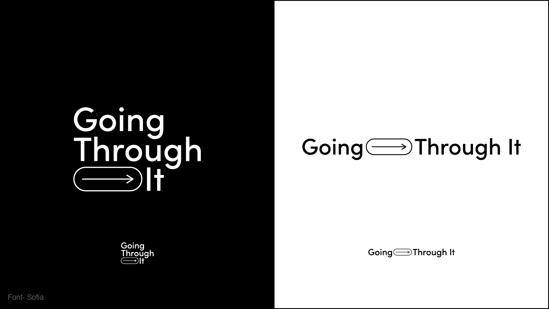
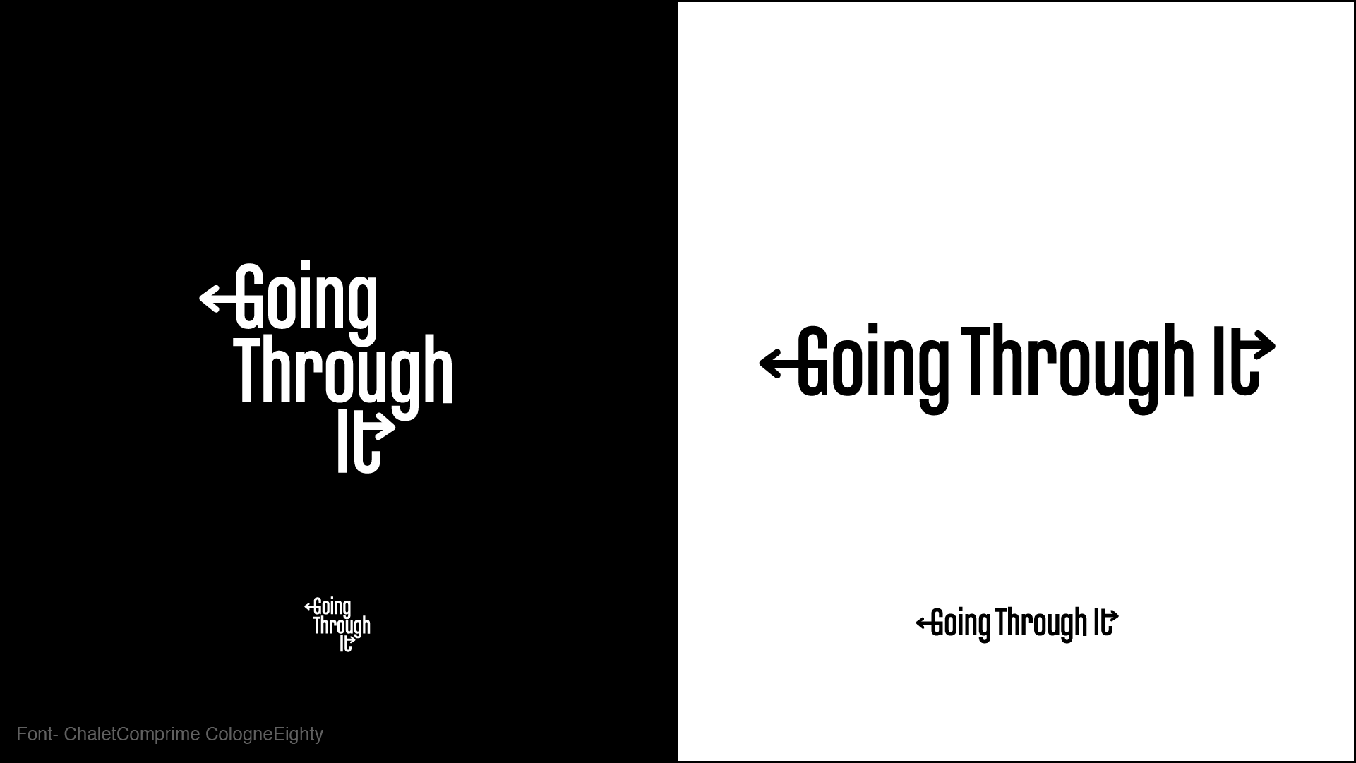
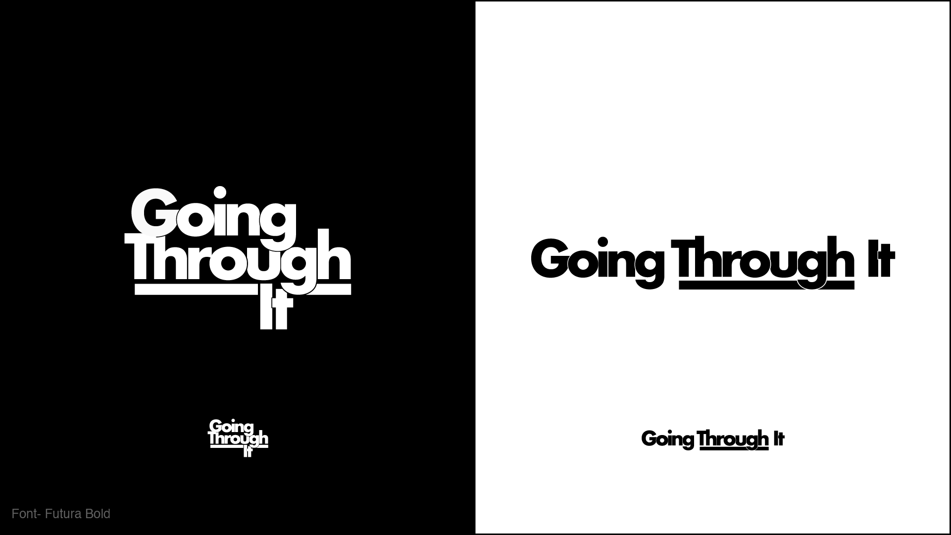
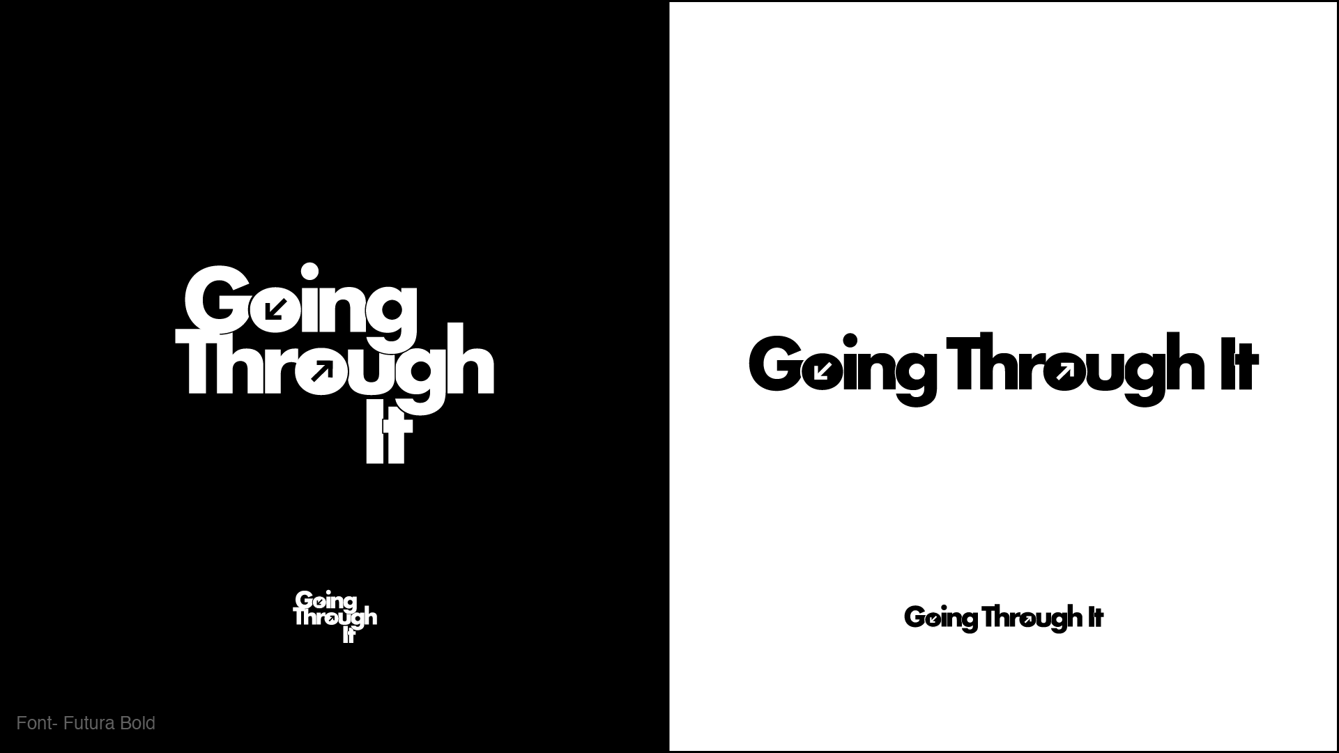
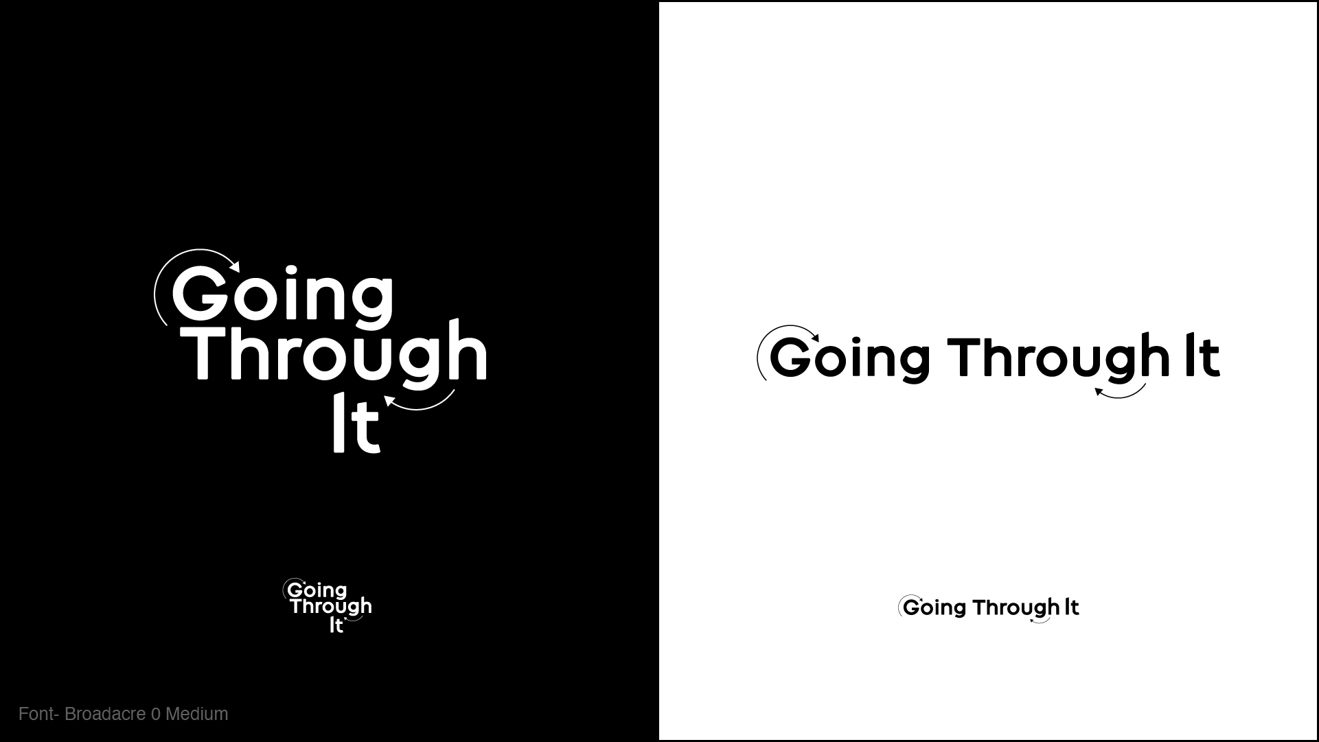
logo design
We began by pulling inspiration for the logo’s typeface, which we wanted to have personality and reflect the diversity and clout of the featured guests. As you can see here, we also explored the role of shapes and iconography within the logo system to aid contextual understanding.

SOCIAL content
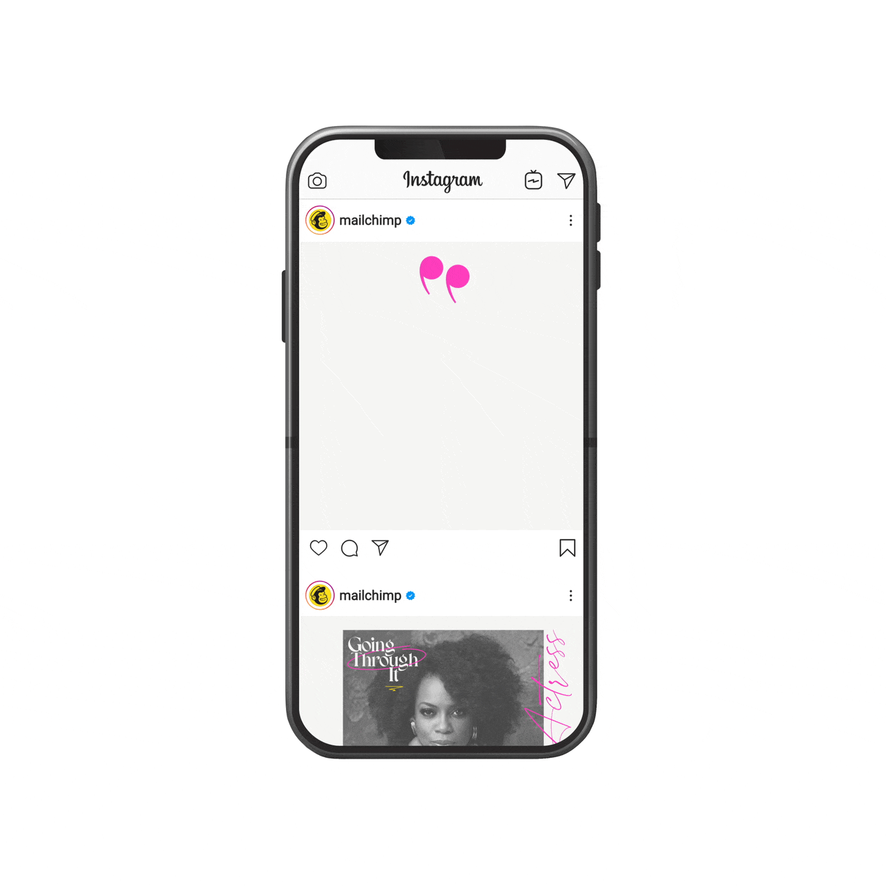
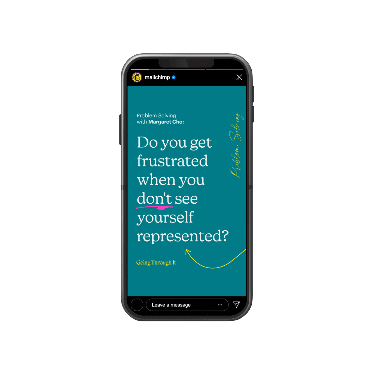
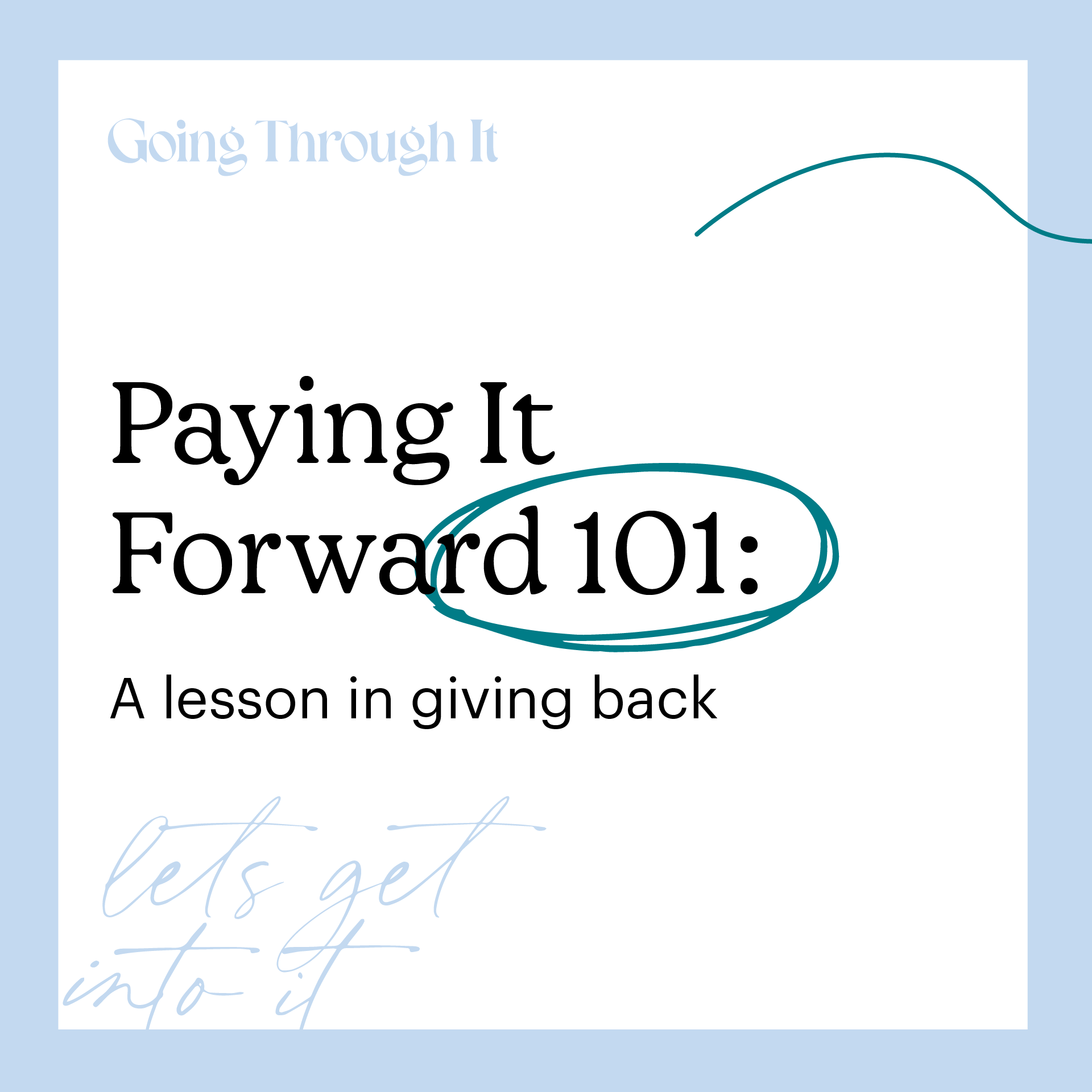
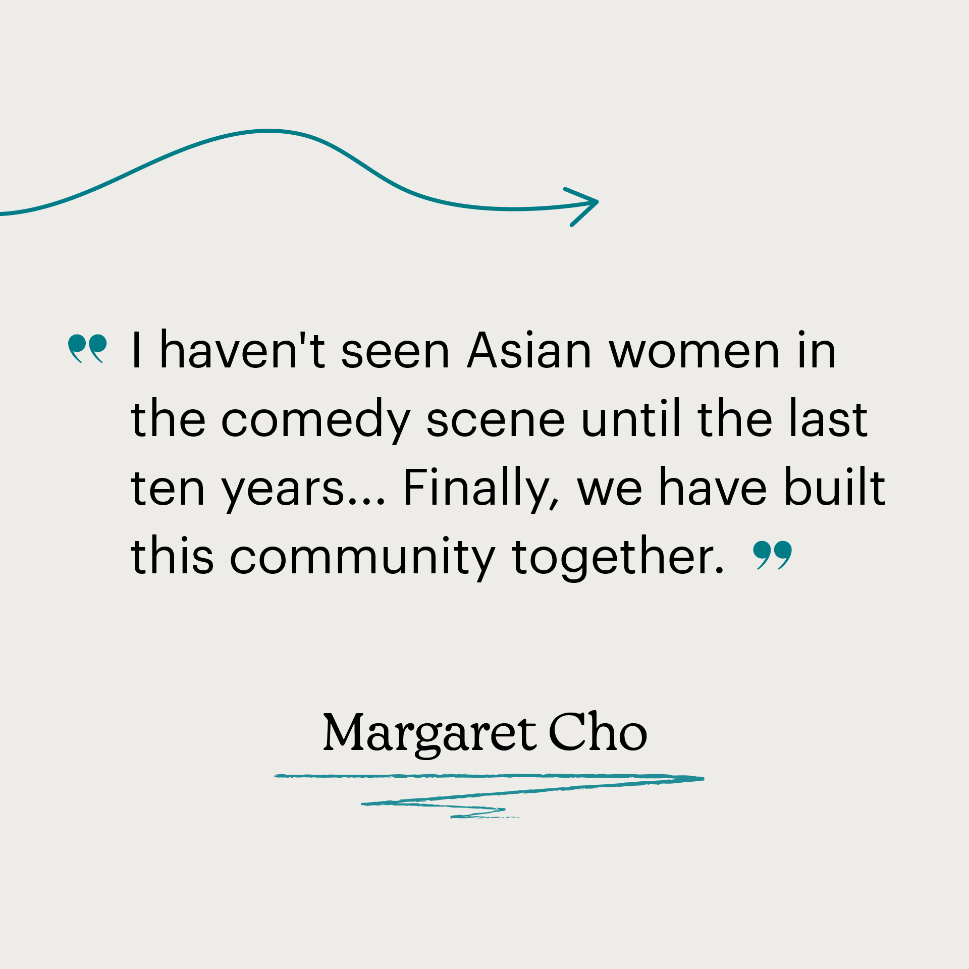
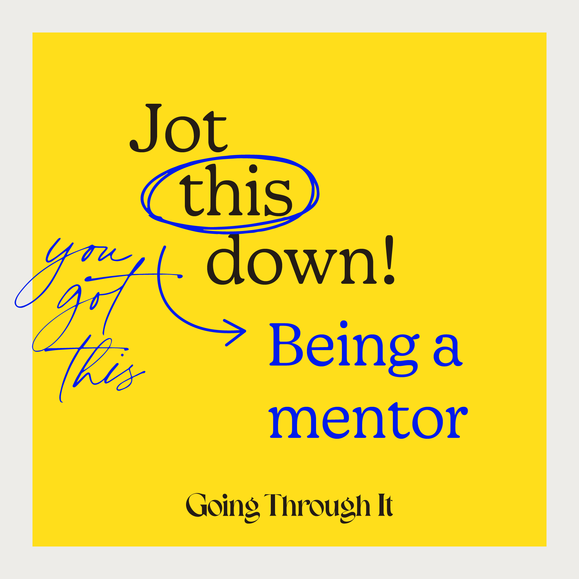
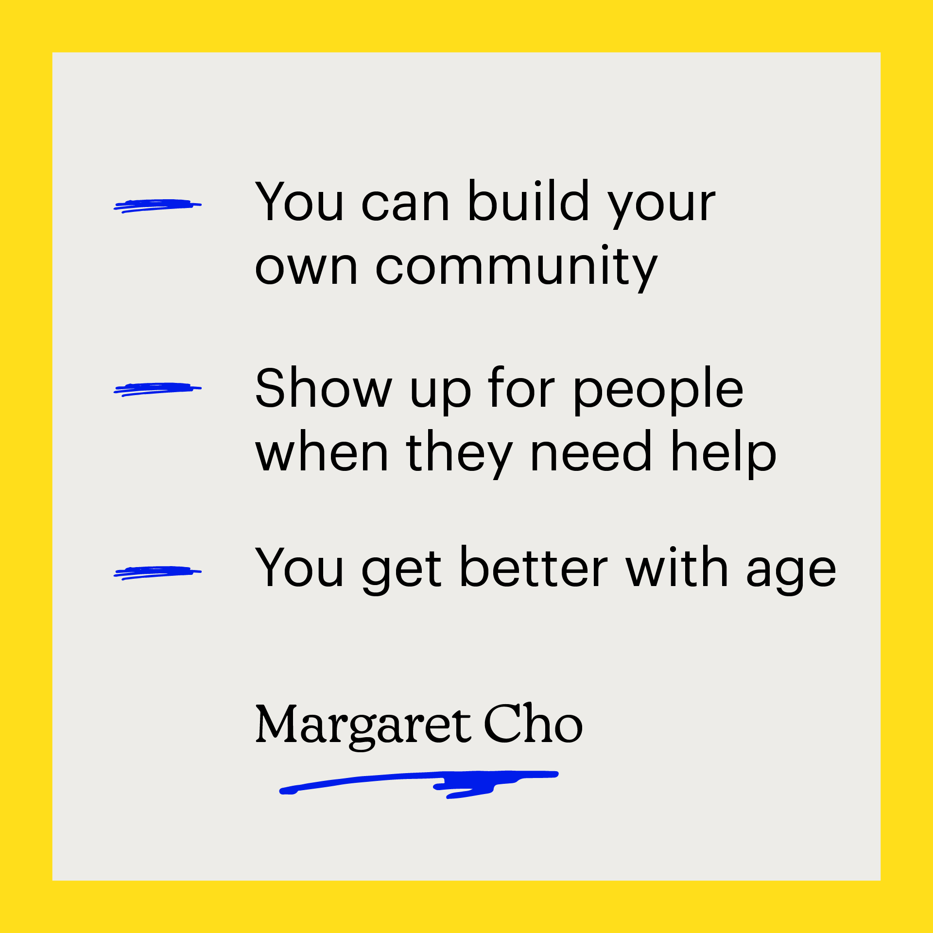
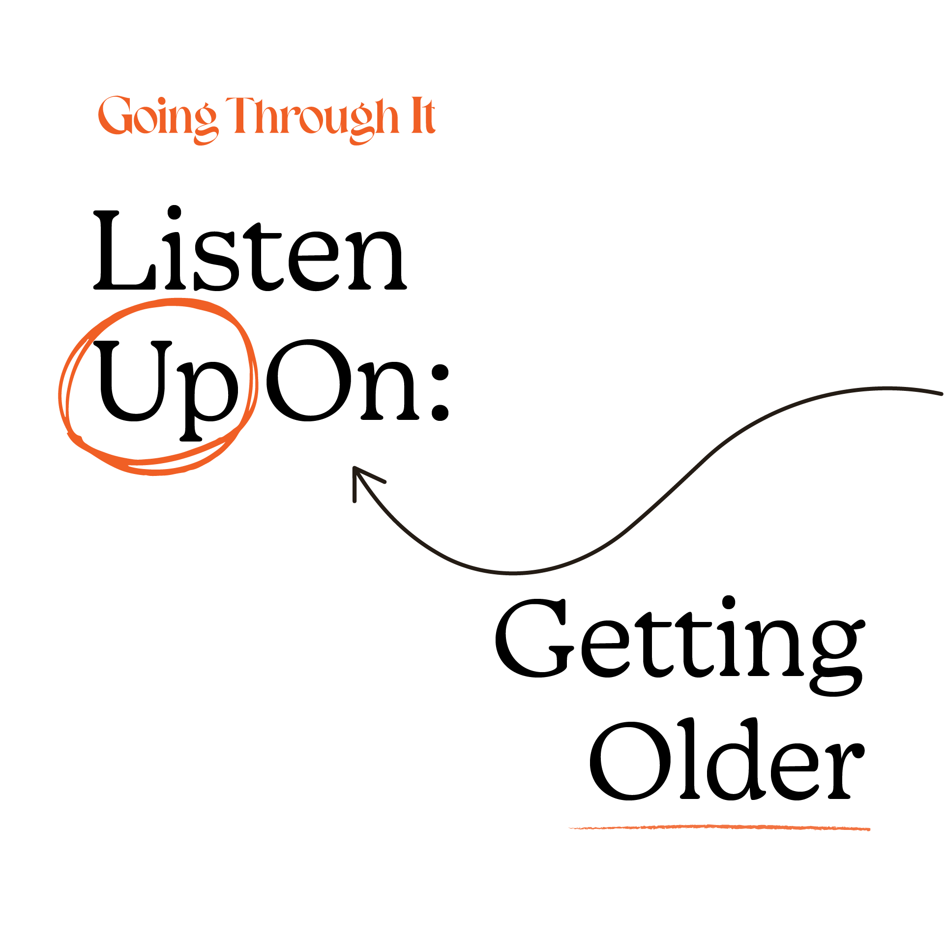
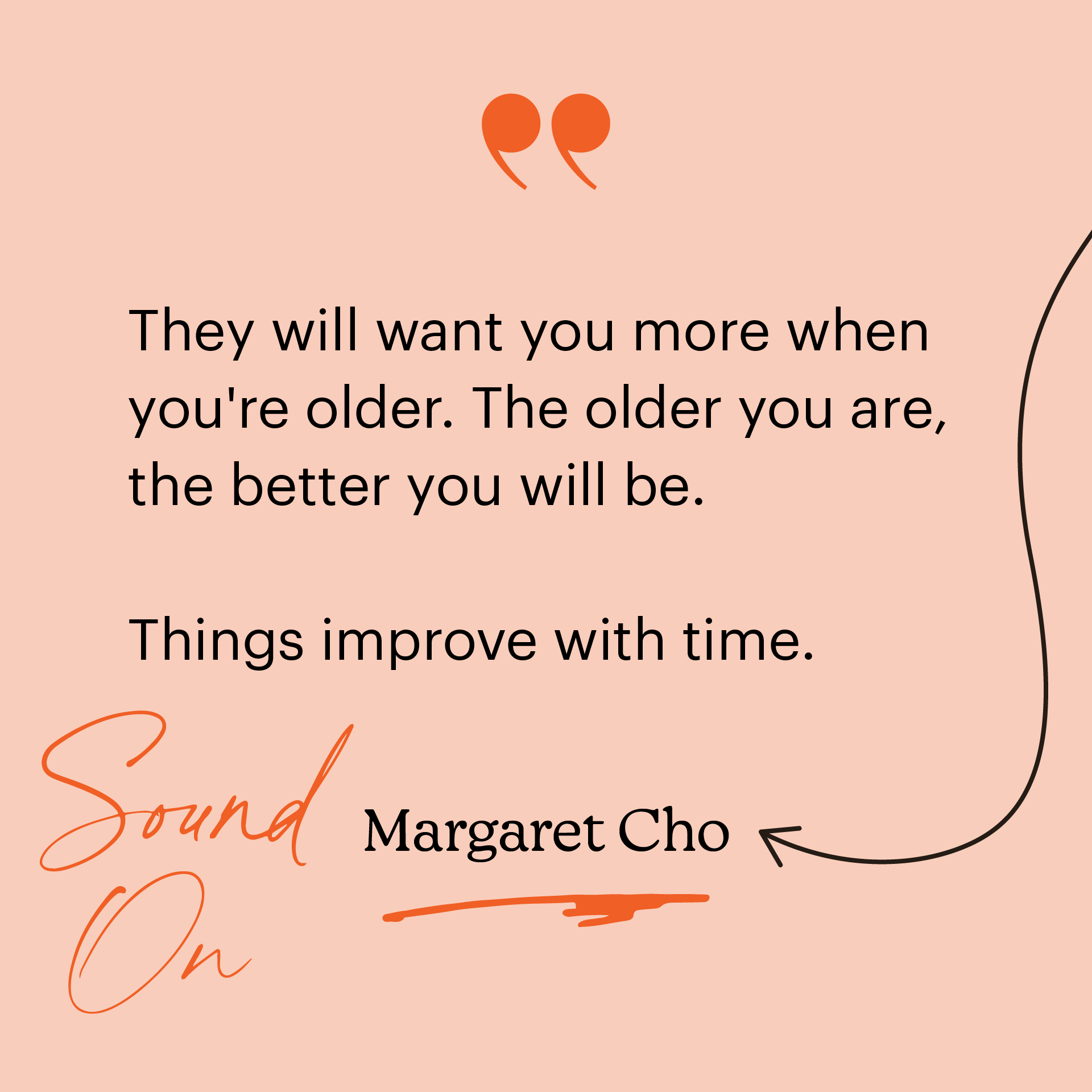
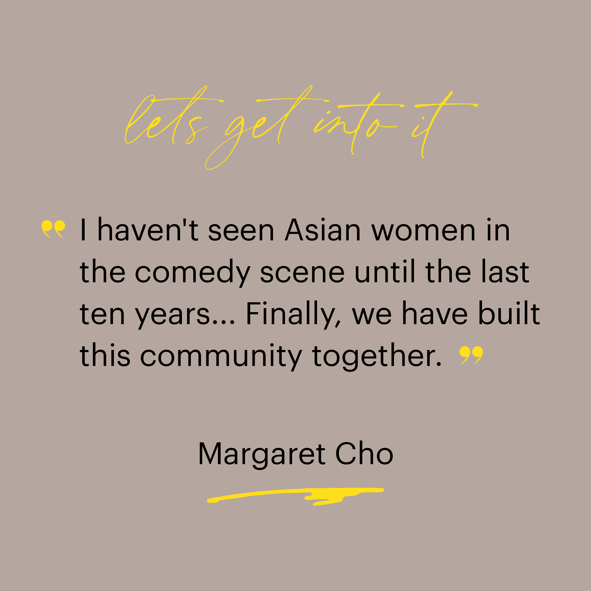
Social posts are meant to be bite-sized and shareable, but we also wanted to use social media to create a deeper connection and engagement with the audience. Below you’ll find some of the larger concepts that we transformed into social posts, such as a “101” intro-course-themed series, a series focused on jotting down advice, and two quote-based series featuring words of wisdom. Using bulleted lists and quotes, we were able to reduce the show’s content into approachable, compelling designs.

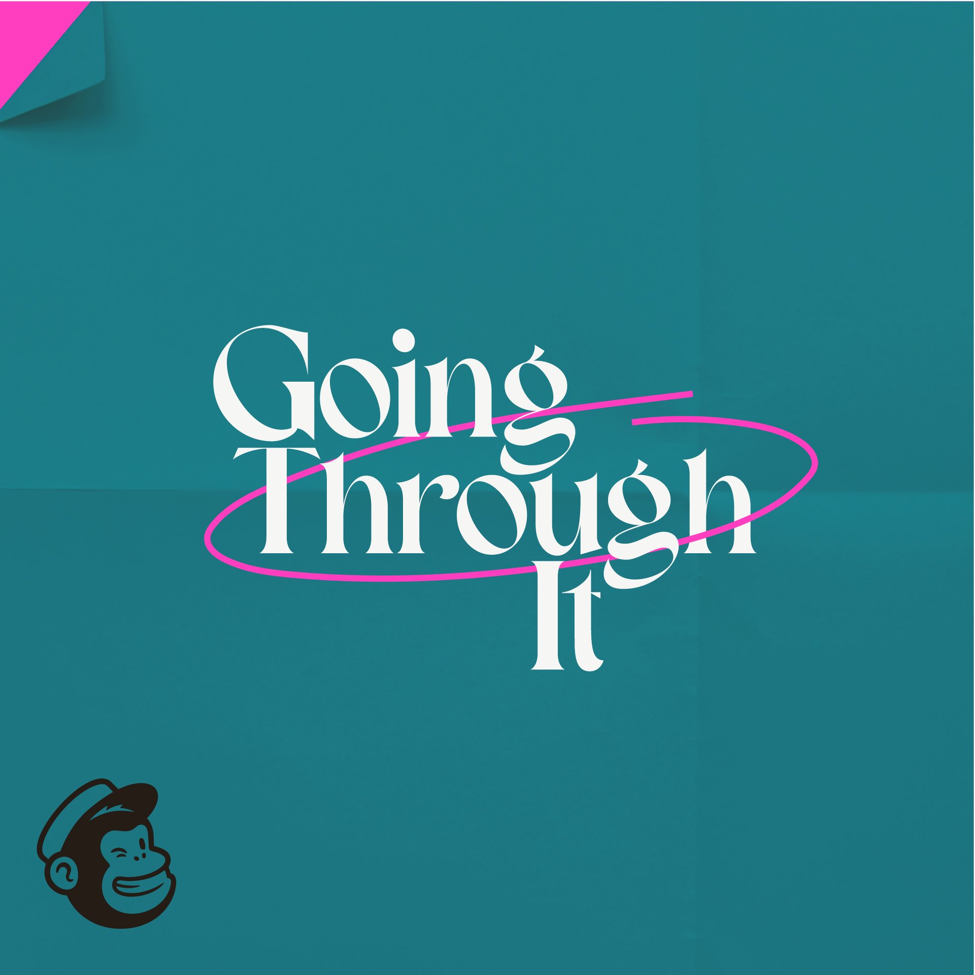
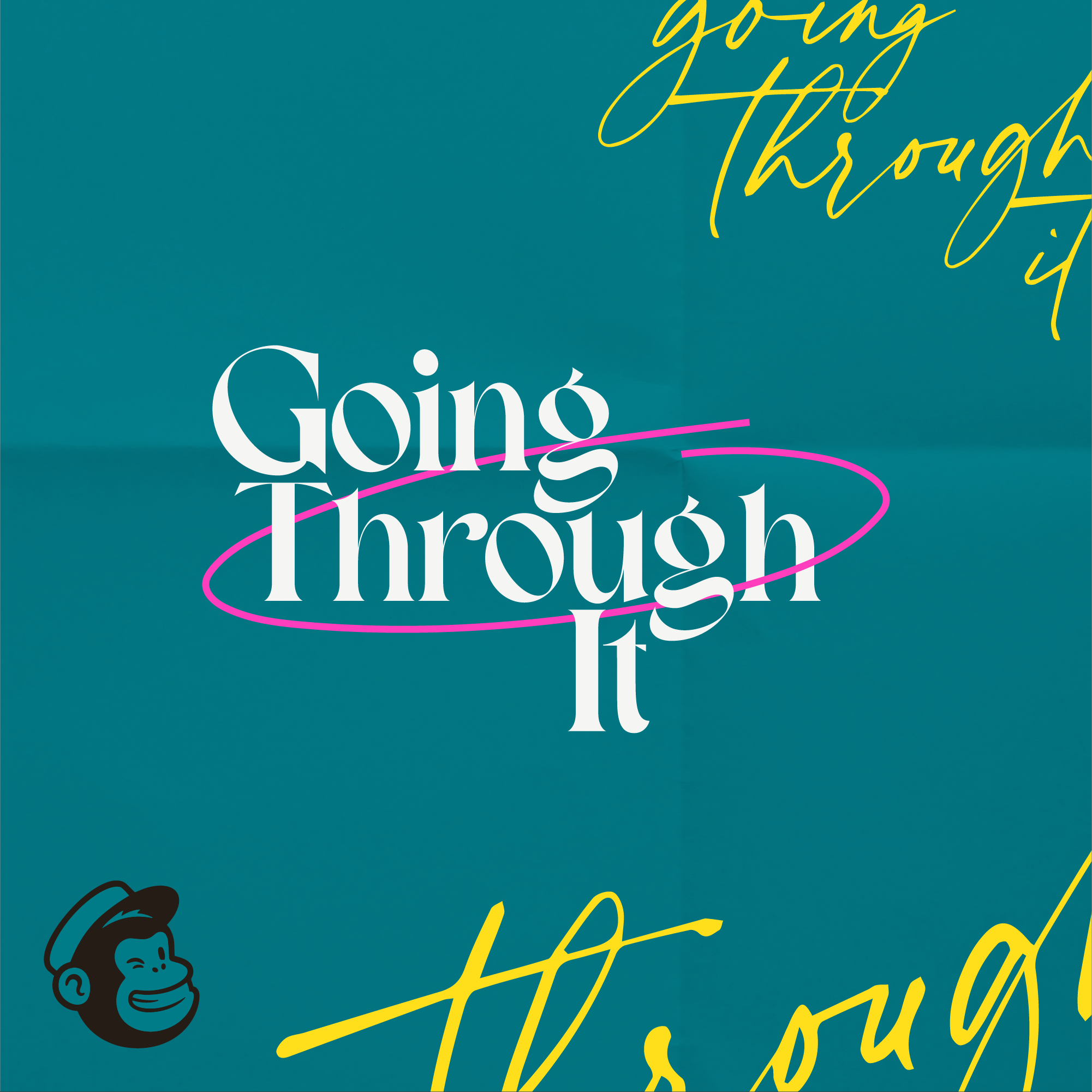
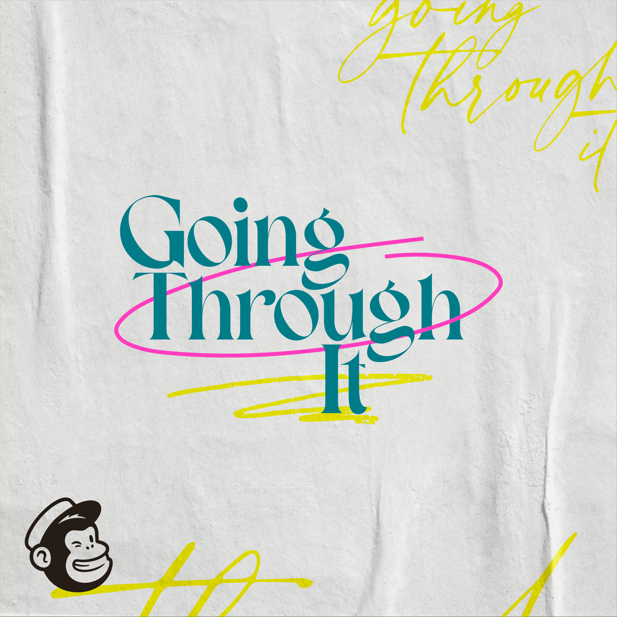
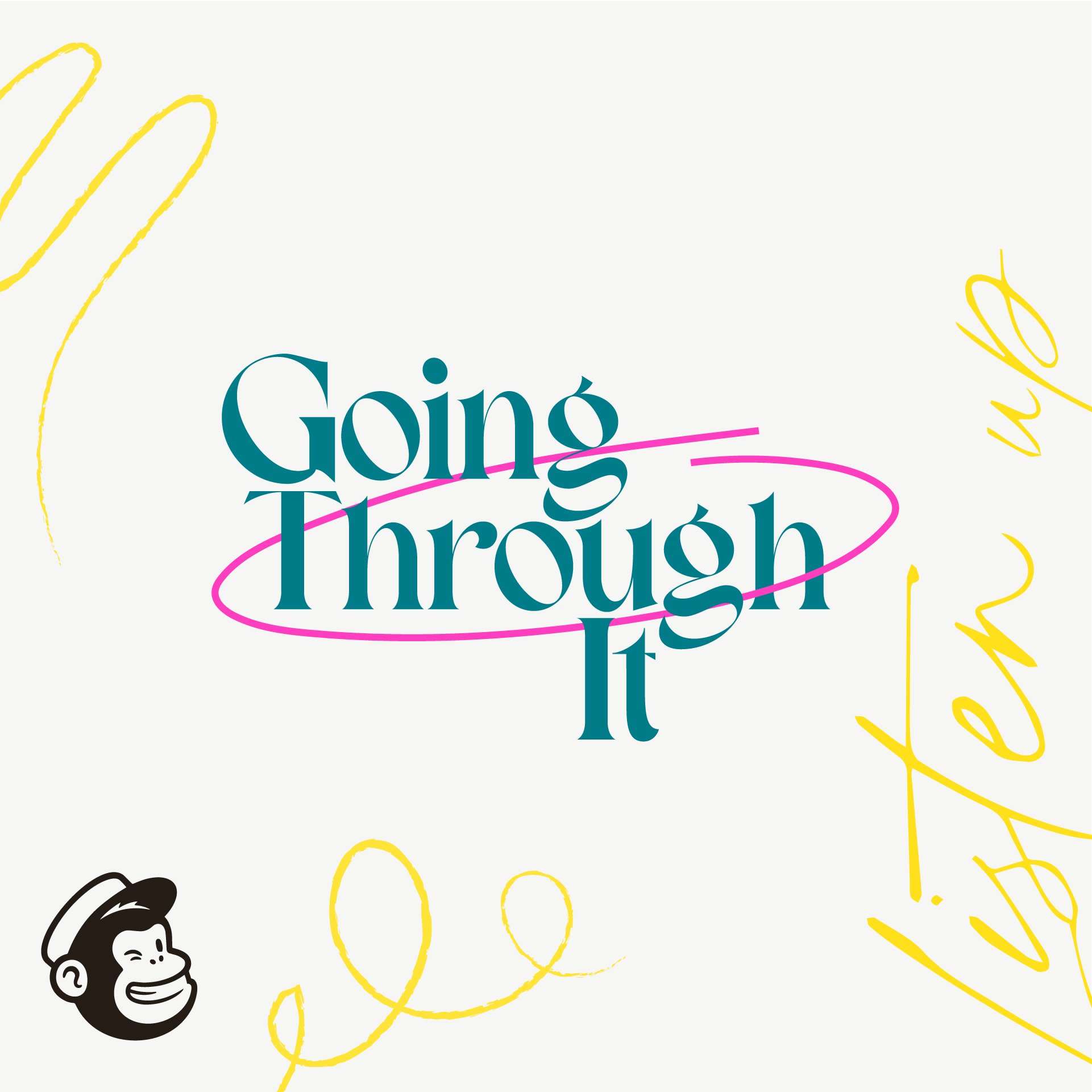
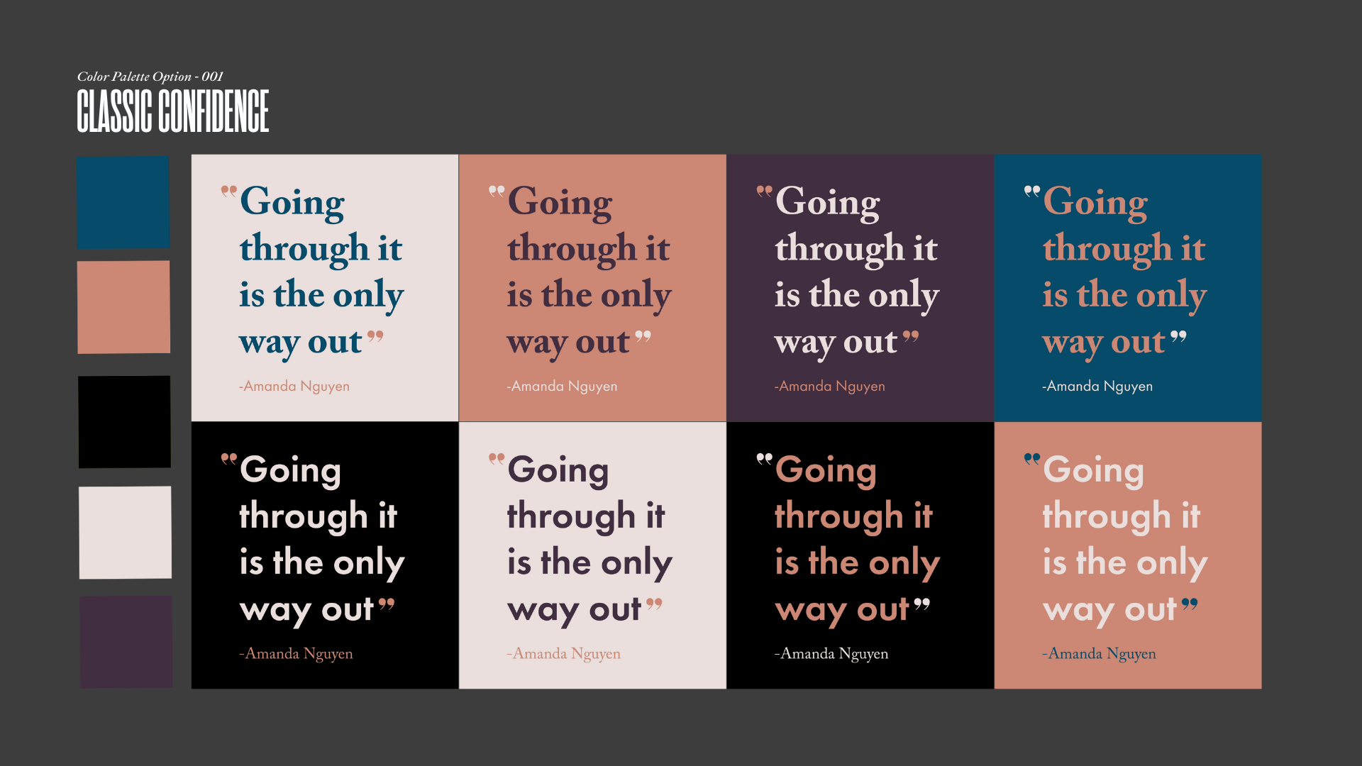
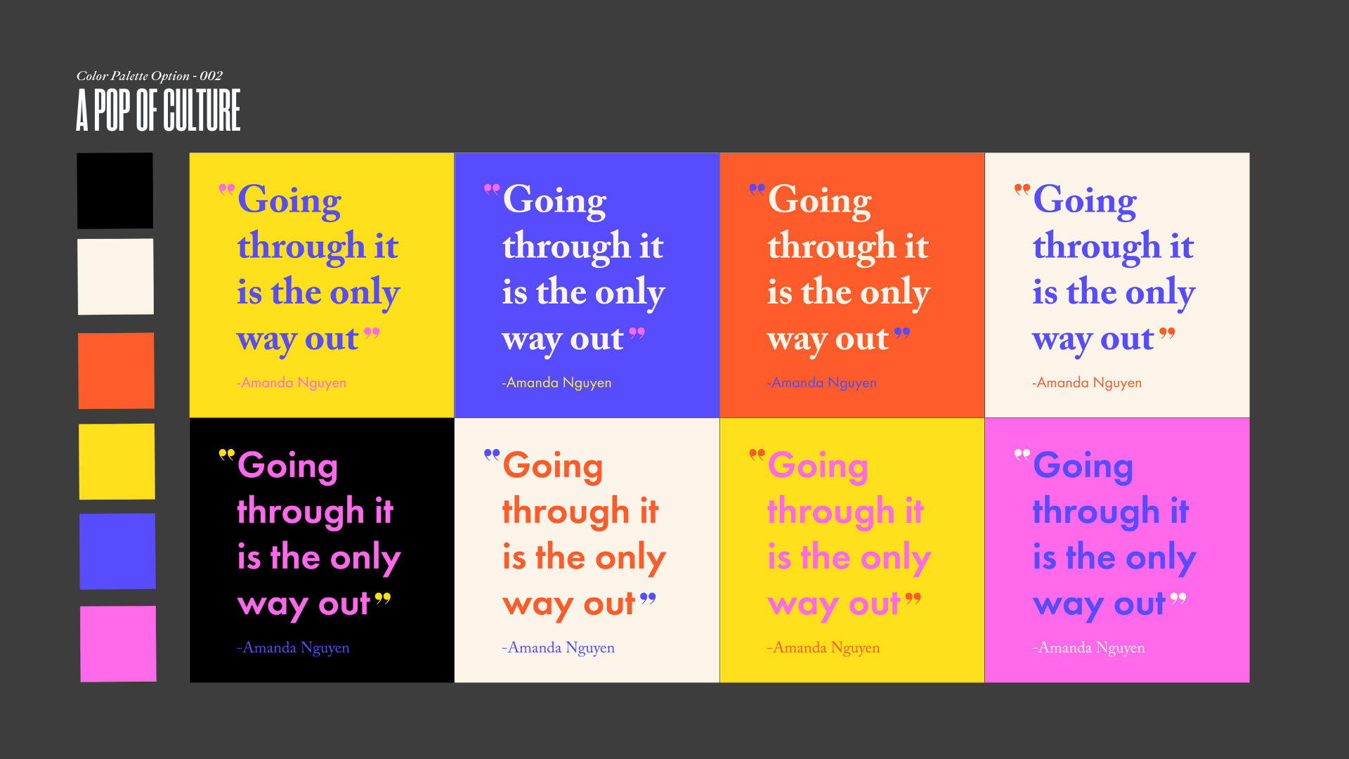
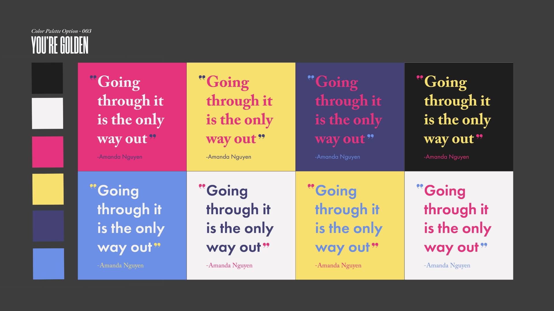
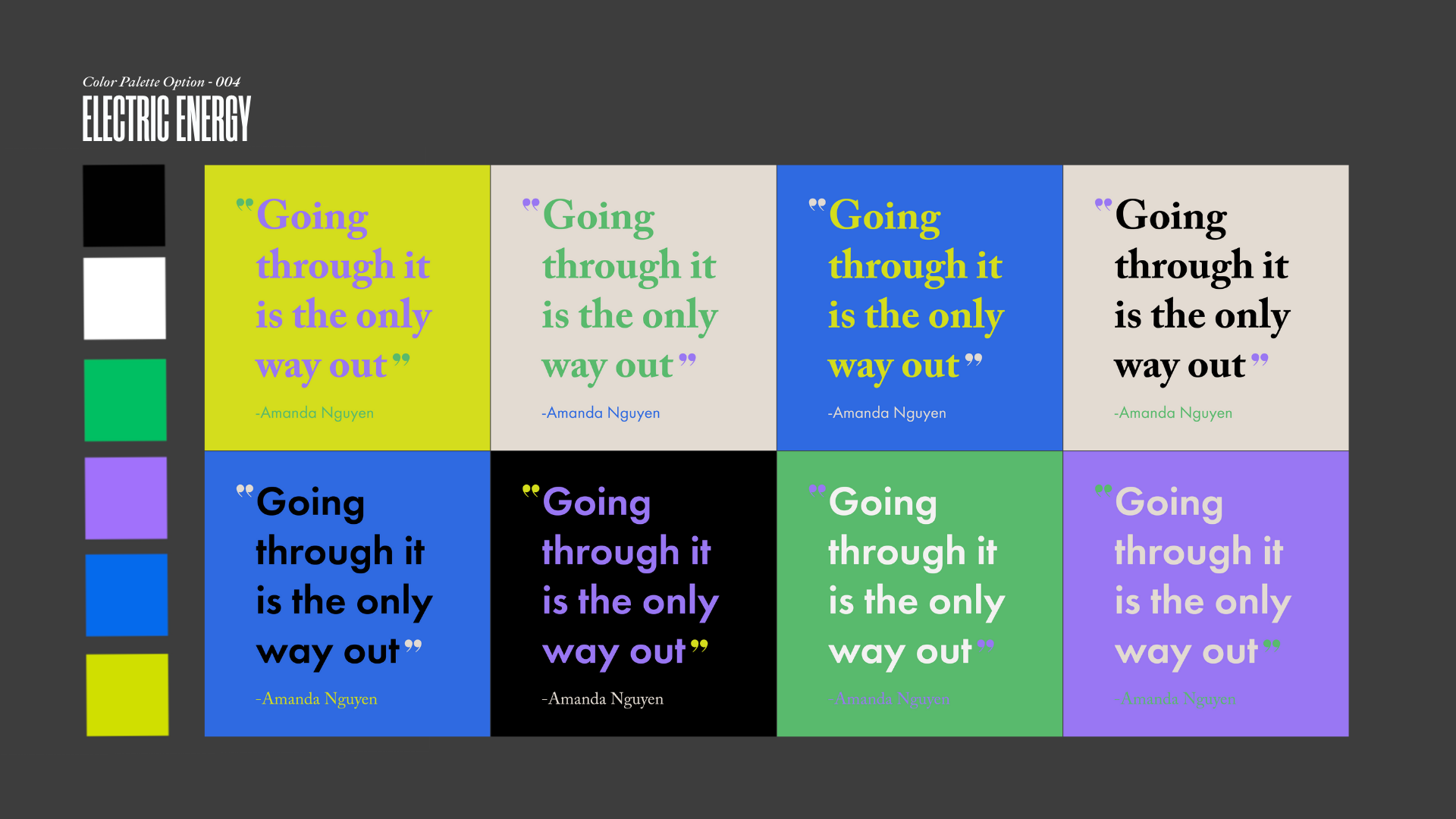
color palette
Using a combination of Mailchimp branded colors to create our palette, we experimented with how different color combinations would affect the tone of the podcast. The result of this exploration, shown below, allowed us to nail down the overarching mood and feel we were trying to express upon a first impression.

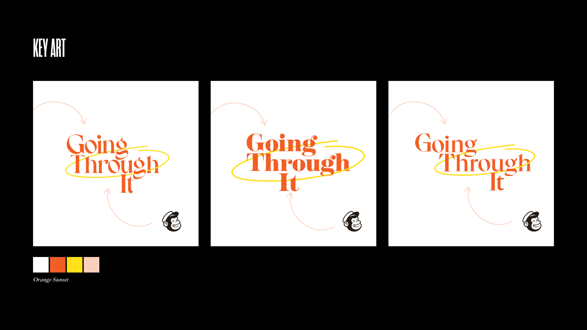
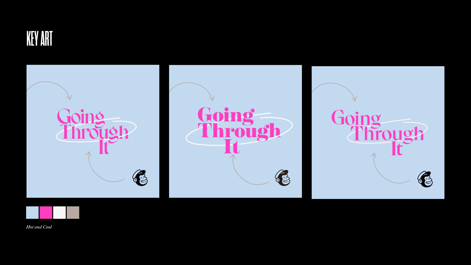
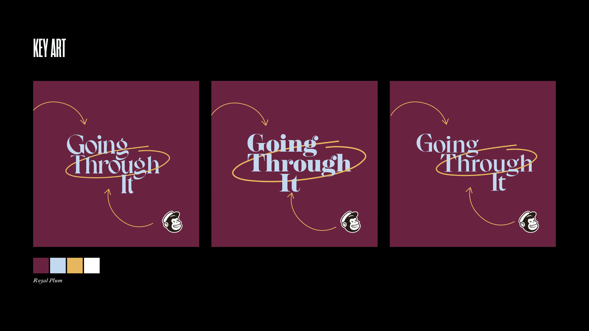
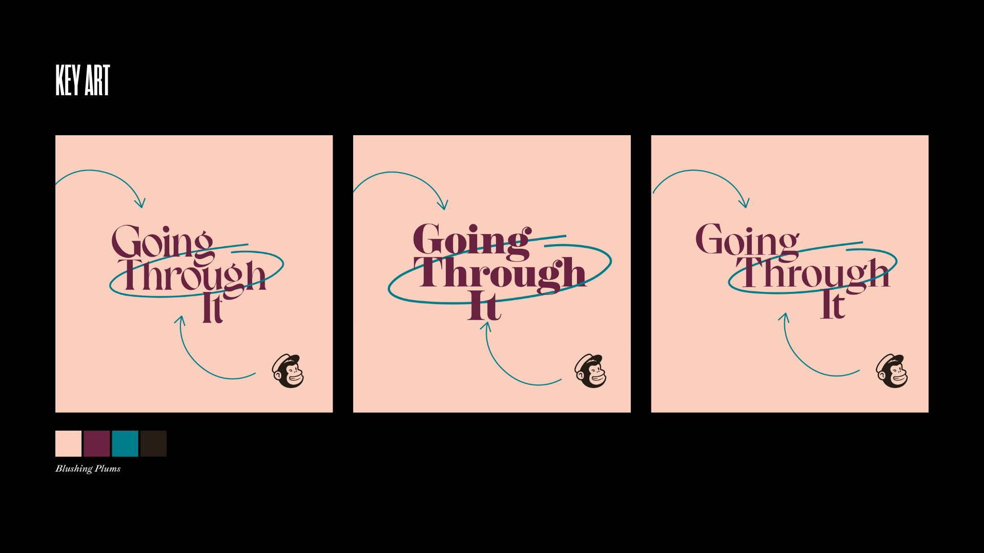

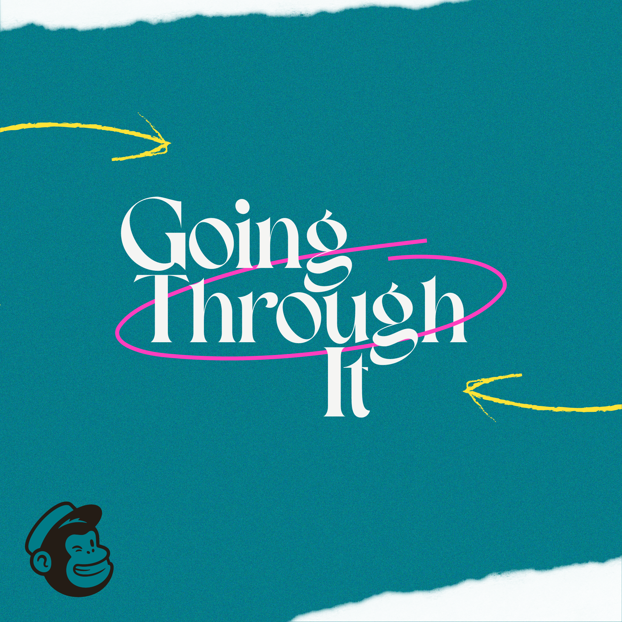
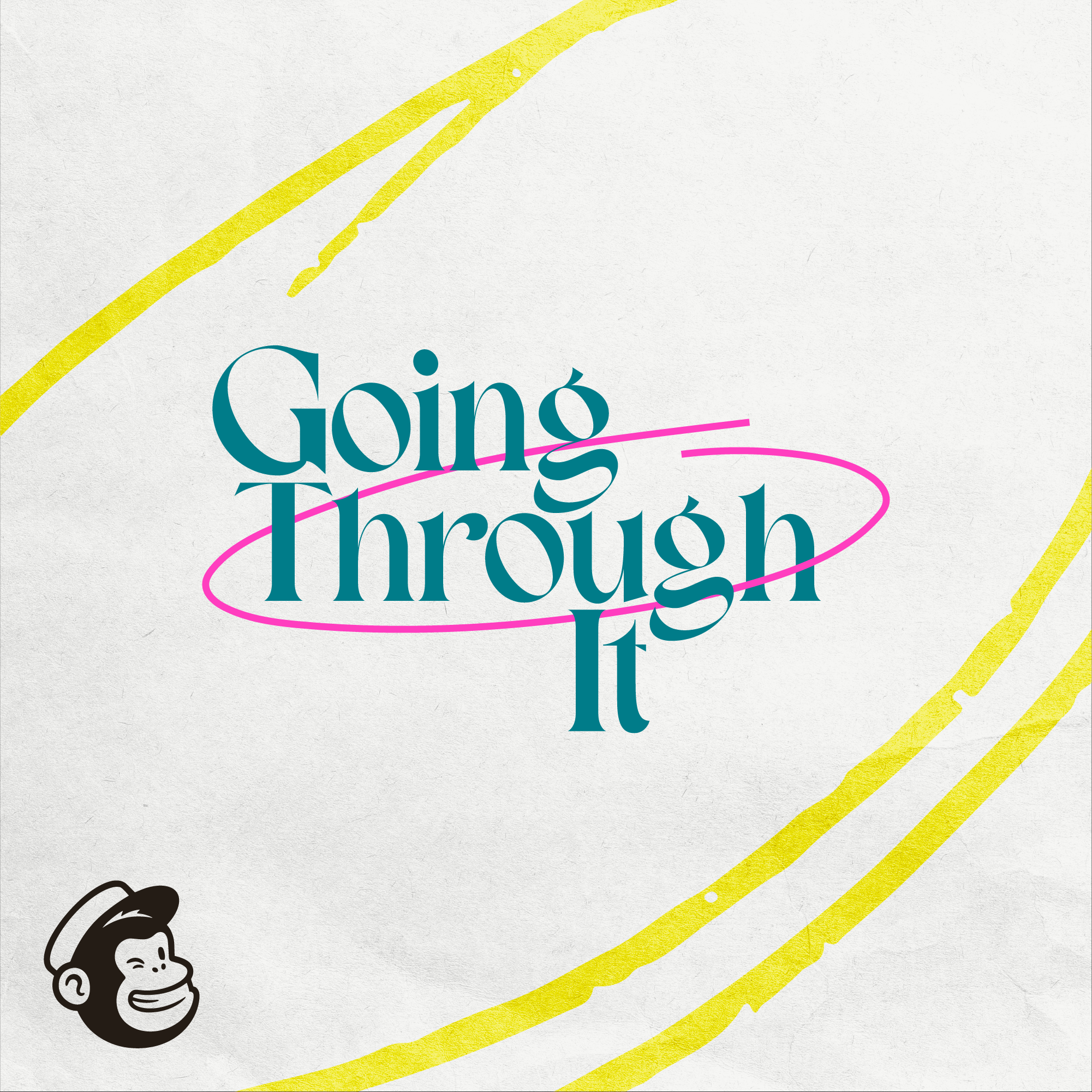
key art
When it came time to create key art for the show, we’d already established the key elements of color and logo design. From there, we began exploring ways to transform the logo using shapes, textures, and handwritten elements that would make the key art feel unique and fully representative of the brand identity.