The Ask
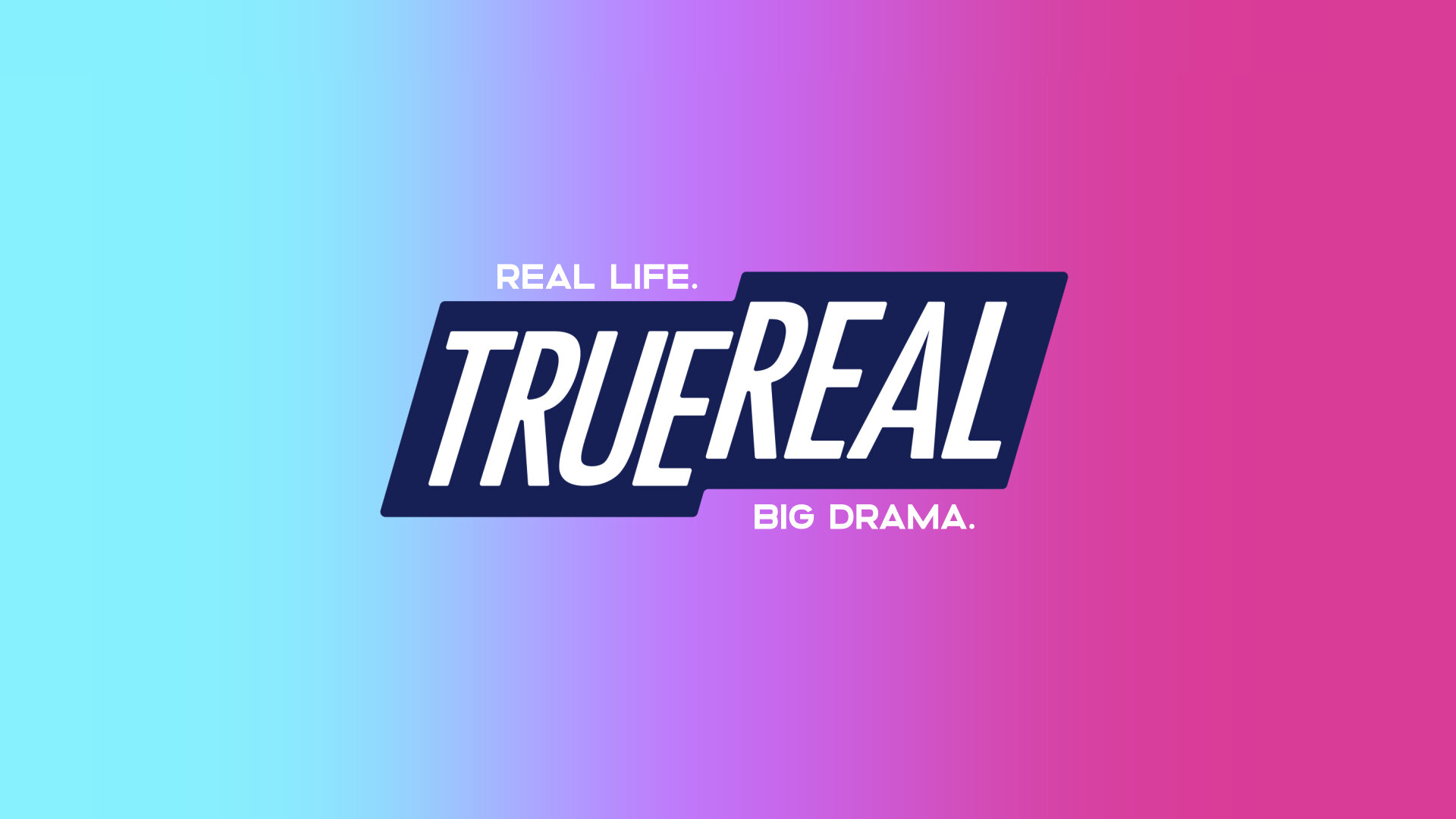
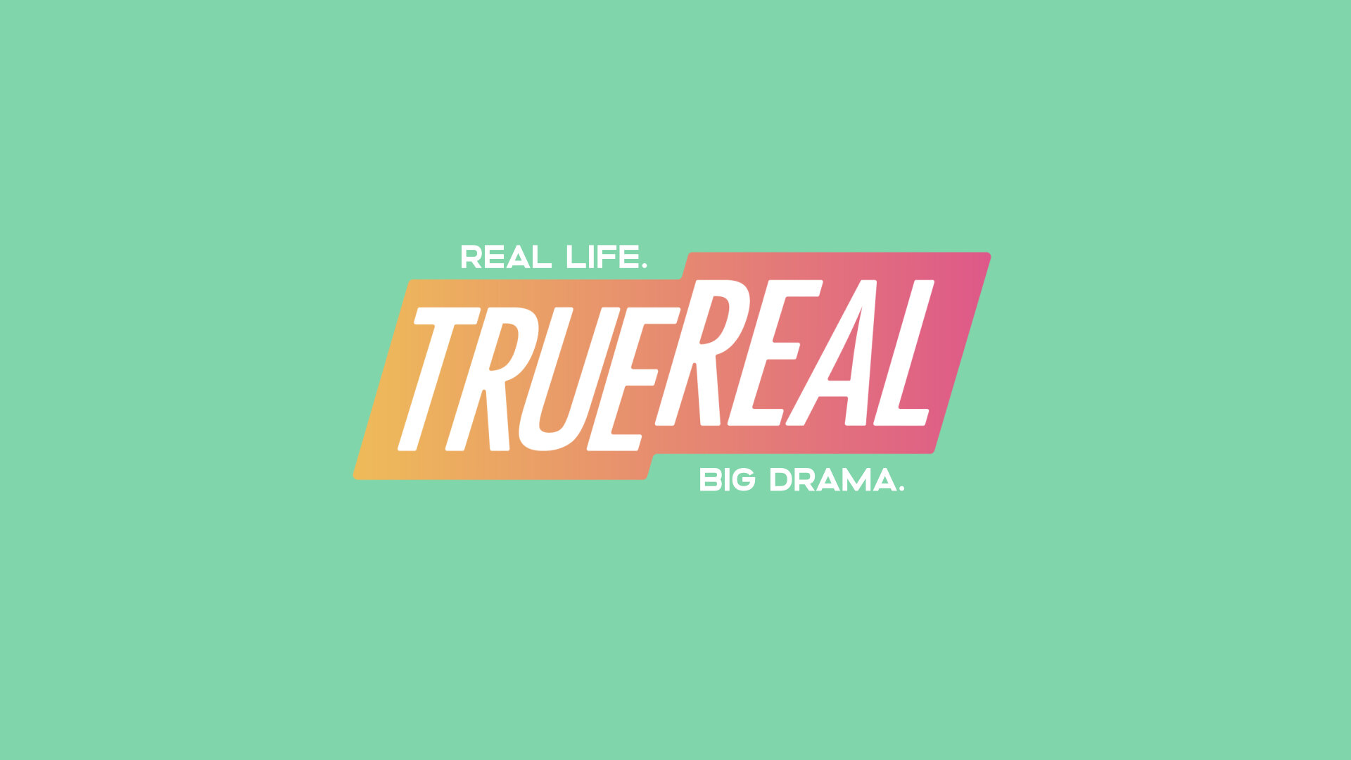
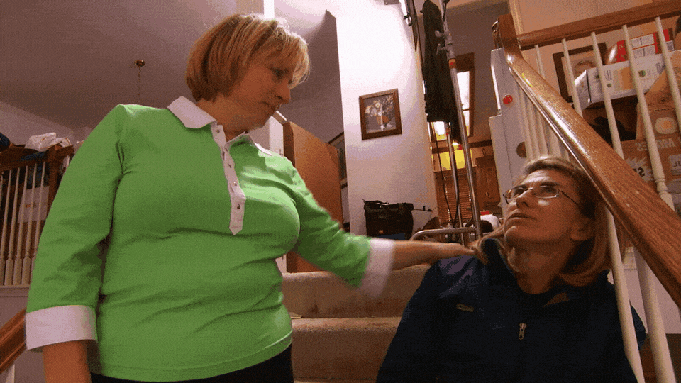
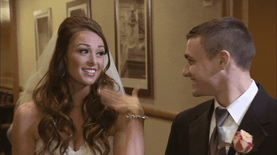
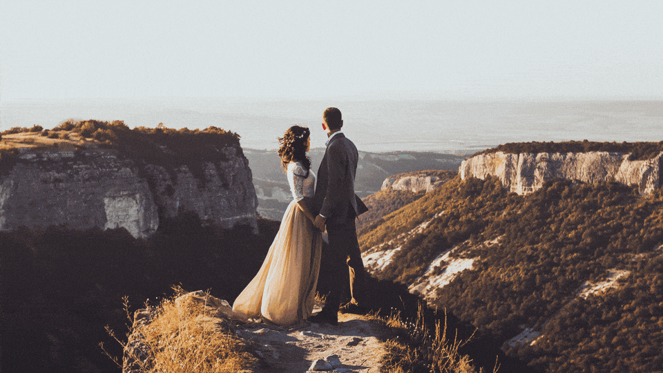
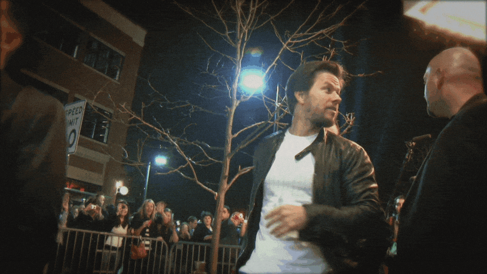
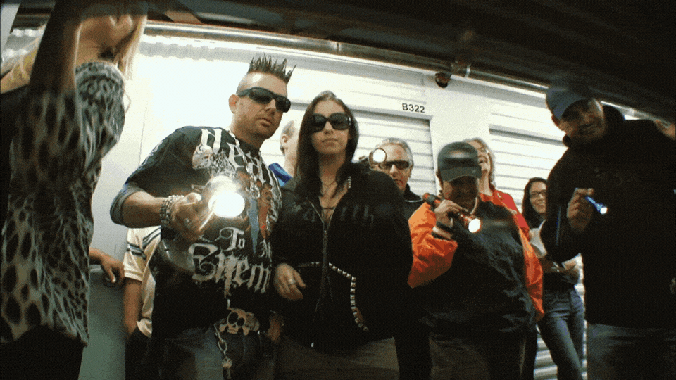
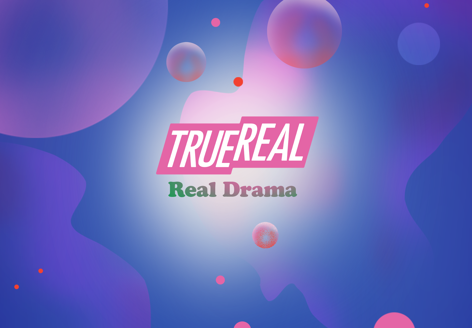
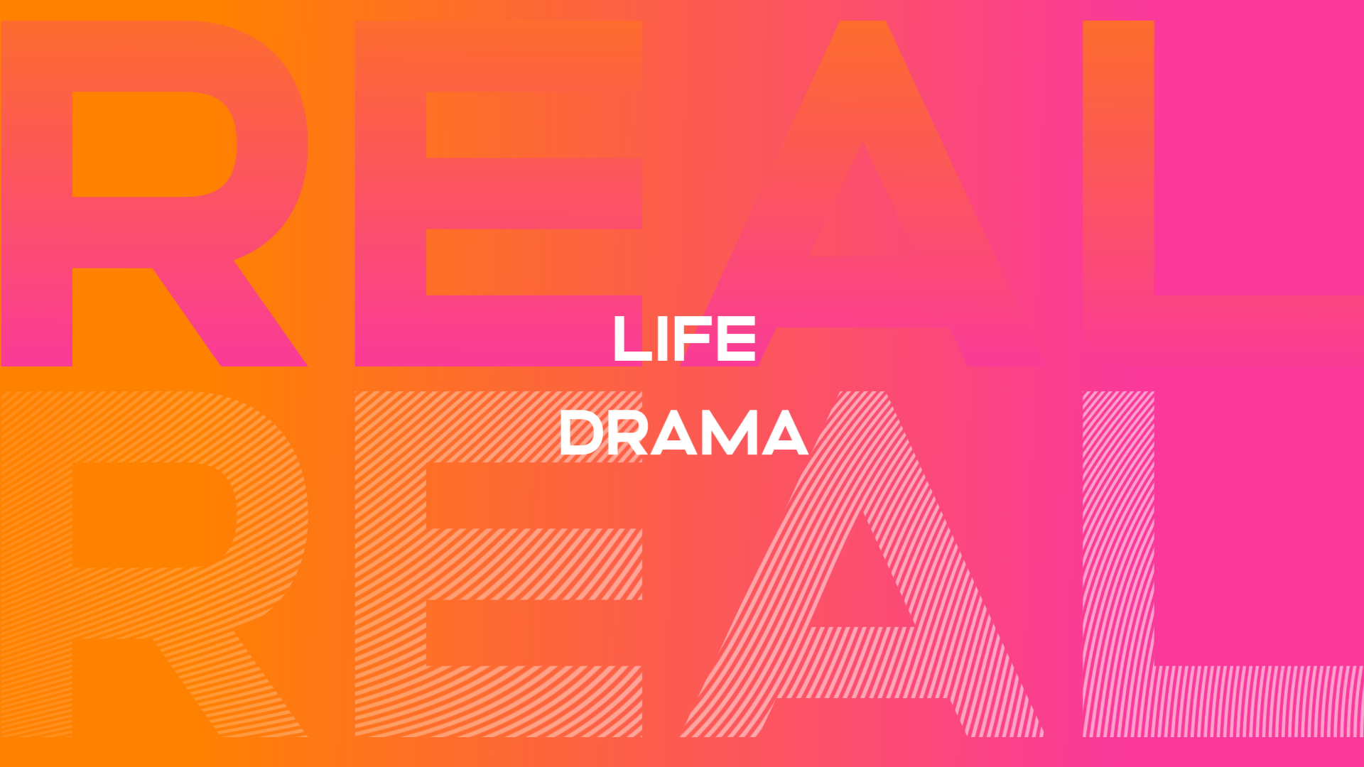
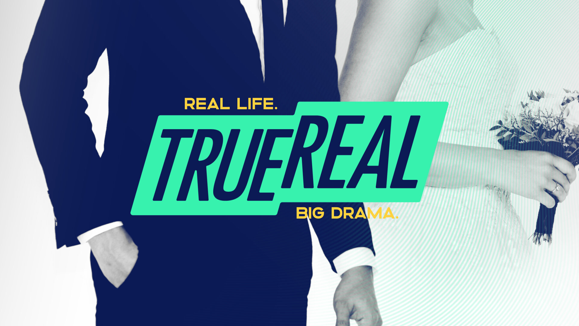
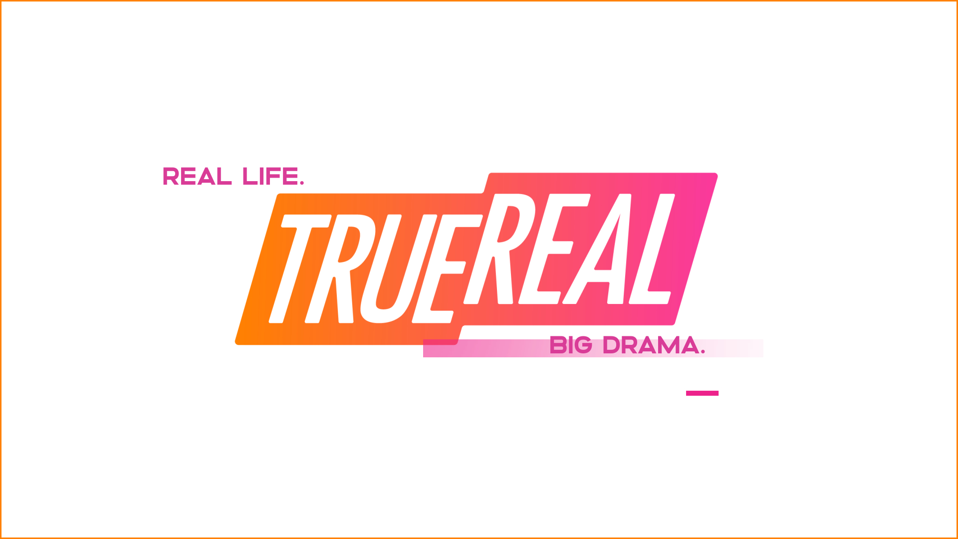
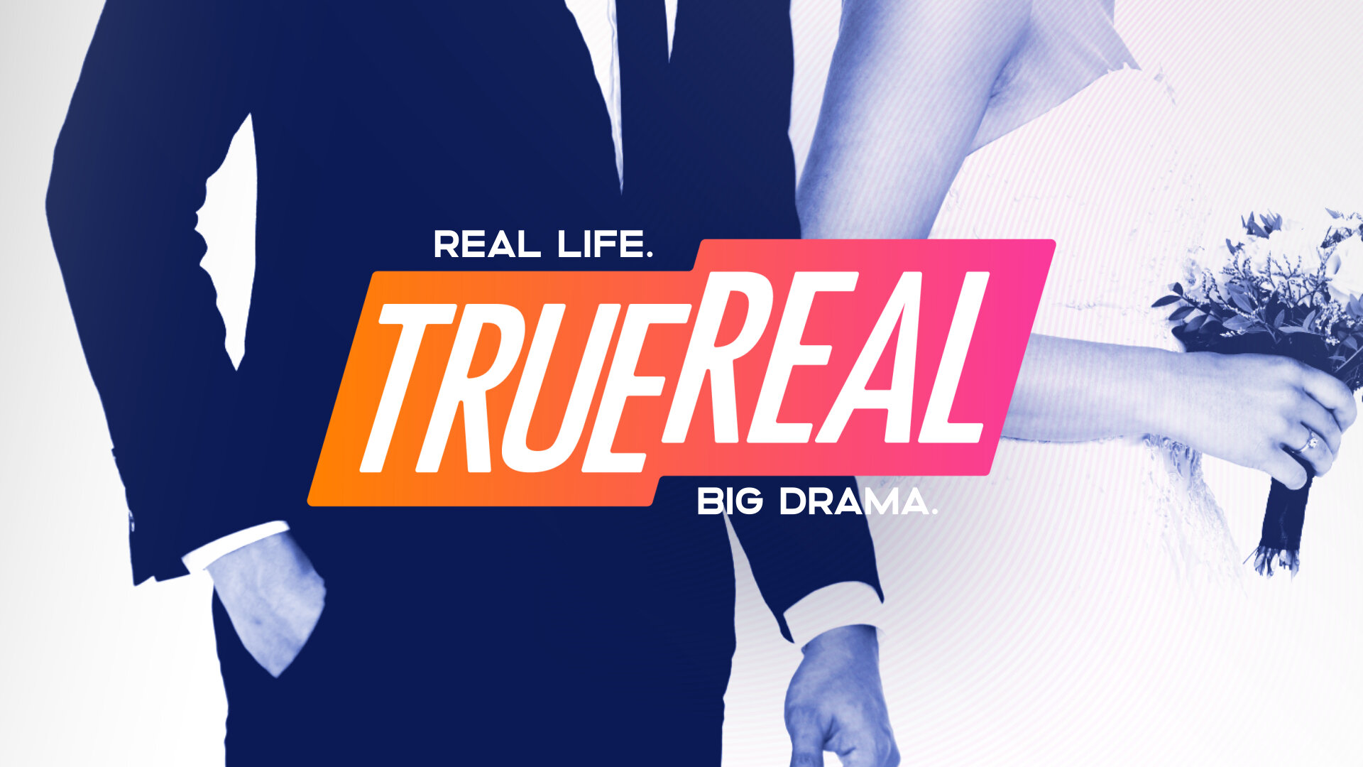
Real Life. Big Drama. That’s the promise of The E.W. Scripps Co.’s new network: TrueReal. TrueReal is a multi-platform network that provides premium, binge-worthy content that is produced, but never scripted. With over 6,000 hours of content, which is largely made up of A&E original series, TrueReal has access to all the best of reality TV, with OTA (over-the-air) exclusivity for these shows. Just as drama is a key component of the network’s diverse programming, Scripps tasked Creative Mammals with elevating the network’s launch campaign by creating a brand identity that is dramatic, modern, sophisticated, and pushes the boundaries of reality television.


The Challenge
One of TrueReal’s distinct features is its wide range of diverse programming, so we needed to create a look and feel that was cohesive and complementary to each unique show within this lineup. Although most of these shows are A&E originals and not a direct product of TrueReal, we needed to make sure each show felt like a member of the TrueReal family, and fit seamlessly within the graphics system we were creating.
The target demographic of this network is women, which needed to be reflected in the branding; however, we also wanted to ensure that TrueReal would appeal to a broader audience. In order to achieve this, we needed to prioritize a strategy early in our creative process. By doing so, we were able to gather more information about how to best serve the future audience of TrueReal network, and use that knowledge to inform key decisions along the way.
The Result
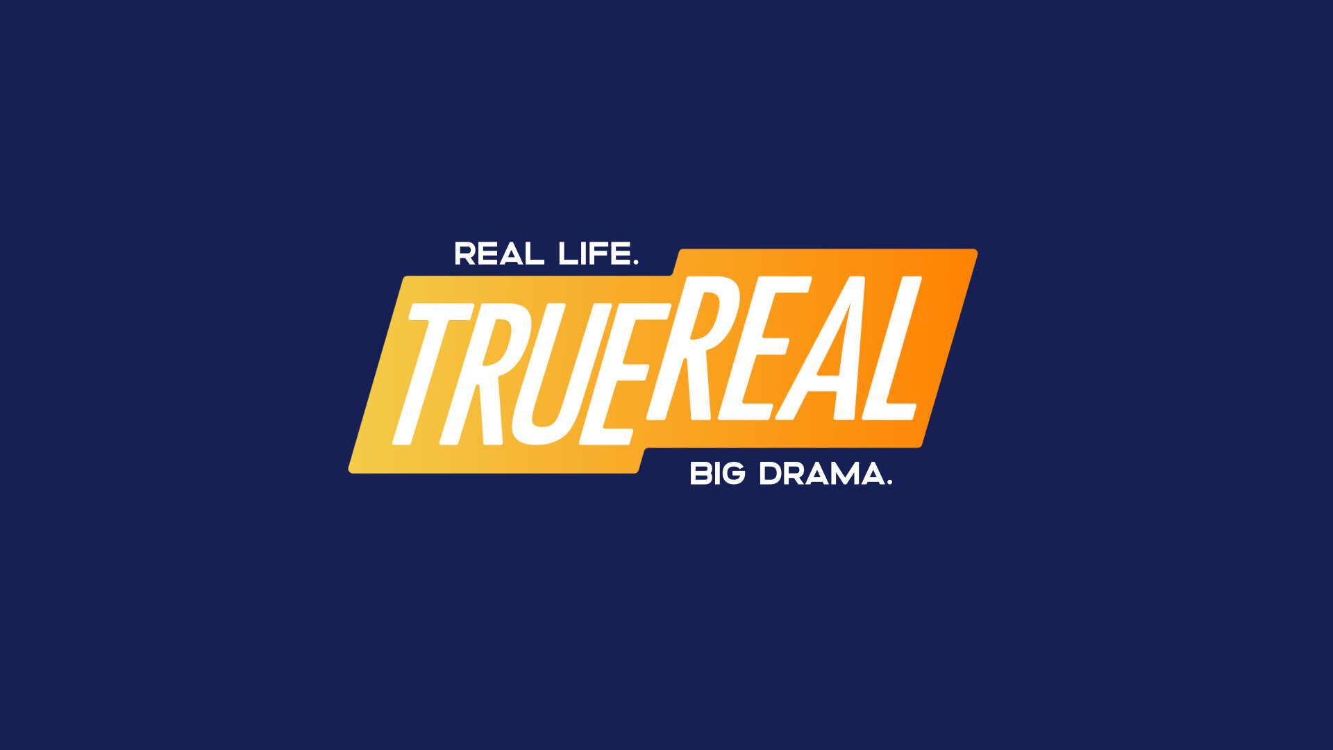
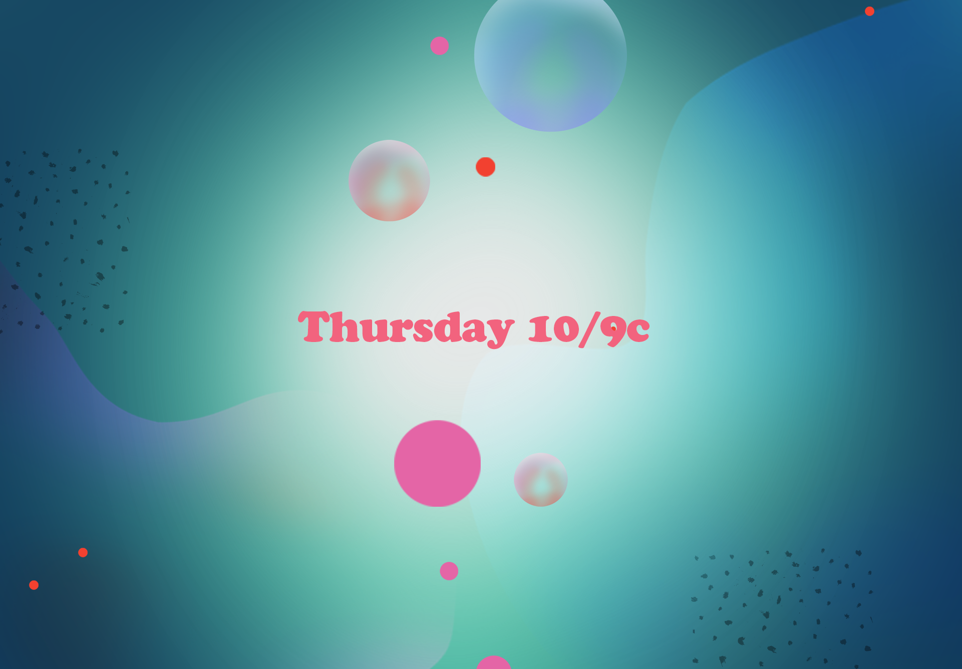
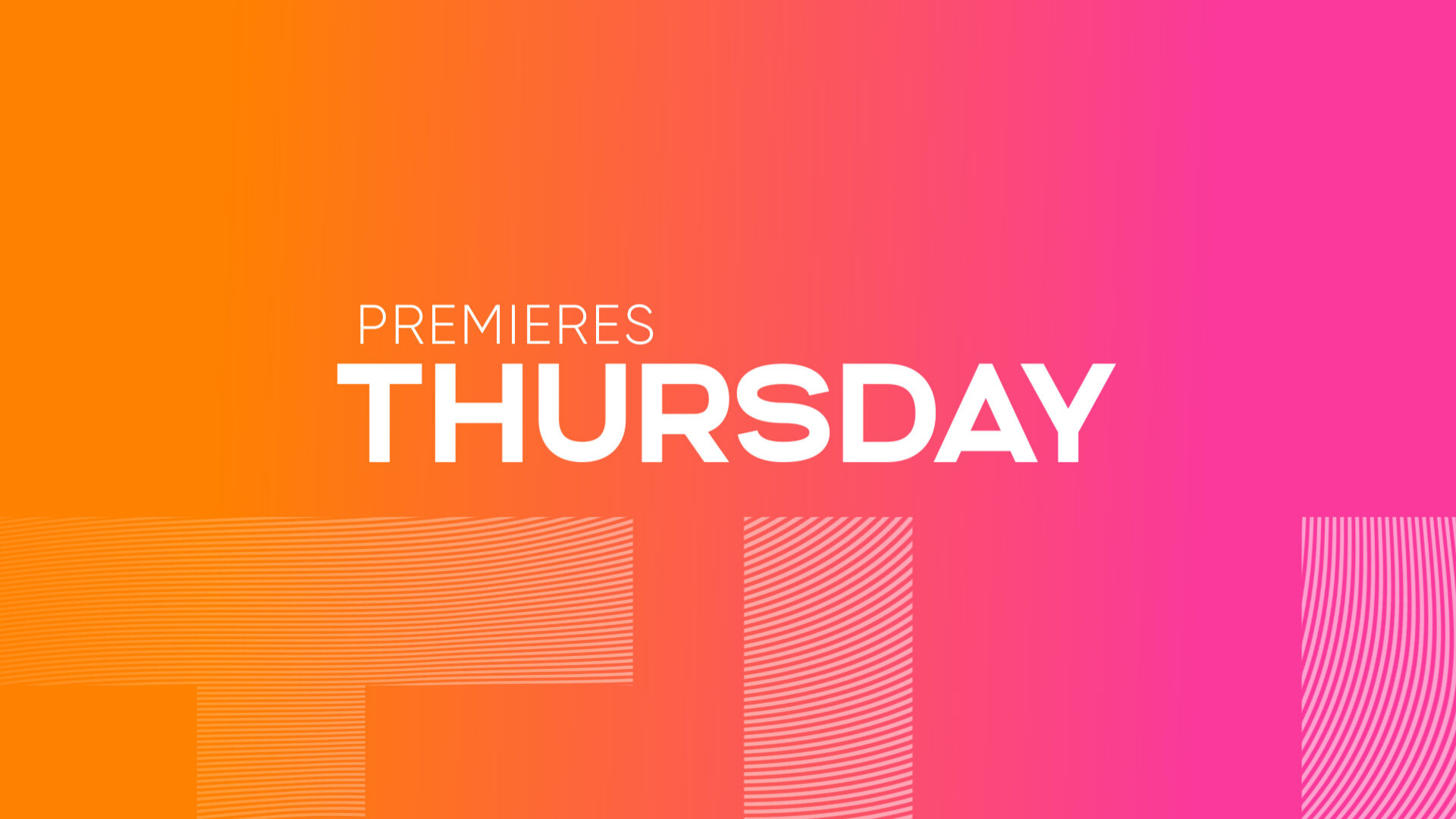
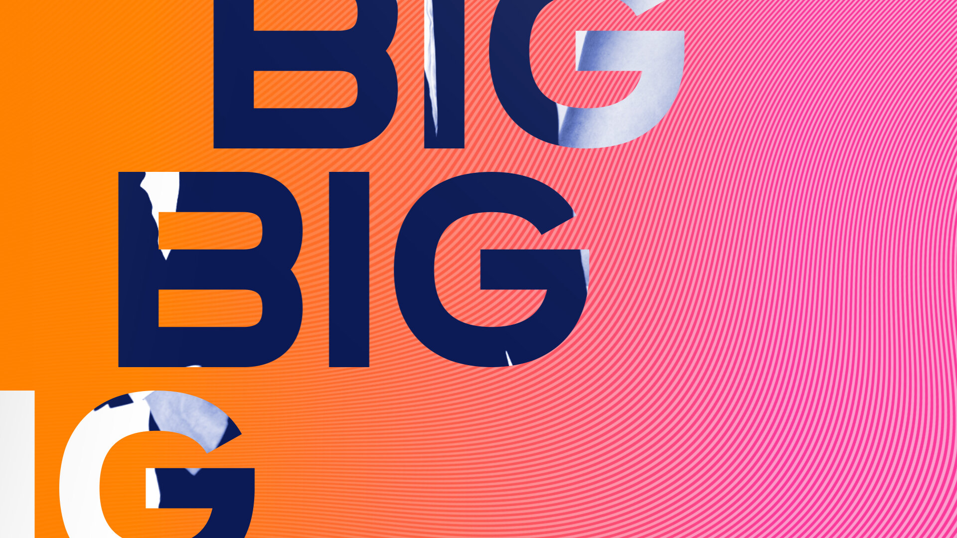
Four vibrant color themes, and 2 bold, geometric, all-caps typefaces define the overall look of the network, and provide the flexibility to showcase the wide range of programming within TrueReal’s roster. The animation of each element is bold and punchy, and quick cuts are a staple of the network’s motion language.
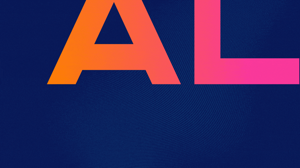
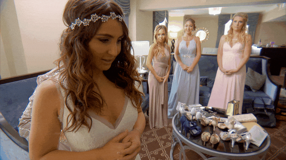
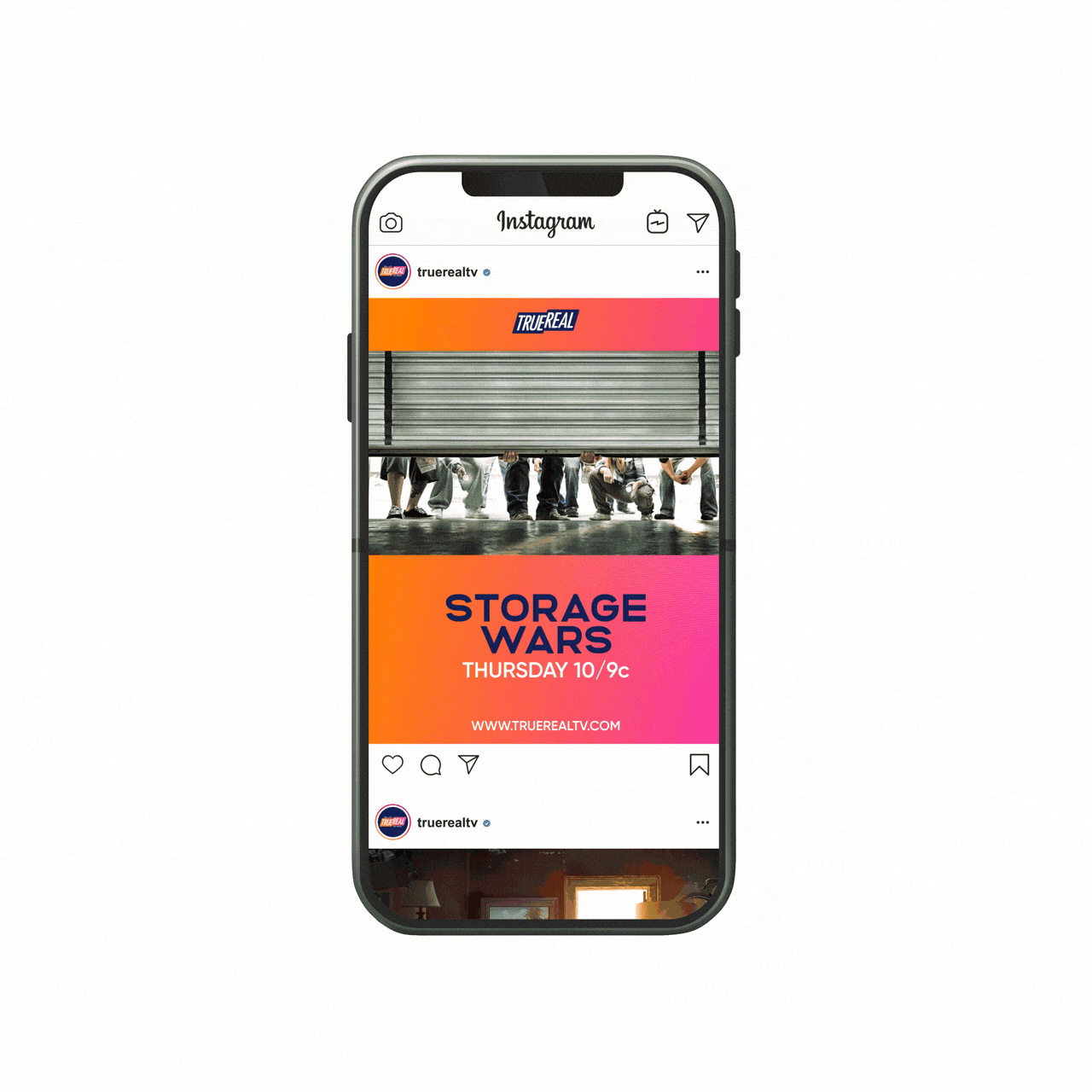
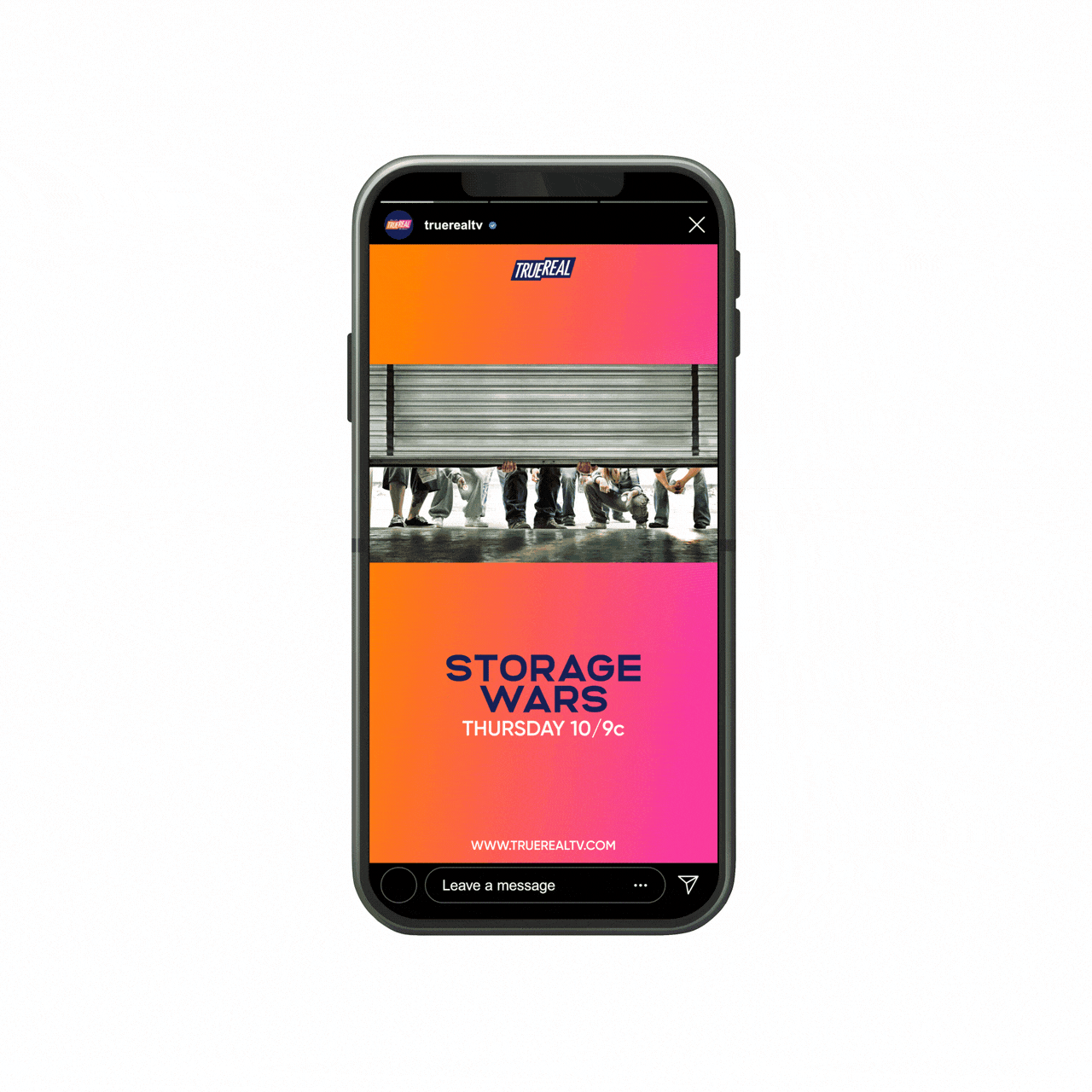
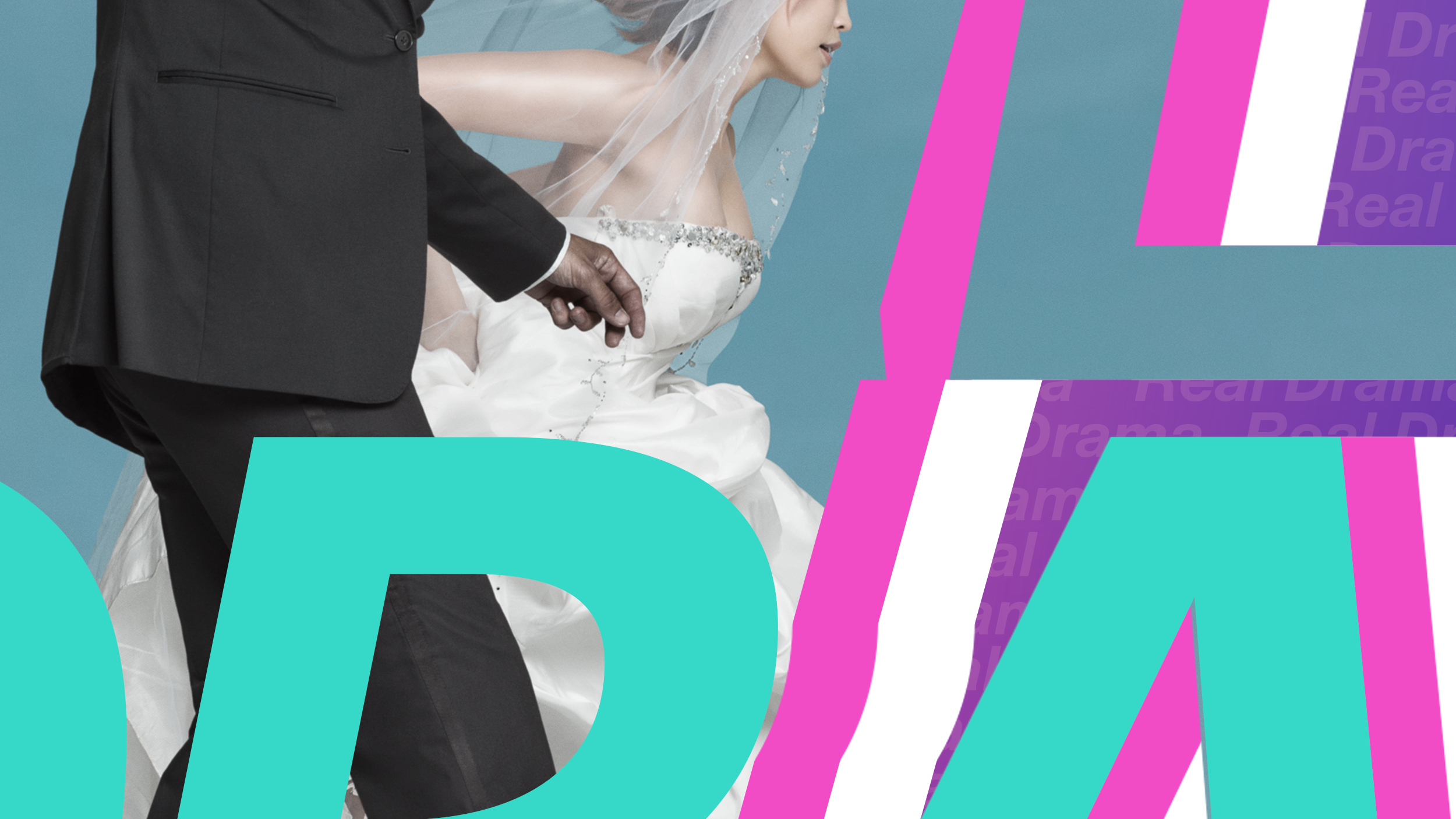
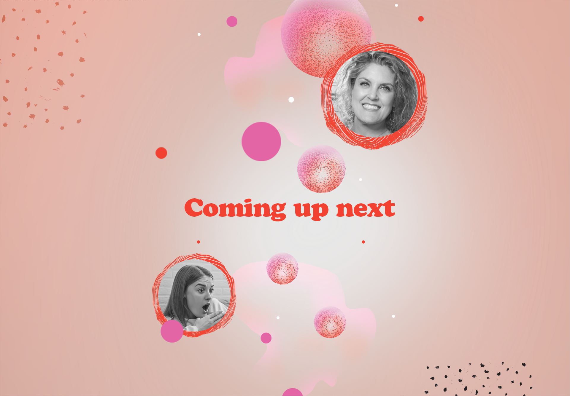
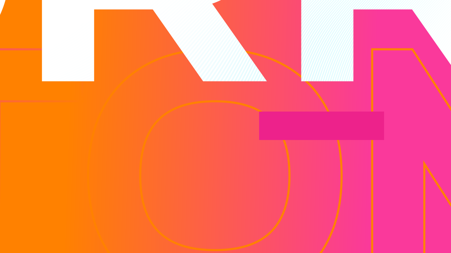
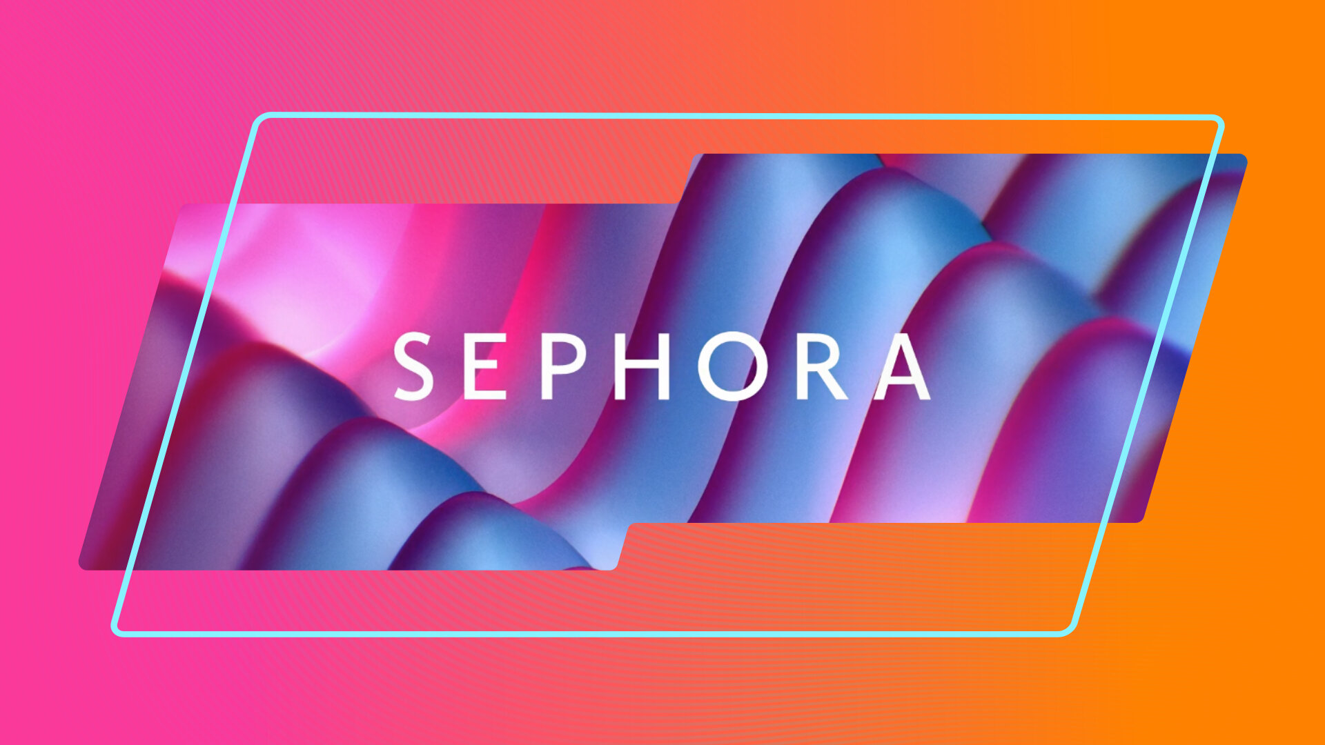
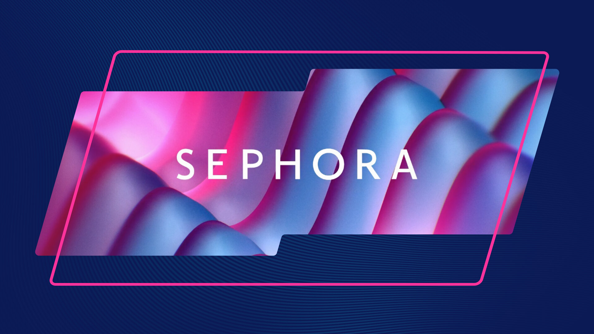
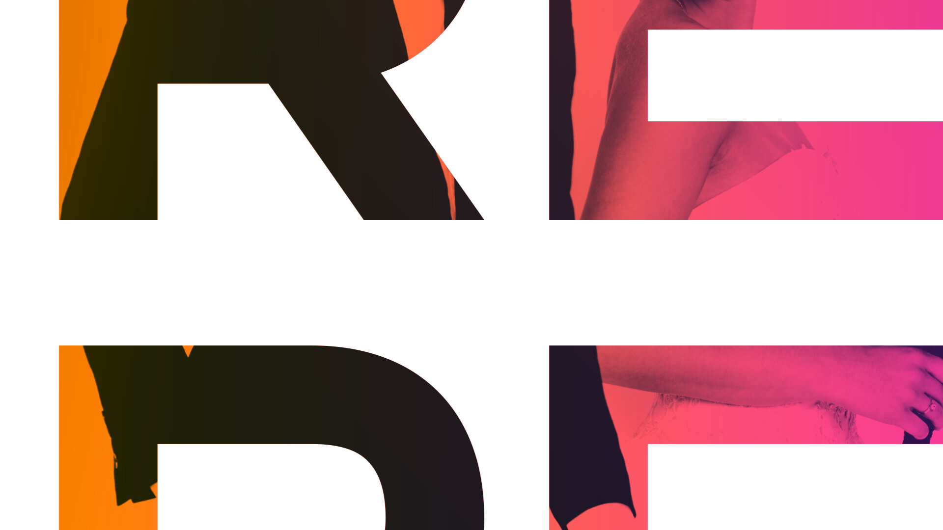
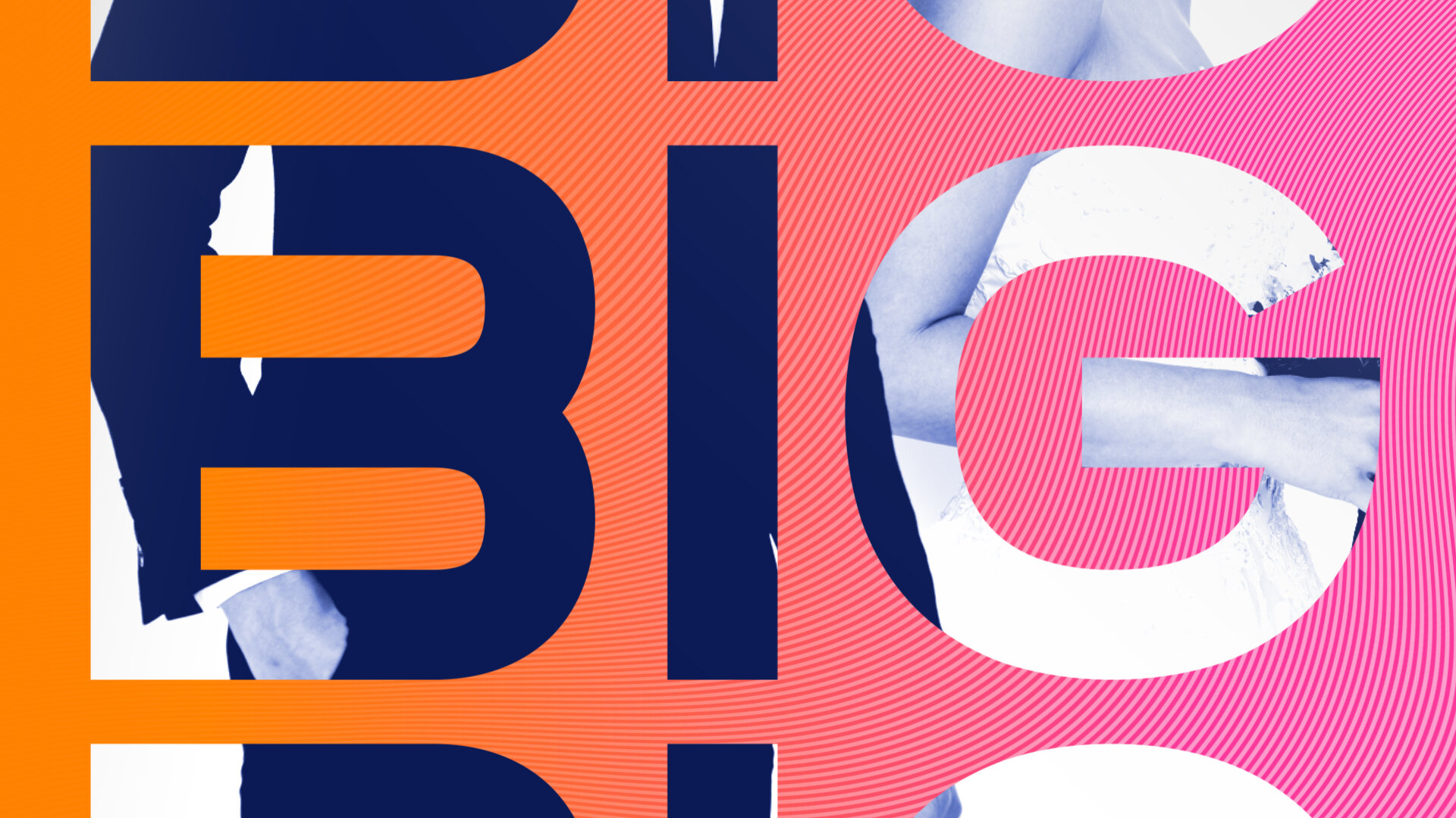
By dissecting and repurposing the shape of the TrueReal logo, we were able to create a recognizable graphic system which uses the backplate motif as a framing device throughout the toolkit elements. Because hit shows are literally in TrueReal’s DNA, we implemented footage and imagery from the shows within these backplate shapes, as well as within the typography itself, giving the audience various windows through which to perceive these characters.
In conjunction with a vast breadth of network, promotional, and social deliverables, we used the Essential Graphics panel within Adobe After Effects to create a fully customizable graphics toolkit, which can be easily adjusted by producers and editors alike, for all of the network’s future needs.

The Solution
Toolkit elements


just my type
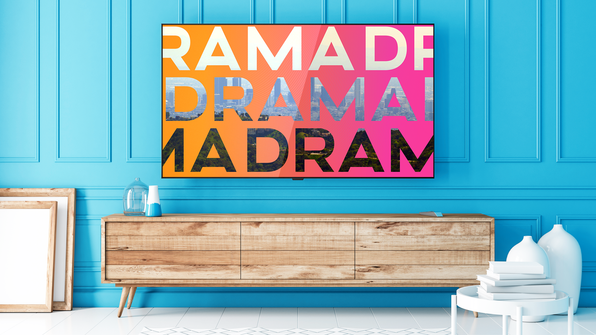
Altero is a modern, sophisticated, sans serif font that was a perfect fit to serve as TrueReal’s primary typeface. Gilroy, the network’s secondary typeface, provides unquestionable legibility and reinforces the strong, but approachable look of the network. Our main goal when selecting typefaces for the brand was to find a balance between sophisticated and modern, without feeling flashy or cliché.


life in color
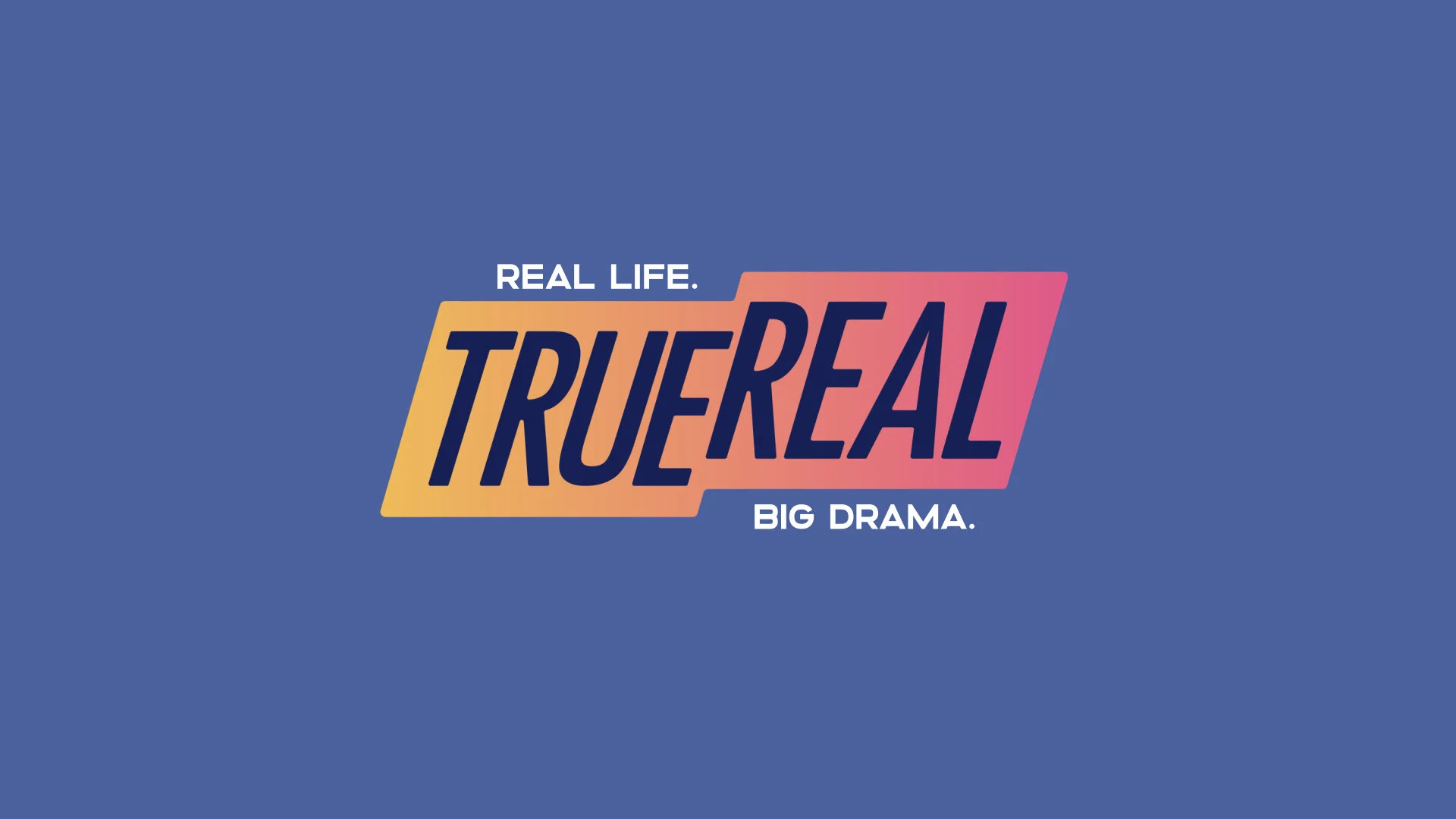
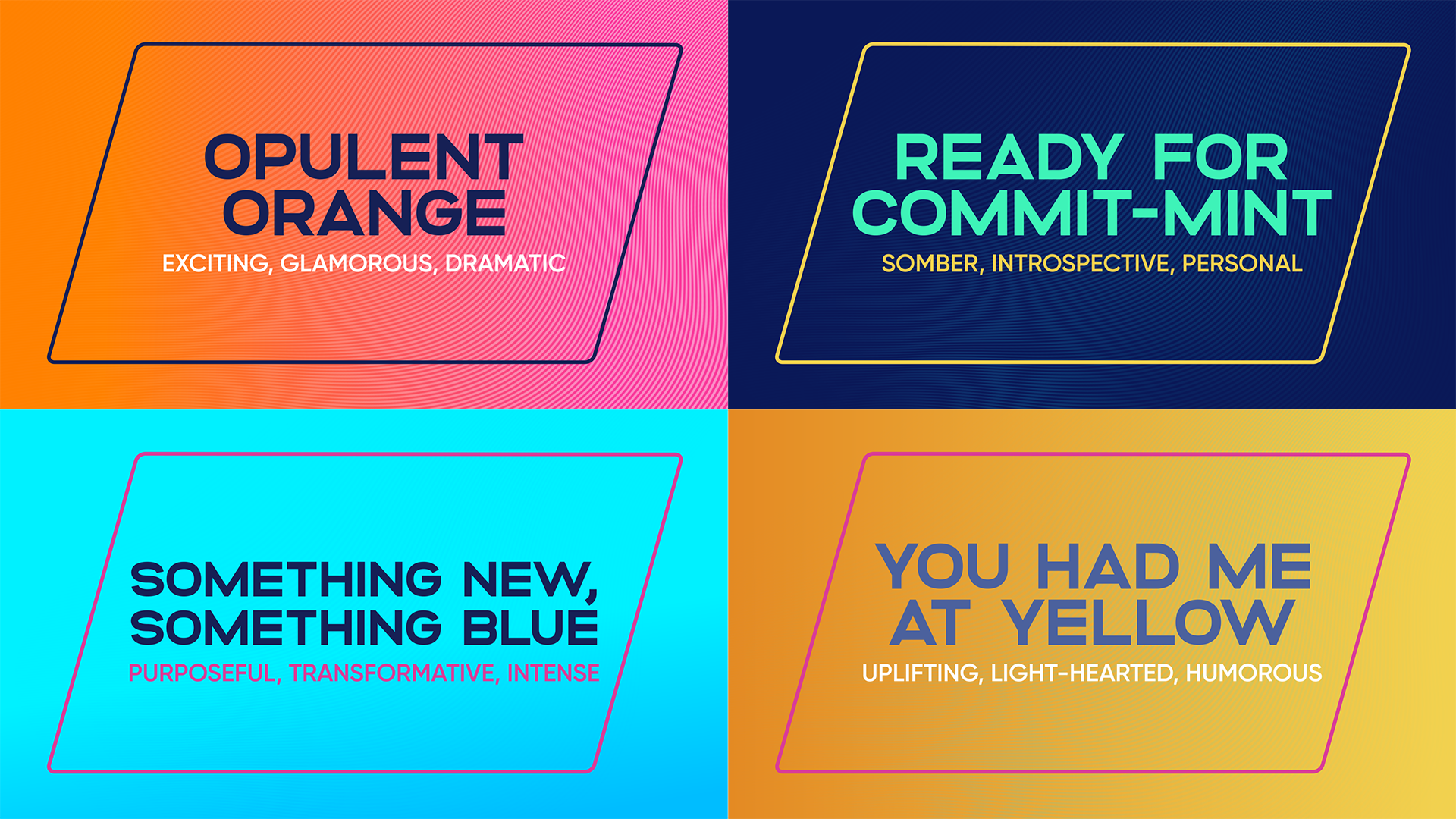
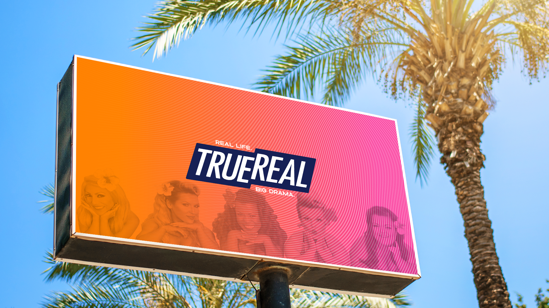
The color palette we established for TrueReal consists of 4 warm and 4 cool colors. From there, we created 4 distinct color themes that would be used to create different moods depending on the tone of each show or promo. Whether looking for a more somber, serious, or a more light-hearted, upbeat tone, these color themes have covered all the bases. The hero theme is “Opulent Orange” - consisting of white, orange, pink, and dark blue - and is characterized as exciting, glamorous, and dramatic, which are key attributes of the TrueReal brand as a whole. In addition to the color themes, the TrueReal color palette was also used to create 4 gradients and a total of 9 background options.
we've got your back... plate
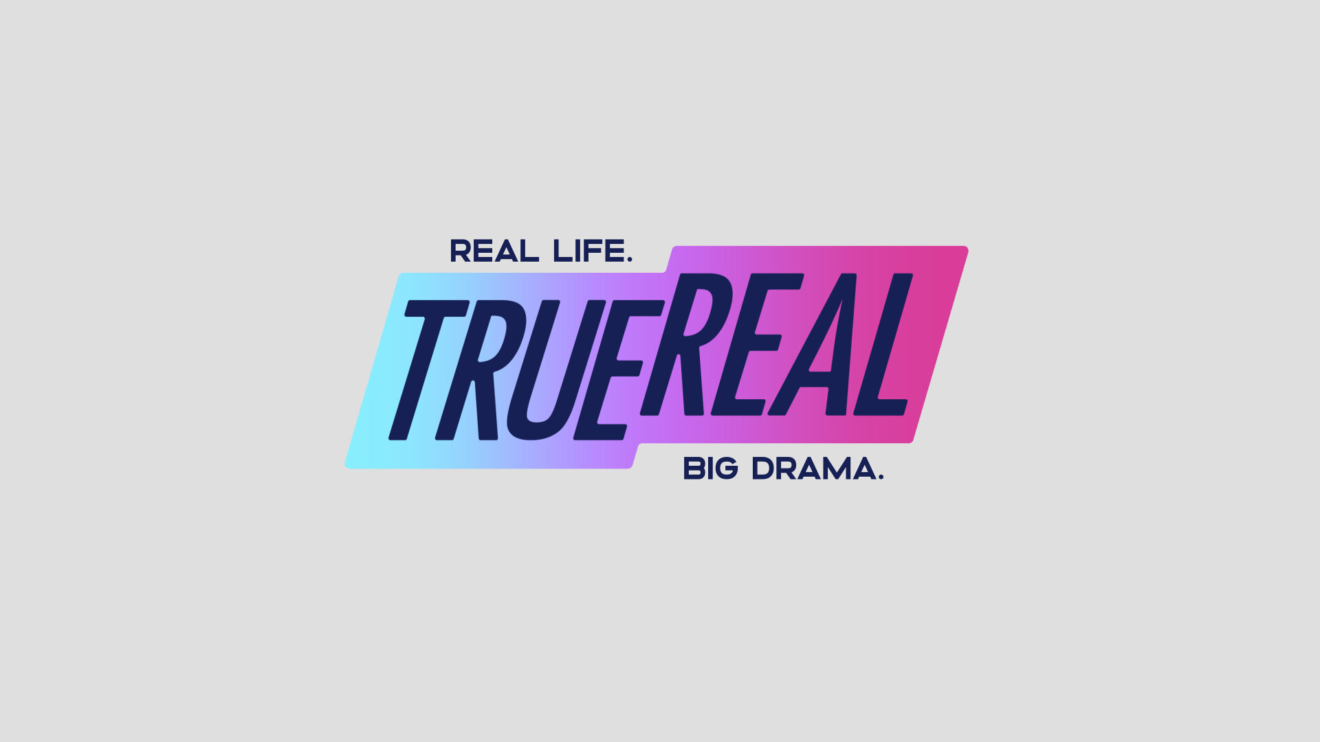
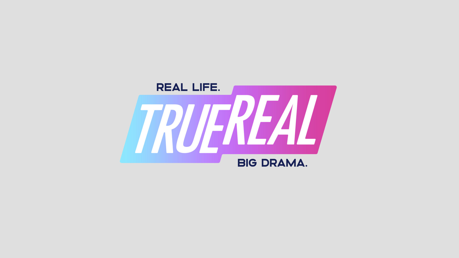
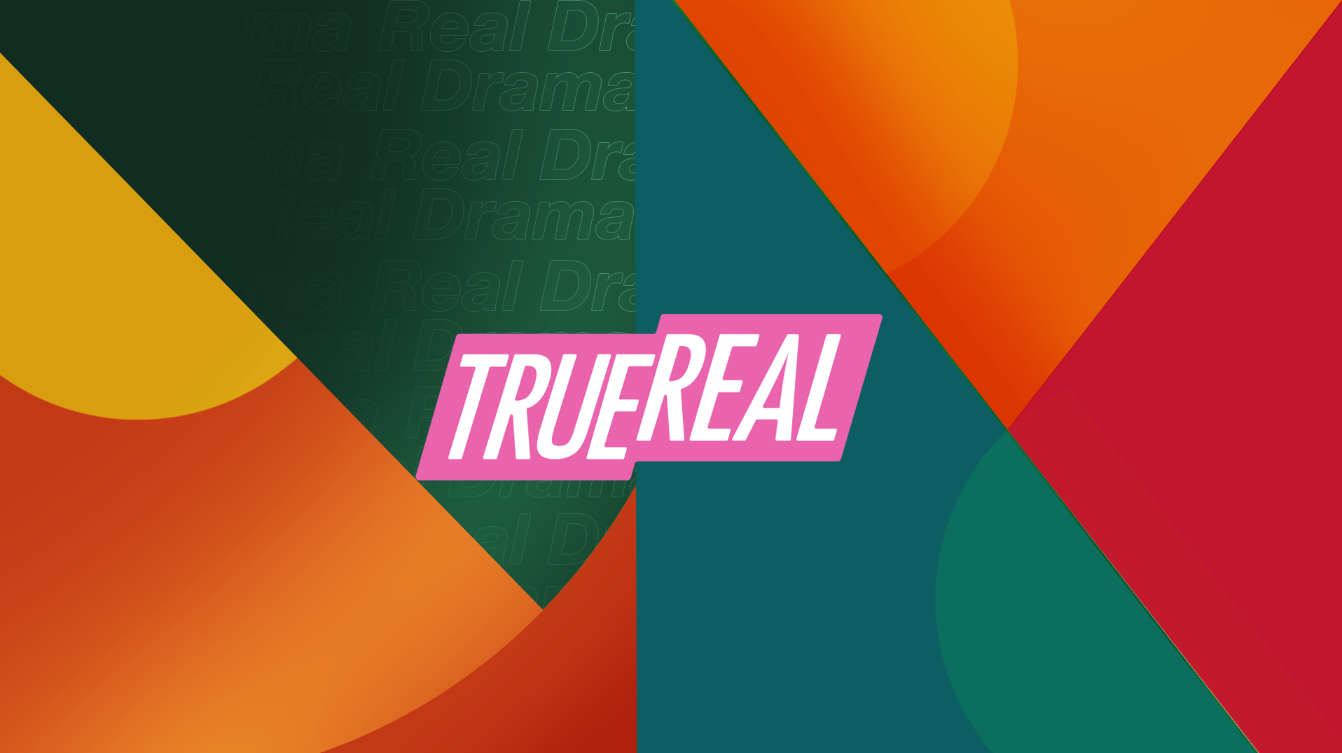
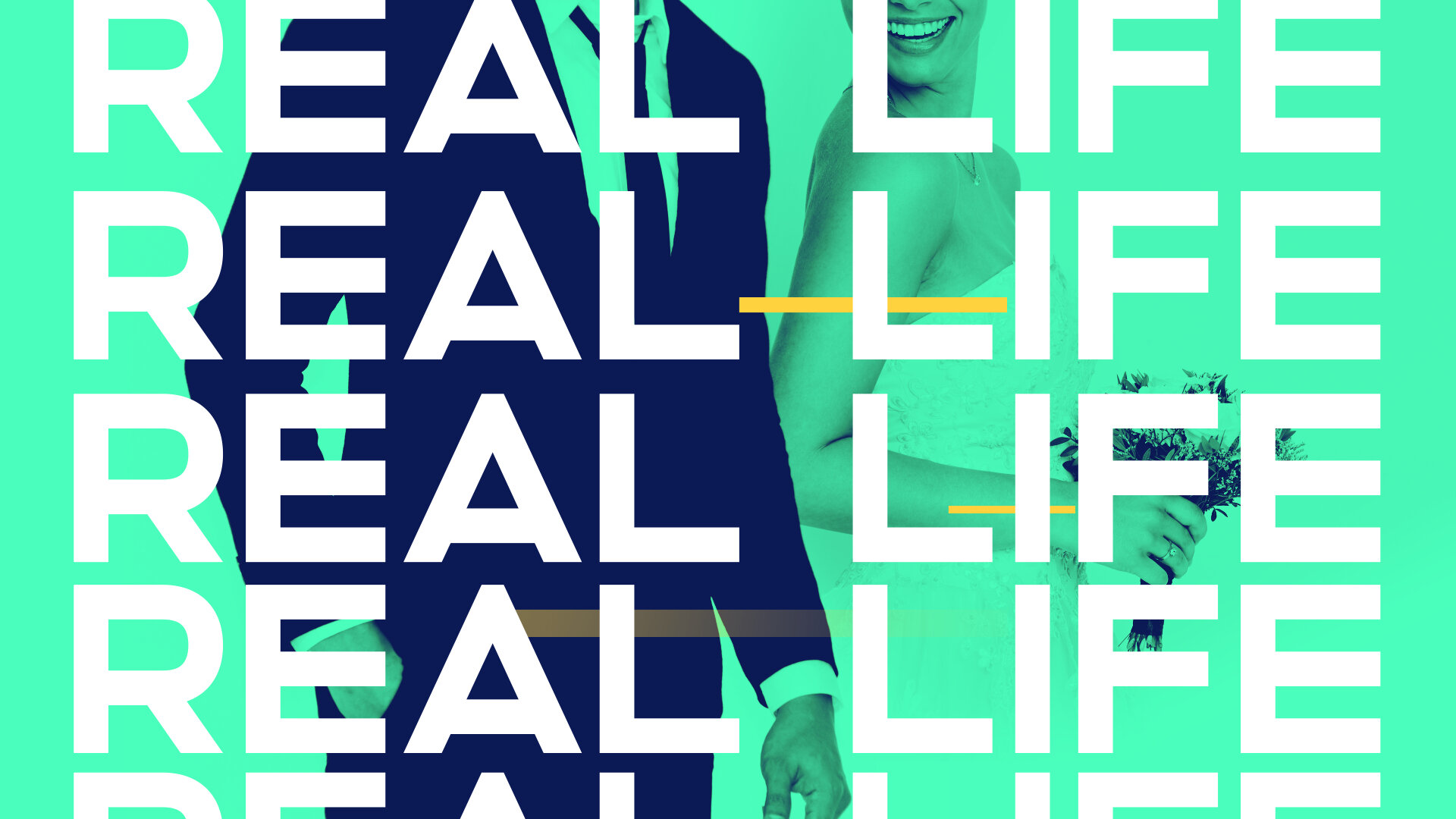
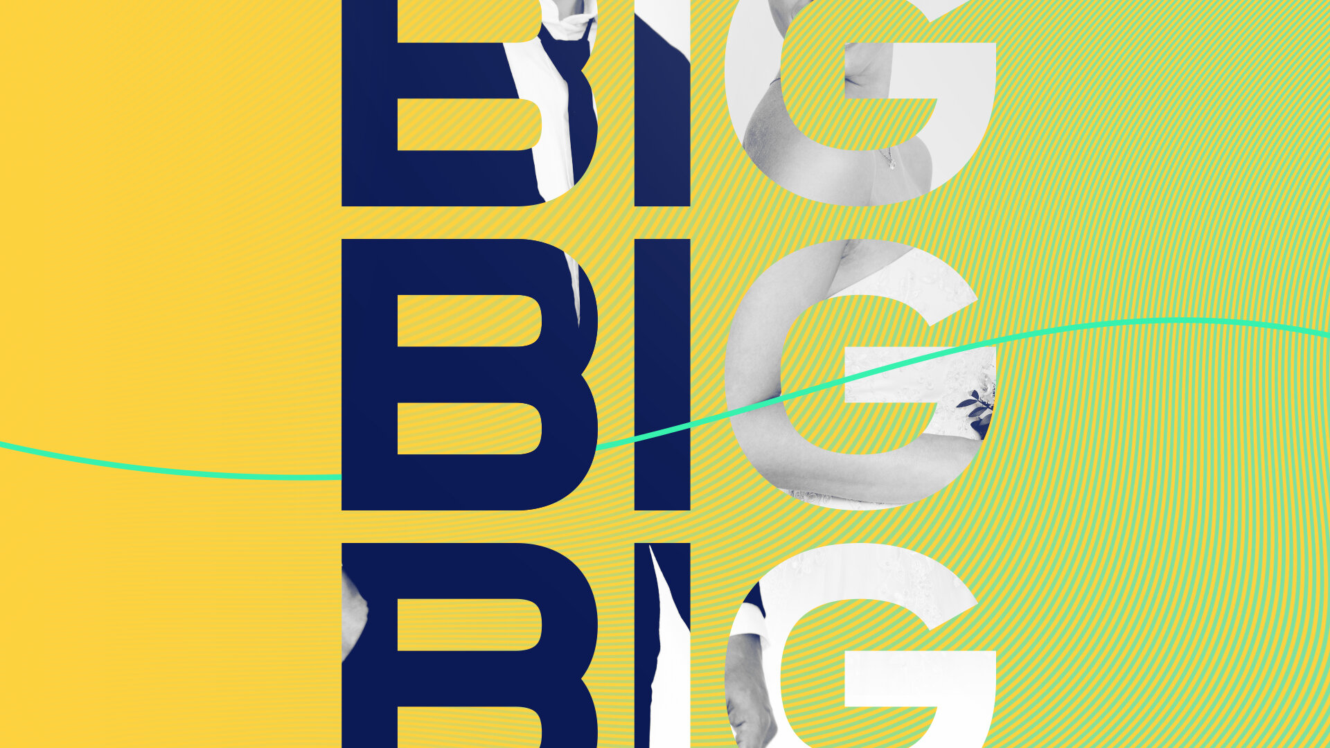
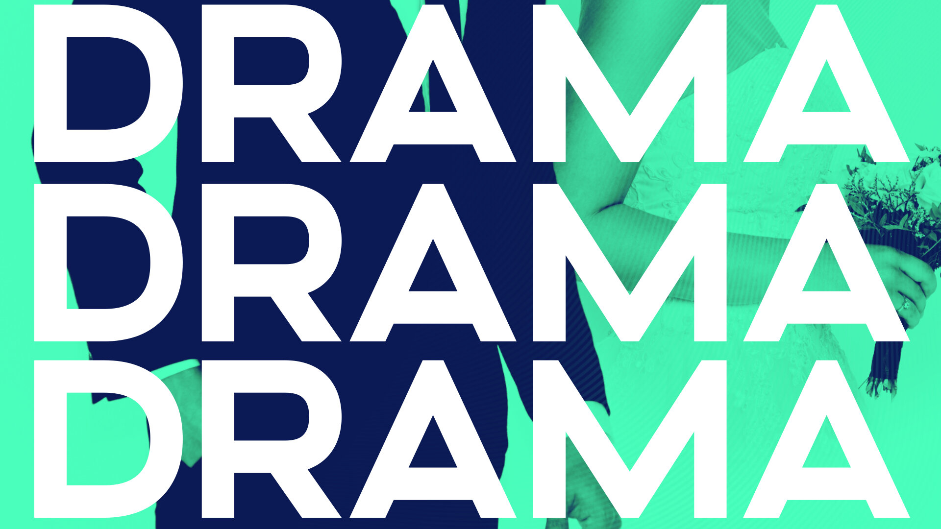
The use of the logo backplate as a framing device is a key component of the network’s branding and vital to building overall brand recognition. By dissecting and repurposing the shape of the logo, we were able to create different visual “windows” through which to view imagery, typography, and color that relates directly back to the brand. The backplate motif is made up of identical parallelograms that can either be combined to create a “Full Picture” view or singled out to create a “Window” view.


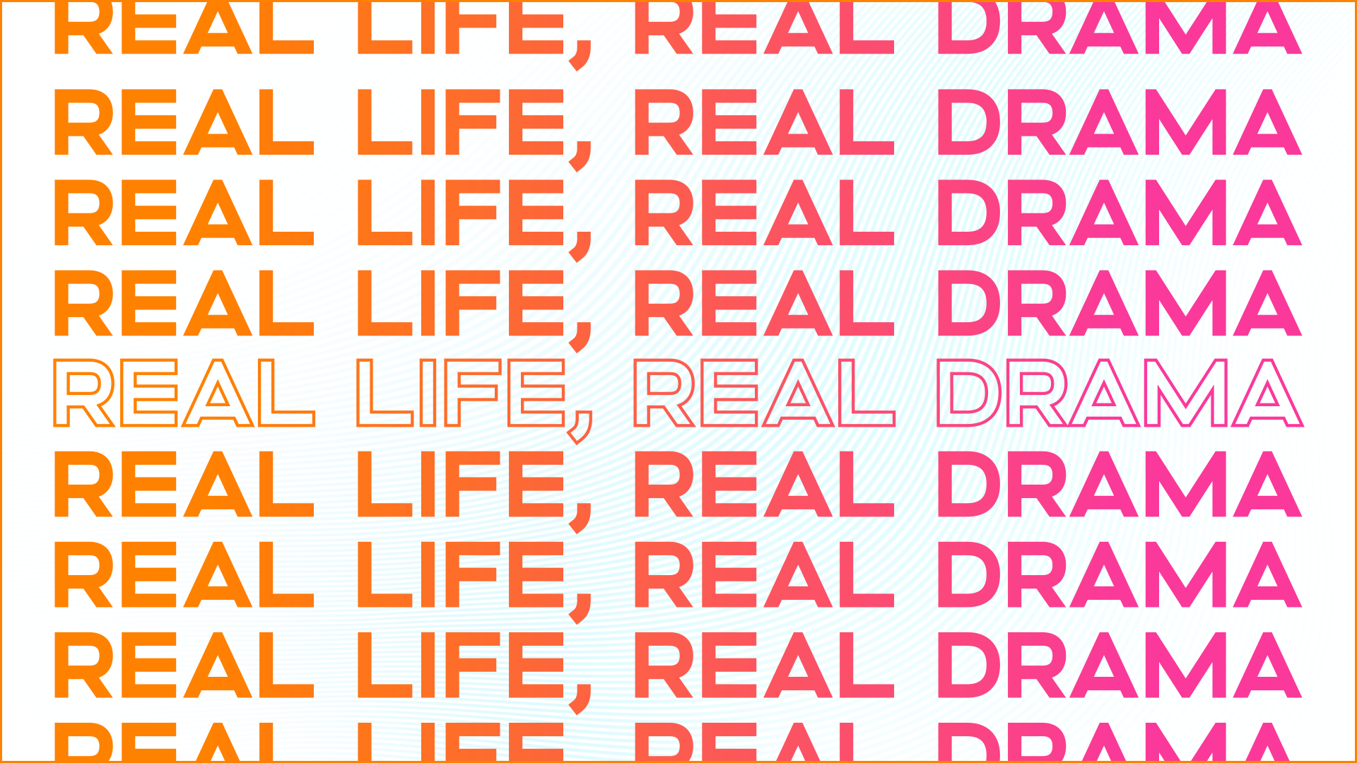
real life. big drama.
Typography, color, and the use of the backplate motifs all played a pivotal role in molding the stylish and sophisticated brand identity of TrueReal. When creating the look for the network, we wanted to envision a brand identity that was equally as flexible as it was good-looking. Not only does this TrueReal brand identity work well within network, promotional, and social deliverables, but it functions seamlessly across a variety of in and out-of-home marketing solutions. By keeping TrueReal’s signature authenticity at the heart of each design decision, we were able to create an extensive brand identity that is cohesive, engaging, and oh-so-relatable.


toolkit time
Using the Essential Graphics panel within Adobe After Effects, we created a completely custom graphics toolkit with extensive functionalities. When building out this toolkit, we needed to ensure that the designs we’d established throughout this process could be easily and elegantly translated into a variety of future use cases. We were also mindful of creating a toolkit that would be extremely user friendly, so virtually anyone could find their way around it without issue. Though this is just a snippet of what it looks like inside the toolkit, the possibilities are endless for customization of network, promotional, and social deliverables.

The process
There is a lot that goes into building a new network from the ground up, so we wanted to take you through a little bit of our visual and conceptual process. We like to showcase some of these behind the scenes moments in order to paint a larger picture of the decisions and thought processes that drove us. Below, we will take a look at some of our initial phases of typography, color, and art direction.


art direction
When we began concepting for this look, there were 3 key words that were guiding our ideation and inspiration: feminine, modern, and dramatic. We knew this look needed to be fun and fresh, but also wanted it to be strong and impactful, as shown here by one of our initial moodboards. We went through several rounds of concepting, type treatments, and visual exploration before landing on a style that fully embodies the mantra of TrueReal: Real Life. Big Drama.


STYLEFRAMES
Once we’d established the type system for the network, we doubled down on exploring the visual identity of the brand. During this process, we explored the use of the backplate motif and repetition as a way to emphasize the drama you can expect from TrueReal’s programming. Both of these ideas were carried through to the final look after some modification, but it was only after going through this styleframe process that we were able to explore what truly fit into our vision for the network’s brand identity.


color
The color palette we established for the TrueReal network was vast and multi-purpose. Before we landed on those particular colors, themes, gradients, and backgrounds, we went through an extensive color exploration phase to determine which colors would properly express the variety of emotions we were looking to convey in our designs.